Overhauling the Visualizer
Overhauling the Enable Cloud Platform's tissue image visualization tool to host new features, improve the in-canvas experience, and upscale general usability.
Project Background
The Visualizer is one of Enable Medicine's flagship products. This tissue image visualization tool gives spatial biologists an immensely powerful way to view multiplexed tissue image data. By visualizing different biomarkers (protein stains, transcripts, etc.) and various masks and annotations, biologists can study diseased tissue and extract information that directly contributes to the study and development of novel treatments.
Multiplex spatial proteomic images are essentially multi-layered image scans of tissue, where each layer highlights a different protein in the tissue sample.
The Challenge
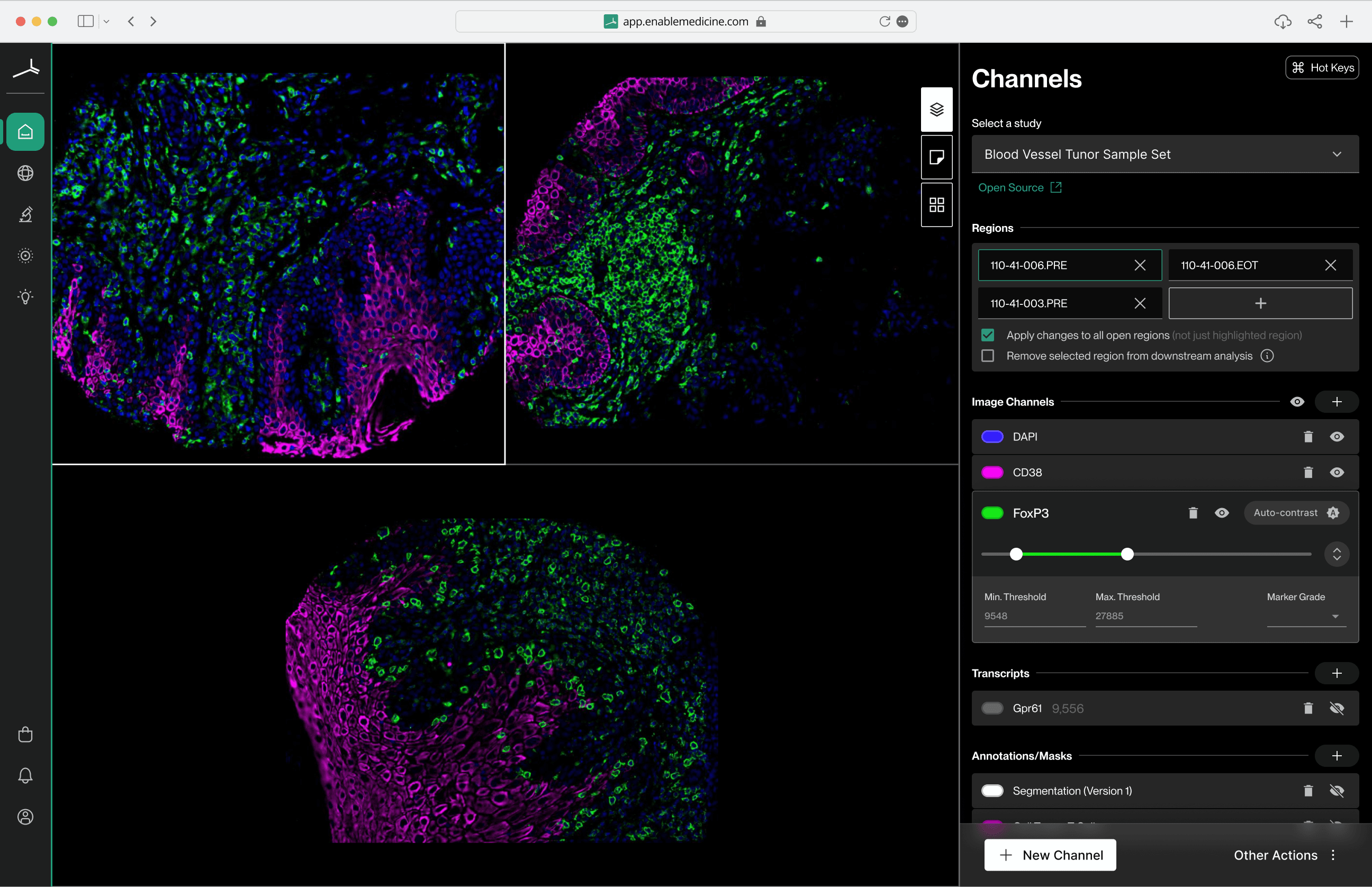
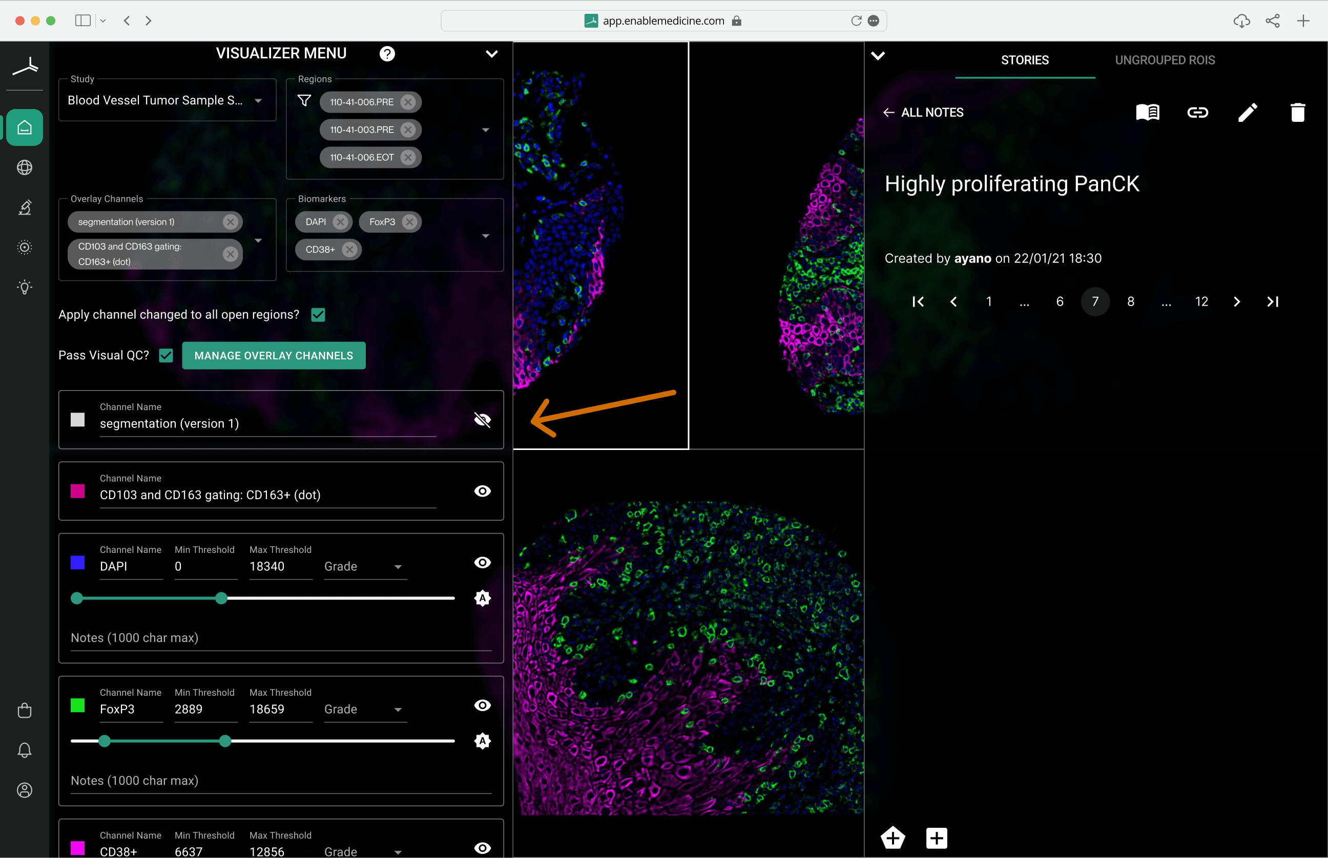
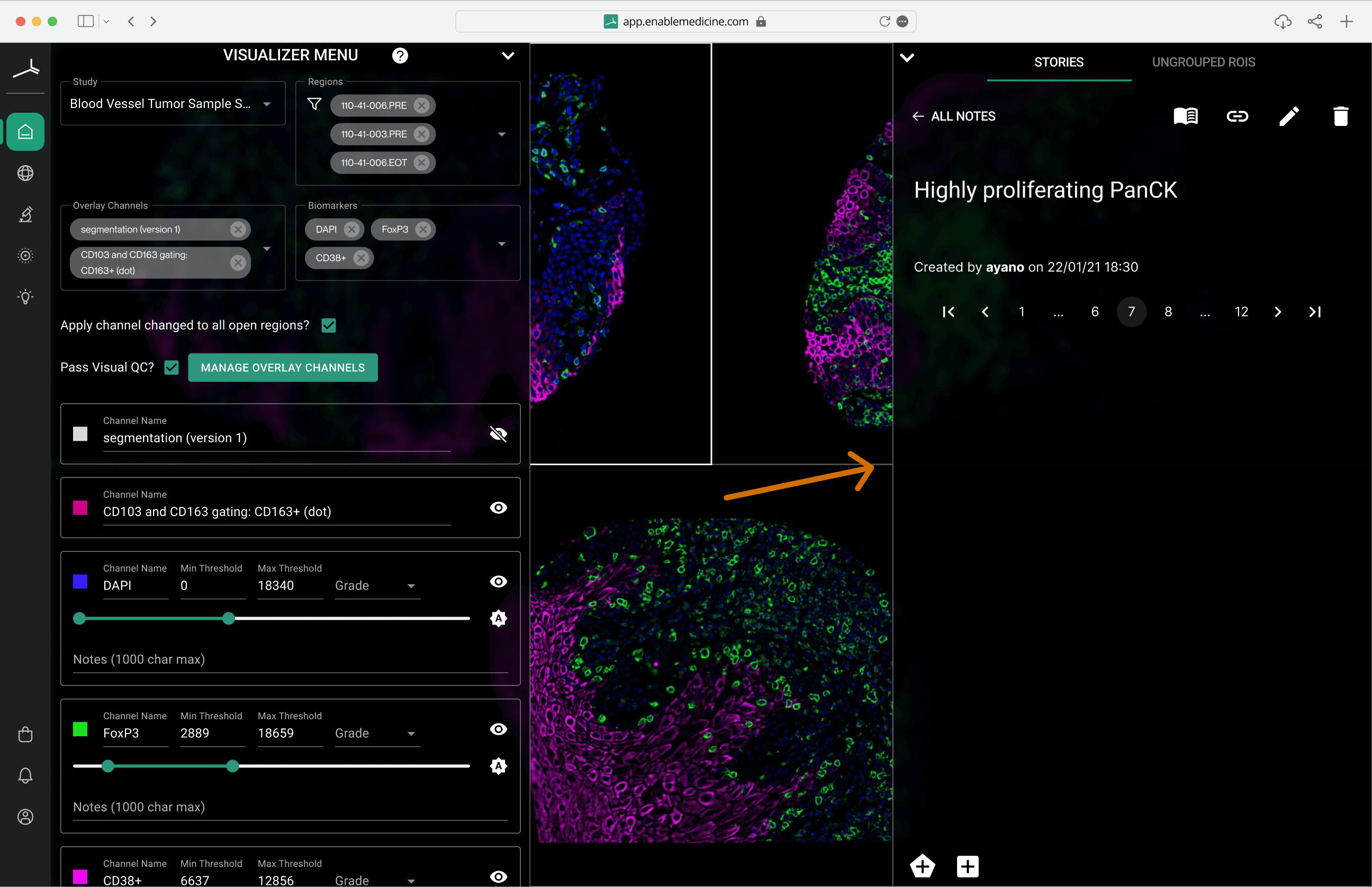
The Visualizer is an incredibly powerful tool, but the complexity that comes with this capability was tripping users up. Having ‘too many controls in too many places’ hampered users' ability to function.
New and existing biologists were:
- 1.Confused about how to add/remove various images, biomarkers, annotations, and masks
- 2.Unable to clearly differentiate which inputs were having what control over the canvas content
- 3.Always opening and closing different panels to see the canvas underneath
Room to grow
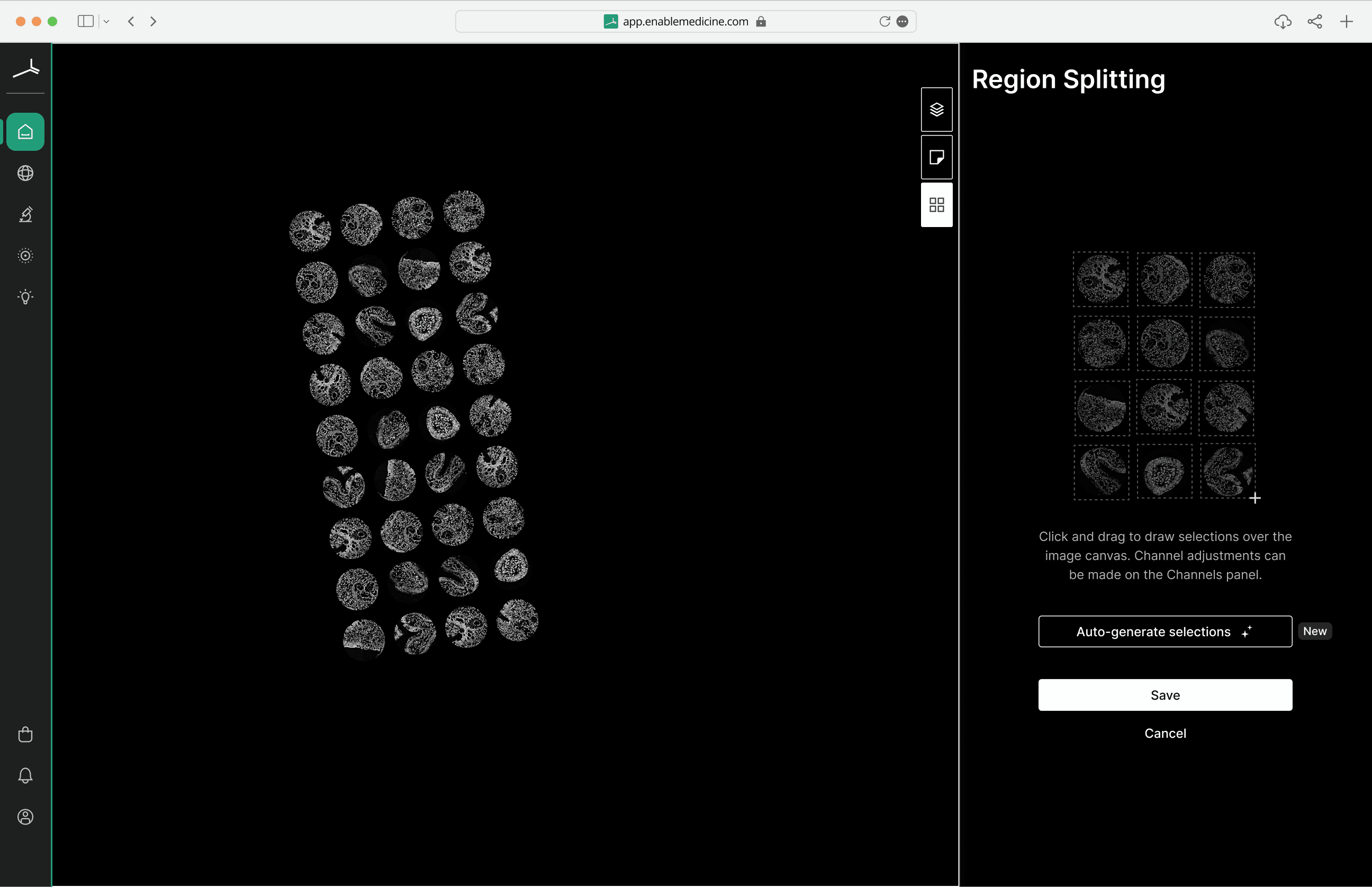
Lastly, a new feature called ‘image splitting’ was soon to be added, but there was virtually no space left on the UI to integrate the new controls necessary.
Key Improvements
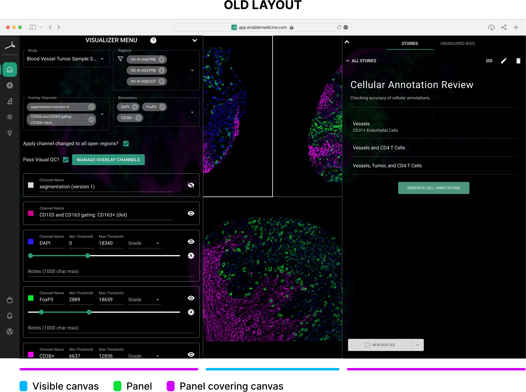
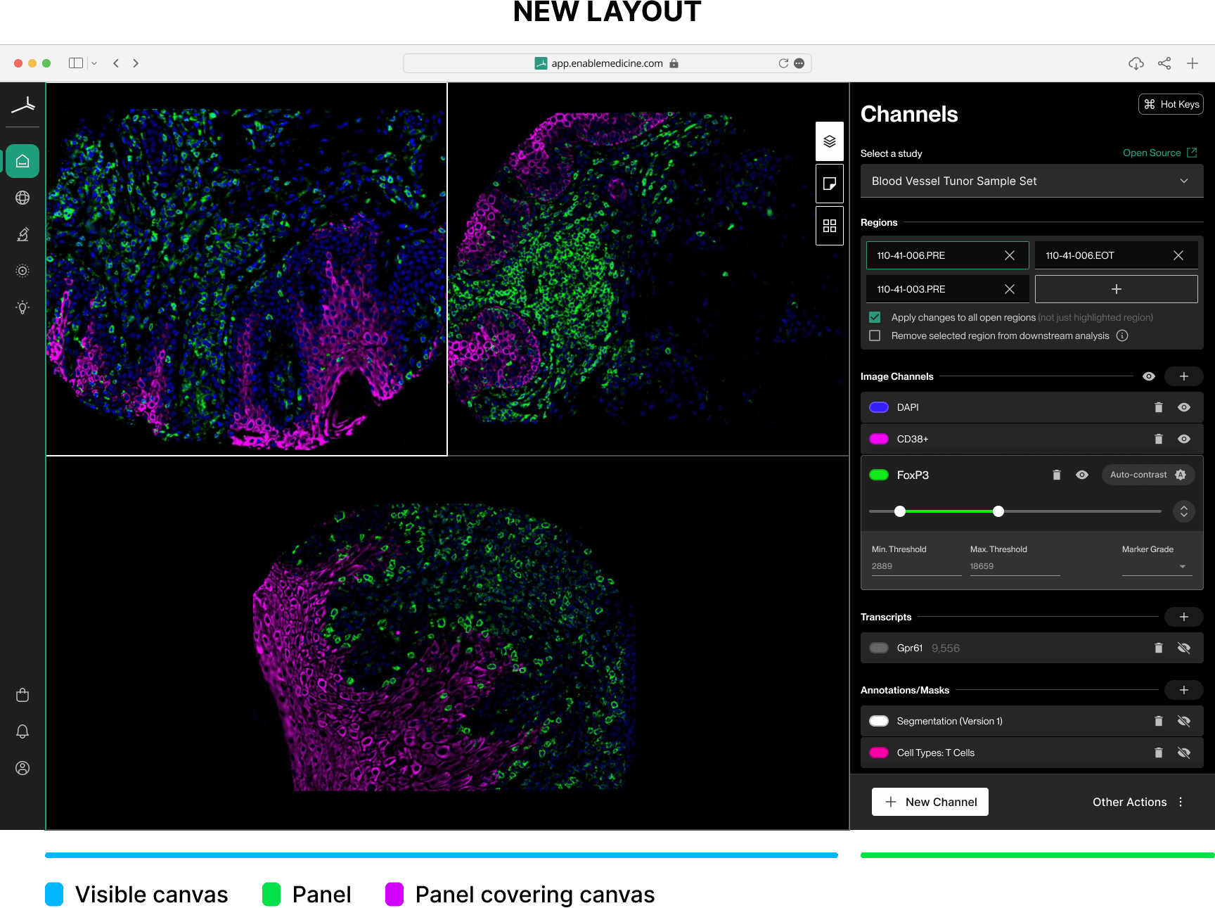
Improved canvas visibility
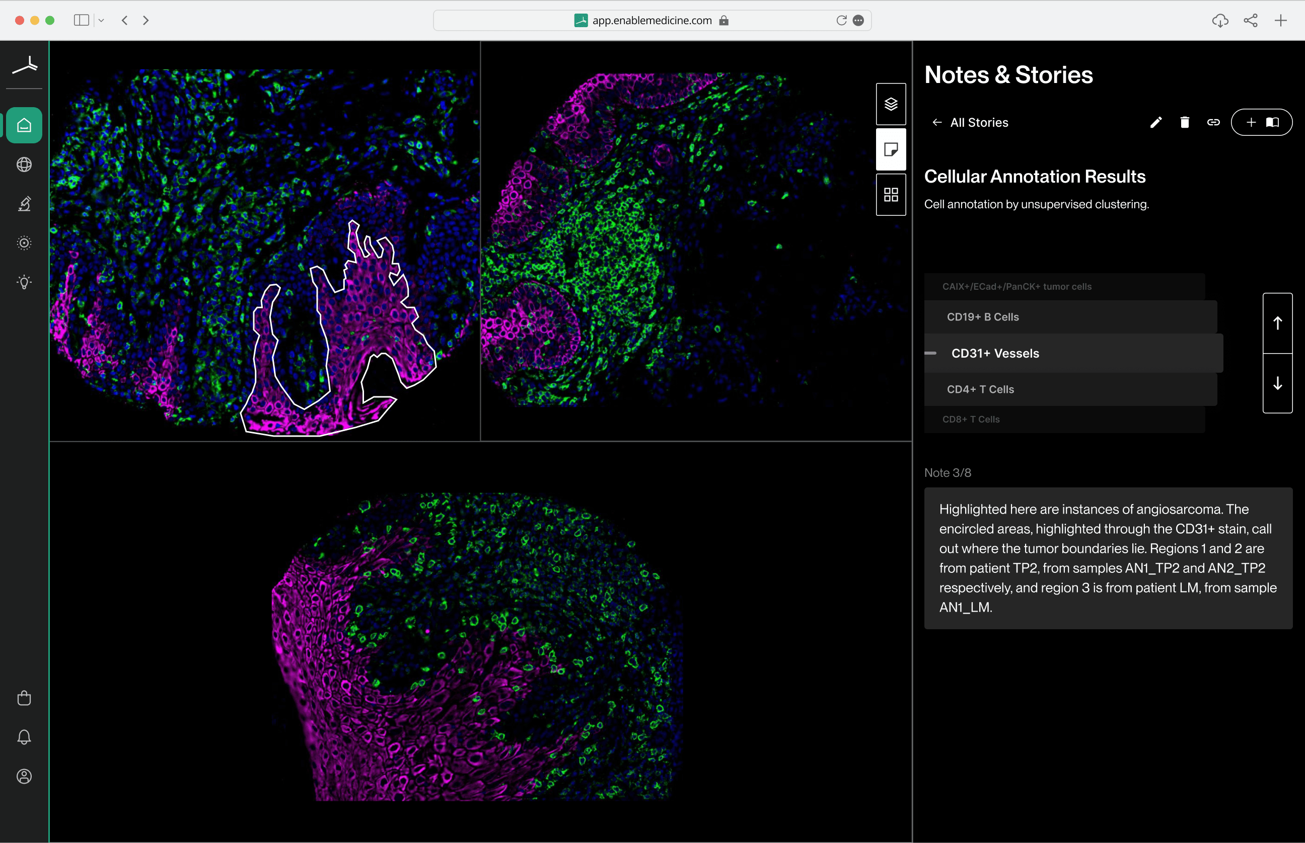
Collapsing different user journeys into their own panels drastically increased the amount of canvas visible at all times.
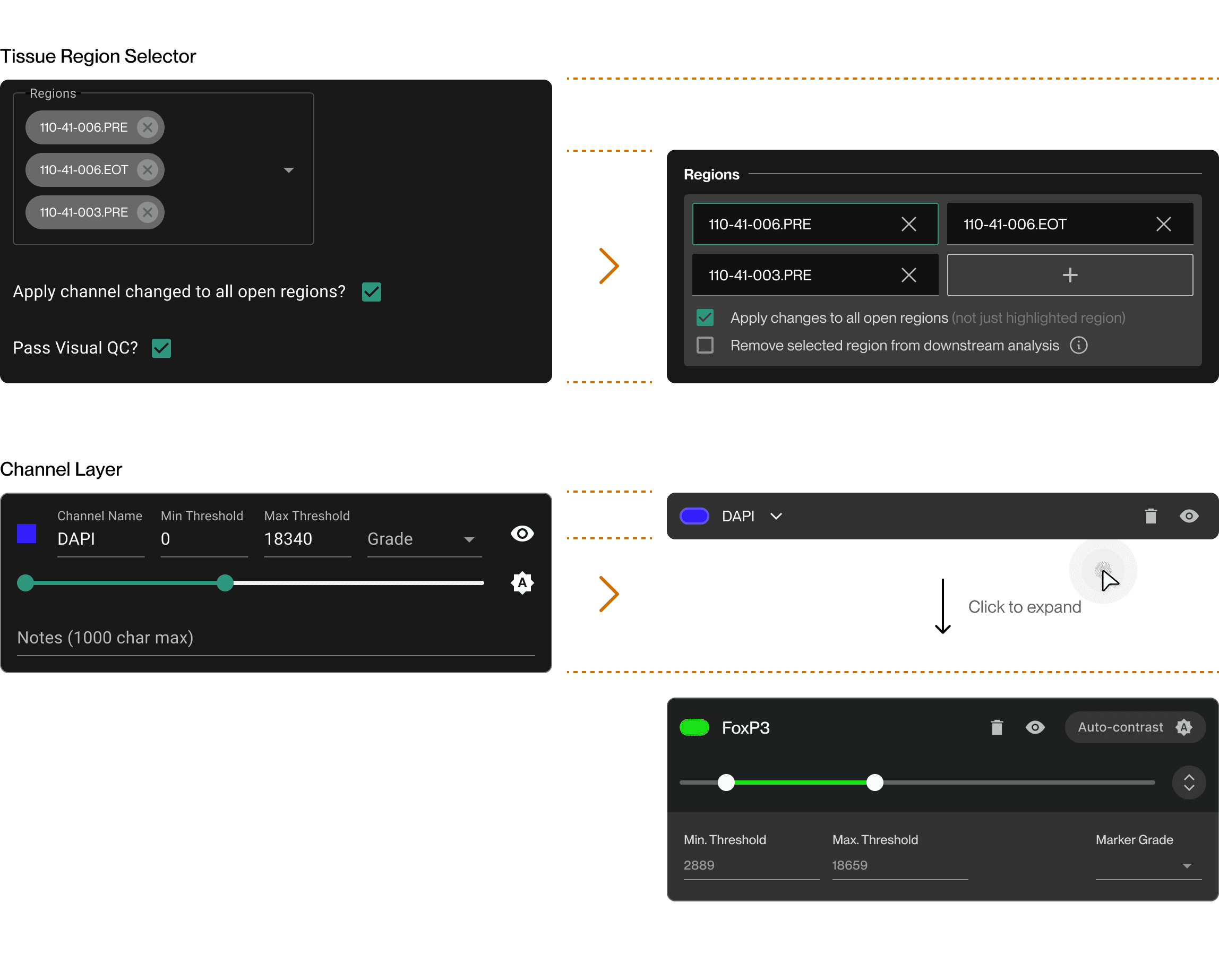
Cleaner, compact channel organization
Slimming down controls and applying standardized UI patterns allowed more controls to fit in a smaller space while retaining high usability.
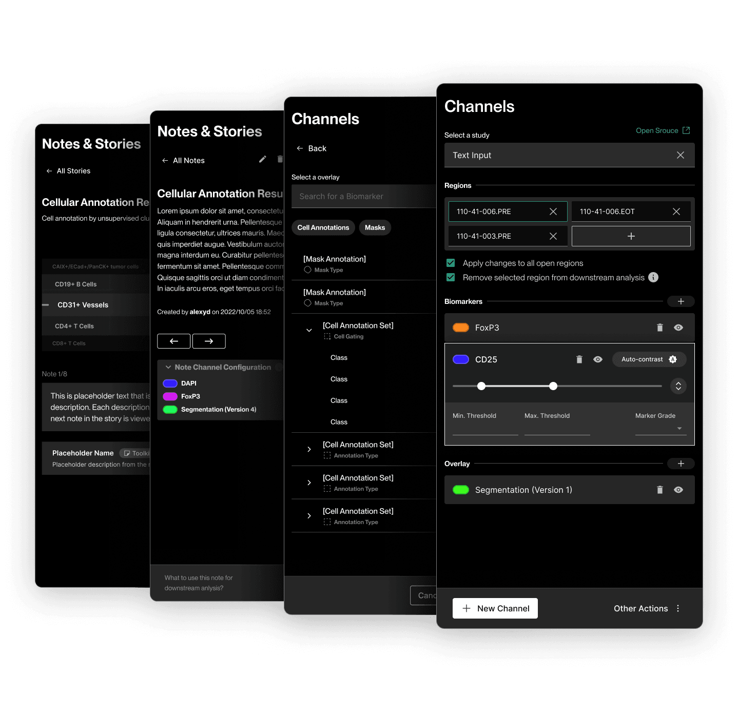
Unified control styling across all surfaces
Applying a custom and unified stylistic approach gave the product a more professional and polished look and feel. We also could begin to introduce interaction familiarity.
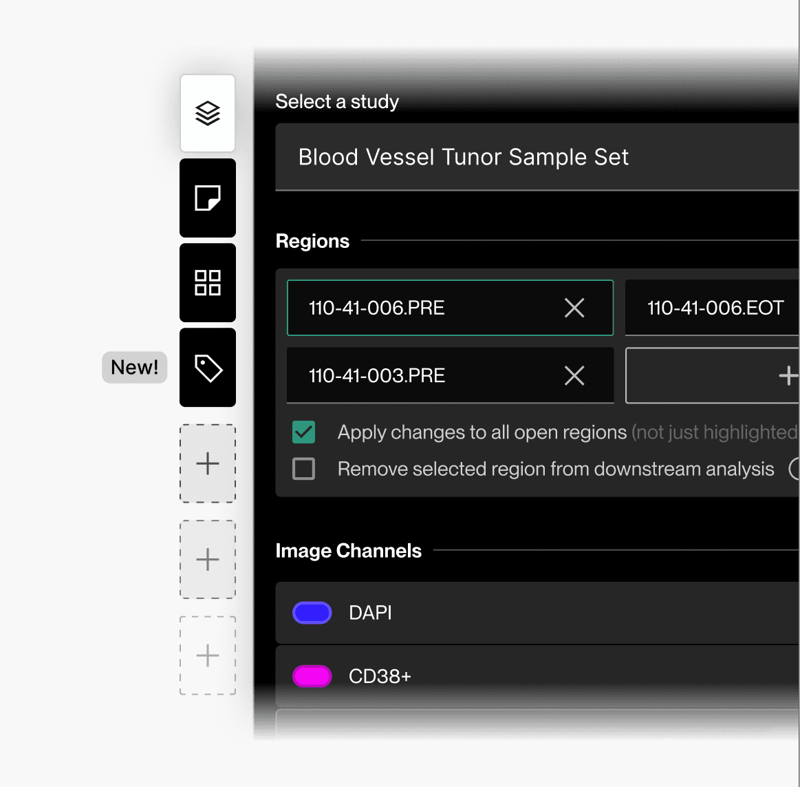
New scalable product structure
With a new scalable UI structure, the Visualizer can now support more feature expansions without compromising the canvas visibility or cognitive burden on the user.
The Impact
Greater canvas visibility meant users spent less time opening and closing panels and more time completing their scientific work — which in turn reduced frustration from repetitive clicks. Users told us constantly opening and closing panels was a big frustration, so this was a small but impactful quality-of-life improvement.
Restructuring the UI allowed us to integrate 2 new feature panels, with room to add many more in the future — which in turn expanded the Visualizer's draw to more user types, opening new business opportunities.
The Approach
Overhauling a surface as big as the Visualizer was not going to be a small project. What you see below focuses more on how I tackled this project than on a comprehensive collection of all improvements, changes, and updates.
Building a picture of the current user experience
Our decision to overhaul the product was not just about ‘making it prettier’. This was our opportunity to hone in on and rethink key parts of the user experience that were not meeting our users' needs.
The first step was to deconstruct the current UI in an audit that focused on general usability, feature discoverability, and UI accessibility.
What current obstacles are slowing users down?
Re-establishing a scalable information hierarchy
It was clear from early on that a UI re-organization was urgently needed. Aside from most of the canvas being occluded by control panels, many of the powerful functions were not easily understood or locatable.
Initiating tasks as simple as creating a note (a fundamental use-case for spatial biologists) was not obvious to our users.
How can we re-organize to maximize usability and efficiency?
Redesigning controls to be more intuitive and save space
Organizing the panels alone wasn't going to be enough. Each UI control held lots of room for improvement in terms of usability, compactness, and clarity. I evaluated each panel control in terms of purpose, priority, space, and clarity. From there I rebuilt as many as I could to (1) reduce the space needed and (2) improve their intuitiveness as much as possible.
Systematically breaking down and rebuilding canvas controls
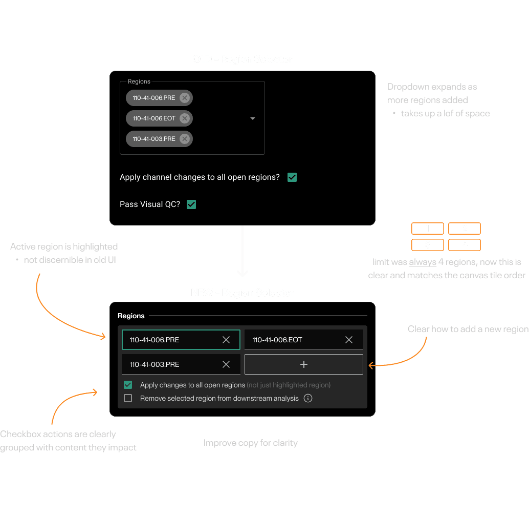
Validating major changes with prototypes and UXR
To ensure the changes I was making were having a positive impact, I conducted usability testing with our internal team of scientists. For each exercise, I evaluated how easily they were able to understand the controls and how quickly they were able to complete the required tasks.
Validating UI structure choices with prototypes and UXR
Unifying the look and feel, boosting UI accessibility
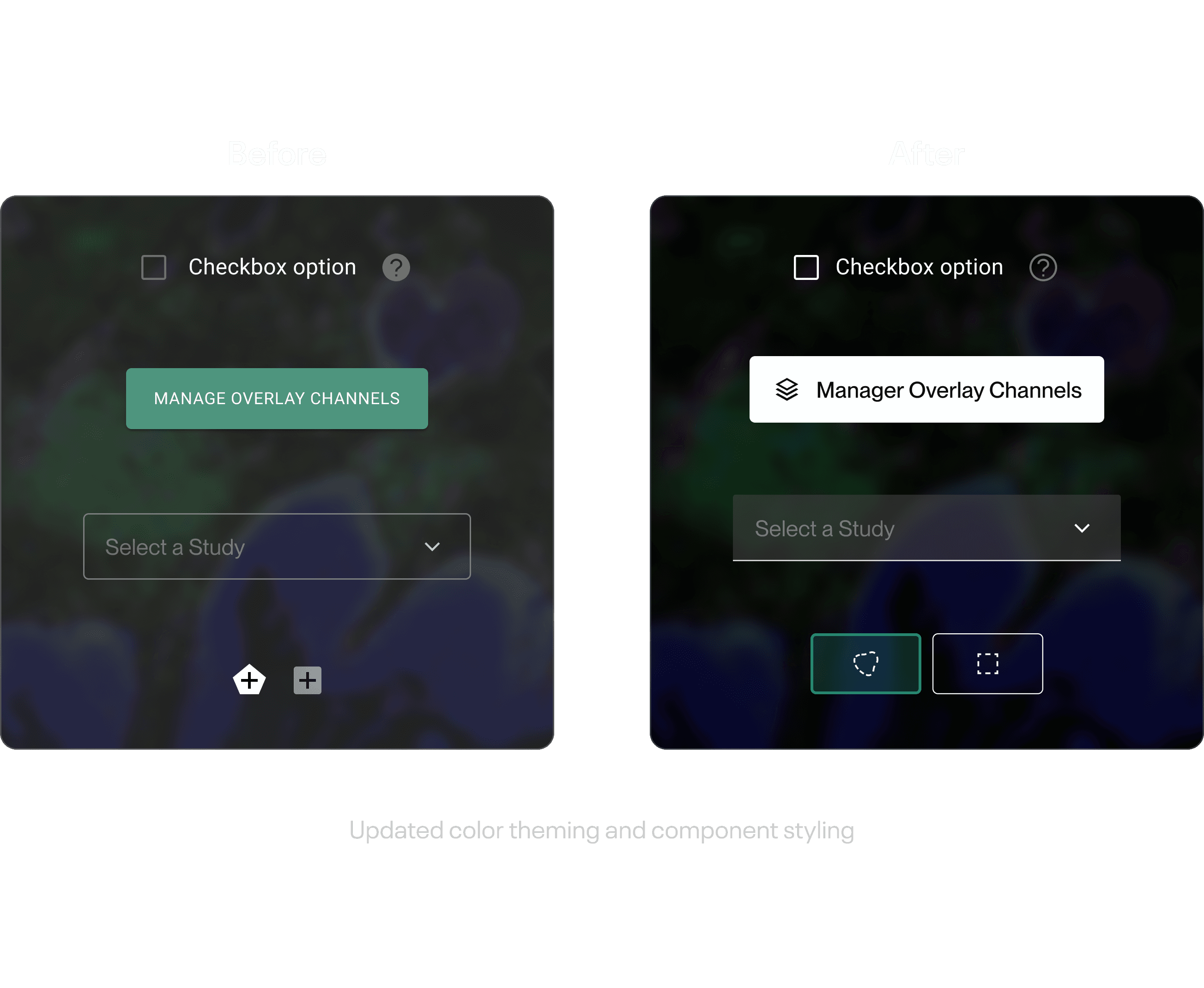
This was an interesting challenge to solve because all of our panels had some level of transparency and the images below tended to be immensely visually complex. On top of that, the existing UI was riddled with low-contrast elements, making the whole UI challenging to cognitively break down.
To improve this aspect of usability, I established a new styling theme to employ over our existing design system. This theme would ensure all controls had enough contrast and clarity when overlaid on the busy backgrounds.
Building in legibility over complex backgrounds
From start to finish
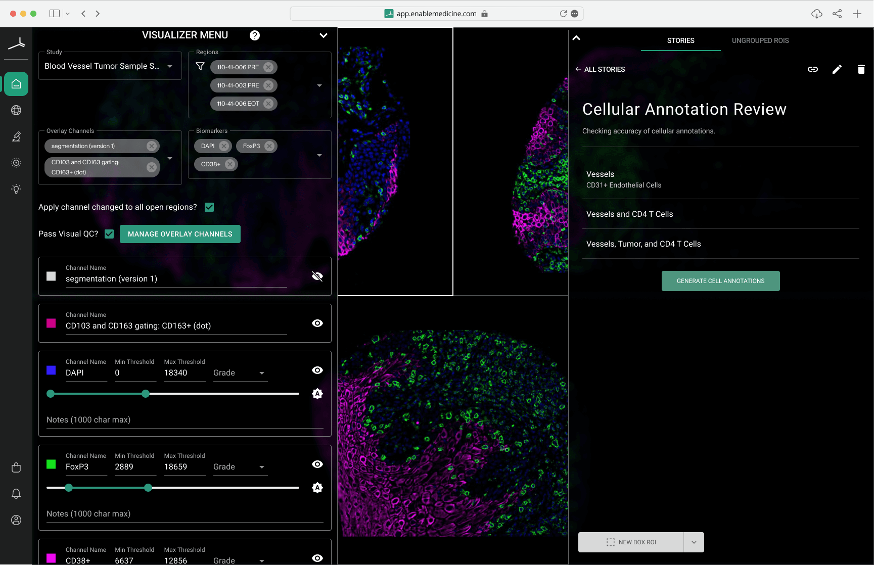
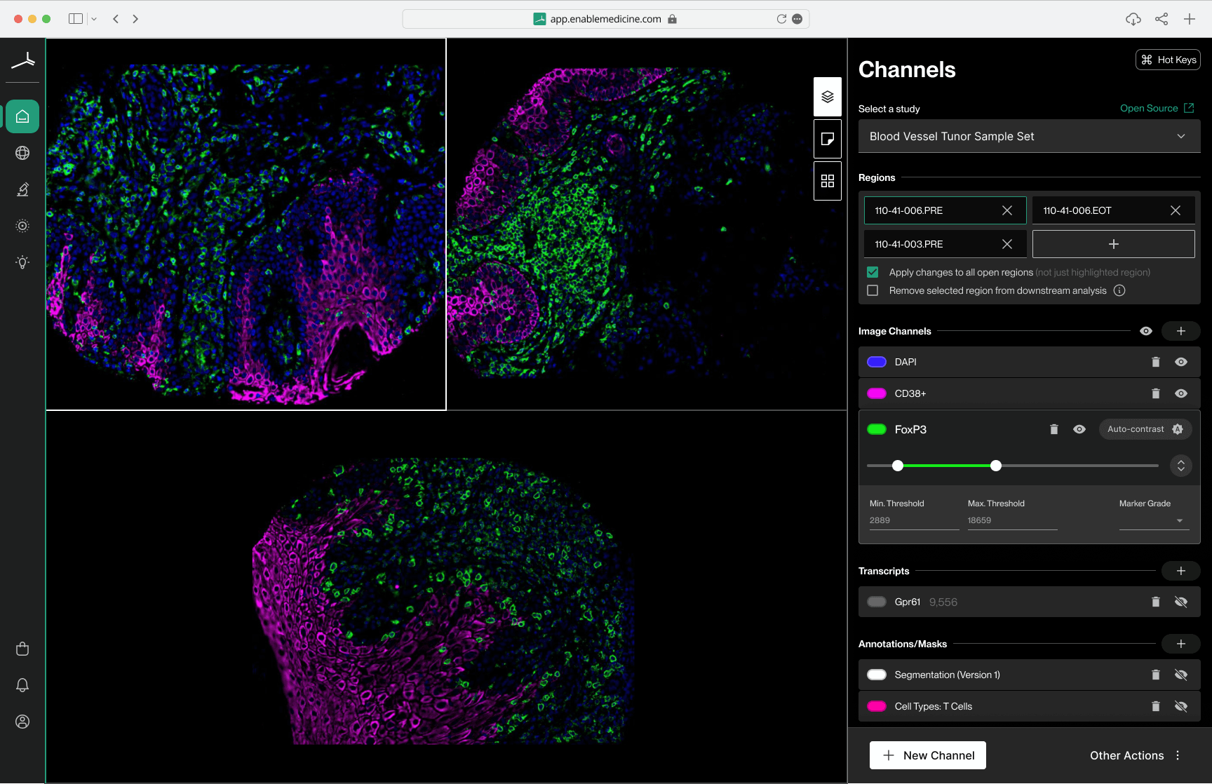
Below is a comparison of the initial UI and the final updated UI.
Other work.
Redesigning Athelas Air's EMR calendar block to be clearer, denser, and easier to scan at a glance.
A collection of 7,000+ digital product icons, designed for personal and commercial use.
Redesigning the initial search experience for a getaway cabin on Unplugged.rest to be more engaging, intuitive, and polished.