Designing Air’s Calendar Block for clarity and efficiency
How I redesigned Athelas Air's EMR calendar block to be more informative, responsive, and handle the extraneous needs of the healthcare environment.
Project Background
Calendars are like the air traffic control of healthcare practices. Whether you're a medical provider or an admin, the calendar is pivotal to understanding what the day ahead looks like.
What makes calendars for healthcare so unique is their need to communicate extreme amounts of detail — appointment types, topics, insurances, payments, and many other key alerts need to be crystal clear in a moment's glance.
Our calendar? Our users found it simply wasn't clear enough, and staff needed to see more than we were communicating.
The Challenge
Improving our calendar communication was a 3-part project. How could we:
- 1.Make appointment details much clearer at a glance?
- 2.Show more of someone's day in the same amount of space?
- 3.Ensure our calendar out-performs other EMR calendars?
Key Highlights
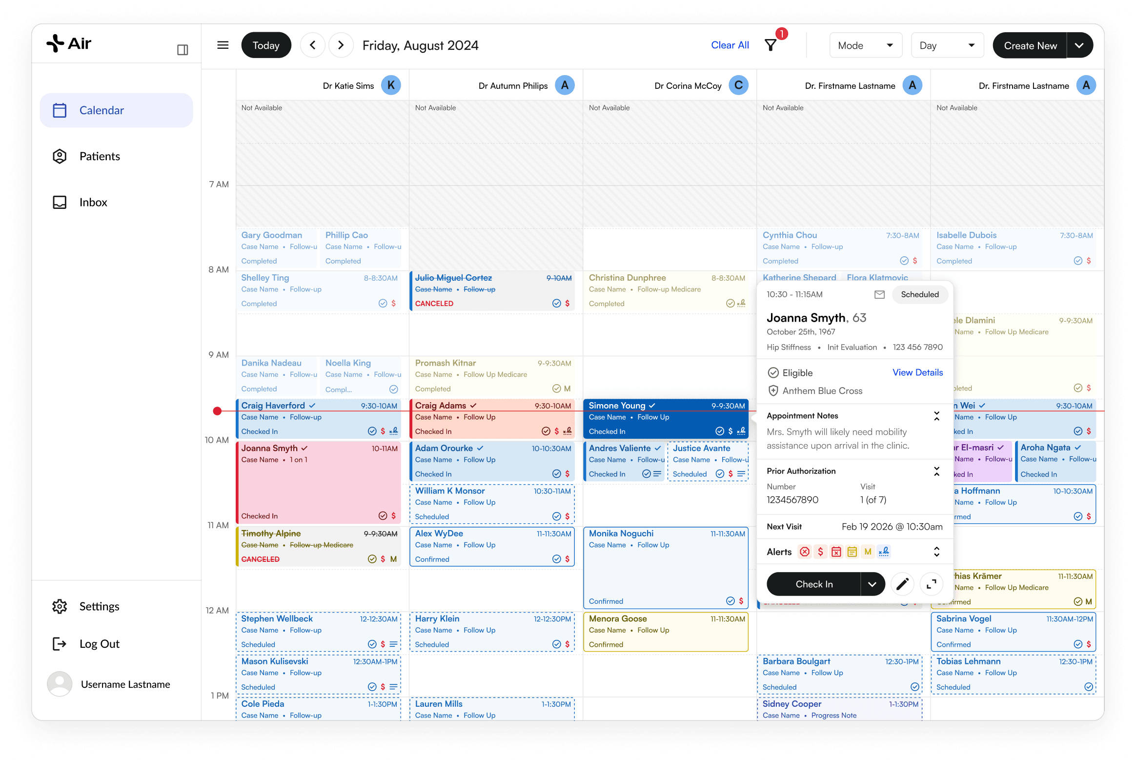
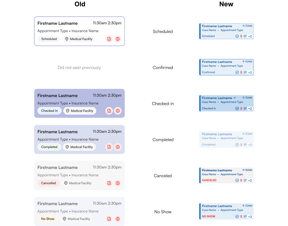
More details, smaller size, clearer statuses
The new blocks take up less space, communicate more information, and make appointment statuses clearer than they were prior.
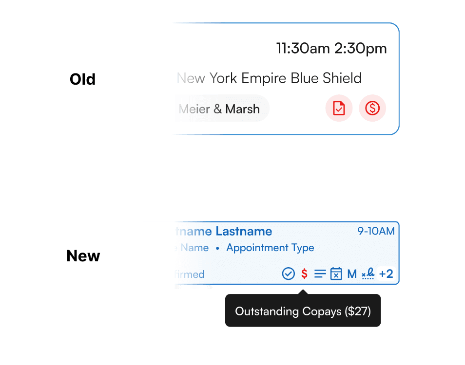
More alerts and more details
Alerting was simplified and shrunk down so we could get much more detailed with what we want users to know.
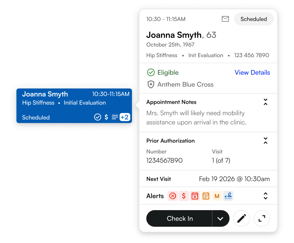
A new, detailed appointment pop-out
Previously, users had to go digging for information in hidden away drawers. Now, the most important information is available right at their fingertips.
Increased overall density for better day visibility
Condensing the appointment block and general structure allowed us to show much more of someone's day without needing to scroll.

The Impact
Condensing the appointment block and general structure let staff see much more of a provider's day at once.
“More information, readily available.” Customers found it quicker and easier to locate specific appointments and extract the relevant information — saving admin staff time and letting them offer quicker, more personal assistance to incoming patients.
“This is going to make a lot of peoples lives easier”
“I love that I can see these alerts without having to click”
“This is already a lot better than what we're currently working with”
“I love this, I'm onboard with all I'm seeing here”
“I'm excited to see this in action”
The Process
From the front desk to the whiteboard — here's how I diagnosed the problem, studied the competition, and landed on the final design across five phases of research, synthesis, and iteration.
Understanding the Healthcare Environment
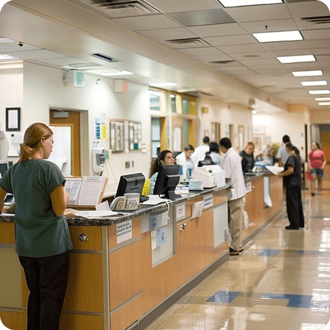
Front desk staff in small/medium size clinics see anywhere from 40–200 patients in a day — in bigger facilities, this can be even higher.
For every patient, front desk interactions involve greeting the patient and checking them in, checking if they need to complete any intake paperwork, and handling pre-visit requirements like copays, insurance, and authorizations. These tasks can range wildly in time and involvement, depending on what the patient needs.
Our research and site visits told us that front desk staff spend more than 70% of their time referencing an EMR calendar, often jumping back and forth between the software and the patient — so operating with speed and precision is paramount to their success. We learnt that an effective calendar should provide quick visibility into a clinic's day, because this visibility informs actions before they are required.
Research observations
- –Bustling physical environment
- –Sudden waves of high-traffic and long lines
- –1–2 front desk staff for 8–10+ waiting patients at busy times
Staff typically struggle with
- –Quickly referencing the calendar when patients have questions about their appointment, insurance, forms, balances, and more
- –Constantly switching between the screen and the patient during interactions
- –Knowing which patients need extra attention before they can be seen



So Why Wasn't Our Current Calendar Working?
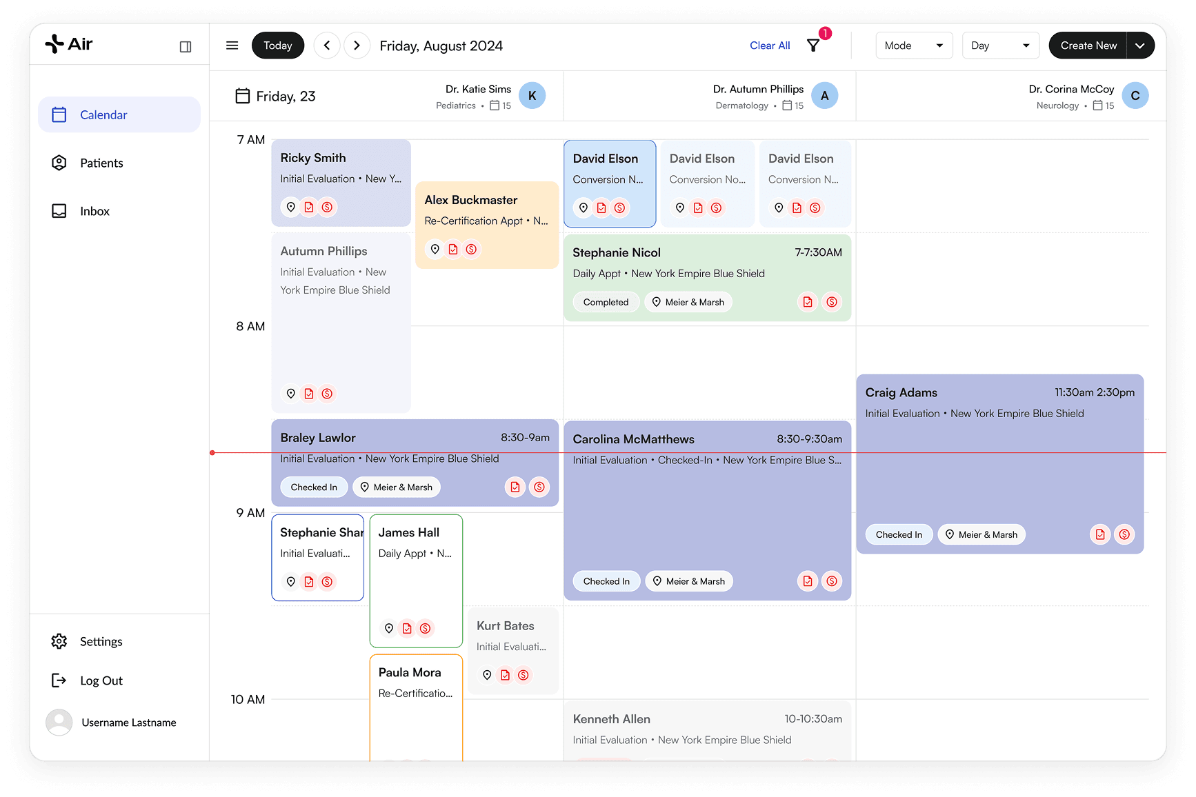
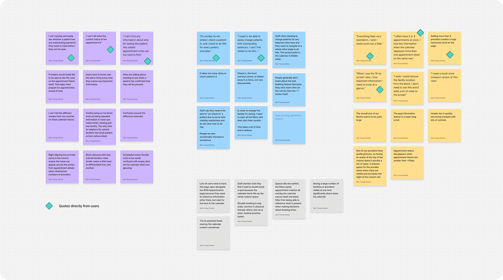
Direct customer feedback on the previous calendar made the gaps obvious:
- –I can't tell what the current status of the appointment is
- –I can't quickly and easily see whether a patient has any outstanding payments they need to make before they can be seen
- –I can't find any information about why I'm seeing the patient — any added appointment notes are too hard to find
- –It's unclear to me where I check a patient in, and I need to do this for every patient, every day
- –I need to be able to easily charge patients with outstanding balances — I can't find where to do this
- –Everything feels very zoomed in, I wish I could zoom out a little
- –When I use the ‘fit-to-screen’ view, I lose important information I need to know at a glance
- –I wish I could remove the facility location from the block, I don't need to see this and it adds a lot of noise to the screen
- –I often have 2 or 3 appointments at once — I lose key information when the calendar squeezes more than one appointment block on the same row
Theme 1 — Ambiguous or unclear appointment information (~80% of users)
- –Critical information about appointments was not immediately clear to users.
- –Impact: users need to look further to find what they need — more clicks, more time to get stuff done.
Theme 2 — Ambiguity around where key actions live (~65% of users)
- –Actions users know they want to take are hard to find or unintuitive to operate.
- –Impact: users are slowed down and/or can't complete required actions, making patients wait longer and creating a negative experience for everyone.
Theme 3 — Generally poor information density (~90% of users)
- –The calendar lacked the desired quantity of information at both the appointment level and the whole-day level.
- –Impact: users felt less aware, lacking a bird's-eye view of the day's activities and feeling less in control.
Studying Other Consumer & EMR Calendars
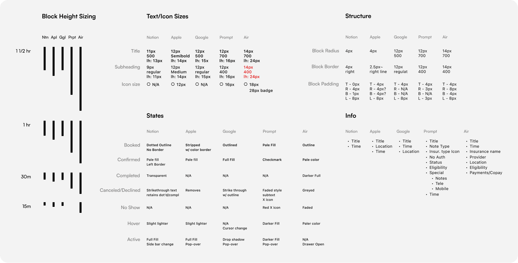
To find our opportunities, I audited how consumer calendars and competing EMRs solved the same problems.
Apple Calendar
- –Event creation and viewing can be done in a pop-out window
- –Source organization is done via color fill + sidebar
- –Very tight padding around block content
- –Secondary content gets hidden on smaller (vertically) block sizes
- –Distinct styles for invited/accepted status
Google Calendar
- –Hour size is not very large
- –Distinct styles for invited/accepted/rejected statuses
- –Sources handled via color theming
- –Content rearranges when block is small
- –Double bookings overlap one another
Notion Calendar
- –Distinct styles for invited/accepted/rejected status
- –Content rearranges when block is small
- –Double bookings overlap when titles can stack above/below, or split column space when they cannot
- –Hour size is very small
Prompt EMR
- –5+ providers are visible at once
- –Alerting is vast and detailed — from title icons to colored dots scattered around the block, very busy and visually cluttered
- –A legend is available to understand the codified calendar approach
- –Appointment type shown via color; block styles also used to surface alerts
- –“Blocks” or unavailable times marked via solid, untitled grey blocks
- –Appointment blocks never take up more than 50% of the column width
Athena Health
- –Very vertically dense
- –Time slots can be reserved but not booked on (different from simply empty)
- –Color bars indicate appointment type
- –No overlapping on double booking
- –Very little detail, no alerting present
WebPT
- –5+ providers could be visible at once
- –Appointment details are surfaced via a pop-out when you click on the block
- –Alerting is handled via icons in front of the appointment title, not scalable
- –Appointment type is shown via color
Opportunity 1 — Information density
- –Our information density was far worse than existing calendars — extra padding, bigger font sizes, and backgrounds on icons required a bigger footprint on the UI.
- –This was likely the cause of staff feeling ‘too zoomed in’ and wanting a better bird's-eye view of the day ahead.
Opportunity 2 — Detailed alerting
- –Other EMRs had much more detailed alerting — all of our alerts were combined into 2 icons with a tooltip, while competitors used many icons and visual cues that each meant something different.
- –This was likely causing our users to go hunt down information elsewhere while the patient waited.
Opportunity 3 — Information access via pop-out
- –Most other tools leverage a pop-out window to surface key appointment information much faster.
- –Matching this pattern would reduce the clicks needed to find key information and take key actions.
Opportunity 4 — Status differentiation
- –Differences between statuses weren't obvious enough at a glance — our shade-based status depiction wasn't noticeable enough for users to quickly tell statuses apart.
- –This was likely causing confusion around where staff should focus their attention on the calendar.

Defining Guiding Principles & Design Explorations
Three principles guided every exploration from here on out:
1. Maximize information density
- –Make the most of the available space — reducing the block footprint decreases the overall footprint, making more of the day visible at once.
2. Make critical and high-value information crystal clear
- –Making critical information easy to spot speeds up staff and helps them get ahead of issues and tasks.
3. Make key, common actions quickly accessible and highly intuitive
- –Fast, fluid interactions increase user enjoyment and let staff close out tasks quicker.
Pilot Launch and Incorporating Feedback
Launching to a pilot group surfaced real-world feedback that shaped the final version.
Feedback #1 — Color clarity and contrast needed to increase
- –Some customers struggled to make out different block colors, due to the pastel style and devices with poor screen contrast ratios.
- –Fix: darkened all block background colors and added a saturated color bar to every status — the bar got even thicker on smaller sizes for clarity.
Feedback #2 — An additional ‘Confirmed’ status was needed
- –Many sites needed a status to indicate when a patient has confirmed ahead of time that they'll arrive for their appointment.
- –Fix: added the status and used a solid border to differentiate it from all other statuses.
Feedback #3 — Remove the facility label, add a written status
- –The facility name on the block was seen as repeated, low-value information causing noise — facilities were soon handled differently on the calendar altogether.
- –Fix: removed the label and replaced it with a written status label for maximum status clarity.
Feedback #4 — More information needed in the appointment pop-out
- –Right after launch, we learnt that key patient details — email, phone, next scheduled visit — were missing from the pop-out.
- –Fix: added these fields so staff could easily contact patients when confirming appointments.
The final design
Other work.
A collection of 7,000+ digital product icons, designed for personal and commercial use.
Redesigning the initial search experience for a getaway cabin on Unplugged.rest to be more engaging, intuitive, and polished.
Replace this with a real project — cover image, title, and summary.