Improving search & discovery on Unplugged.rest
Redesigning the initial search experience for a getaway cabin on Unplugged.rest to be more engaging, intuitive, and polished.
Project Background
Unplugged.rest offers busy city workers a 3-day escape in an off-grid cabin. Their goal is to help people truly relax by escaping to a cabin in the wilderness, with no screens allowed.
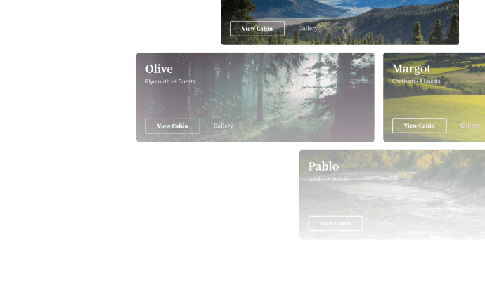
The platform has 10+ cabins across UK locations.
The Challenge
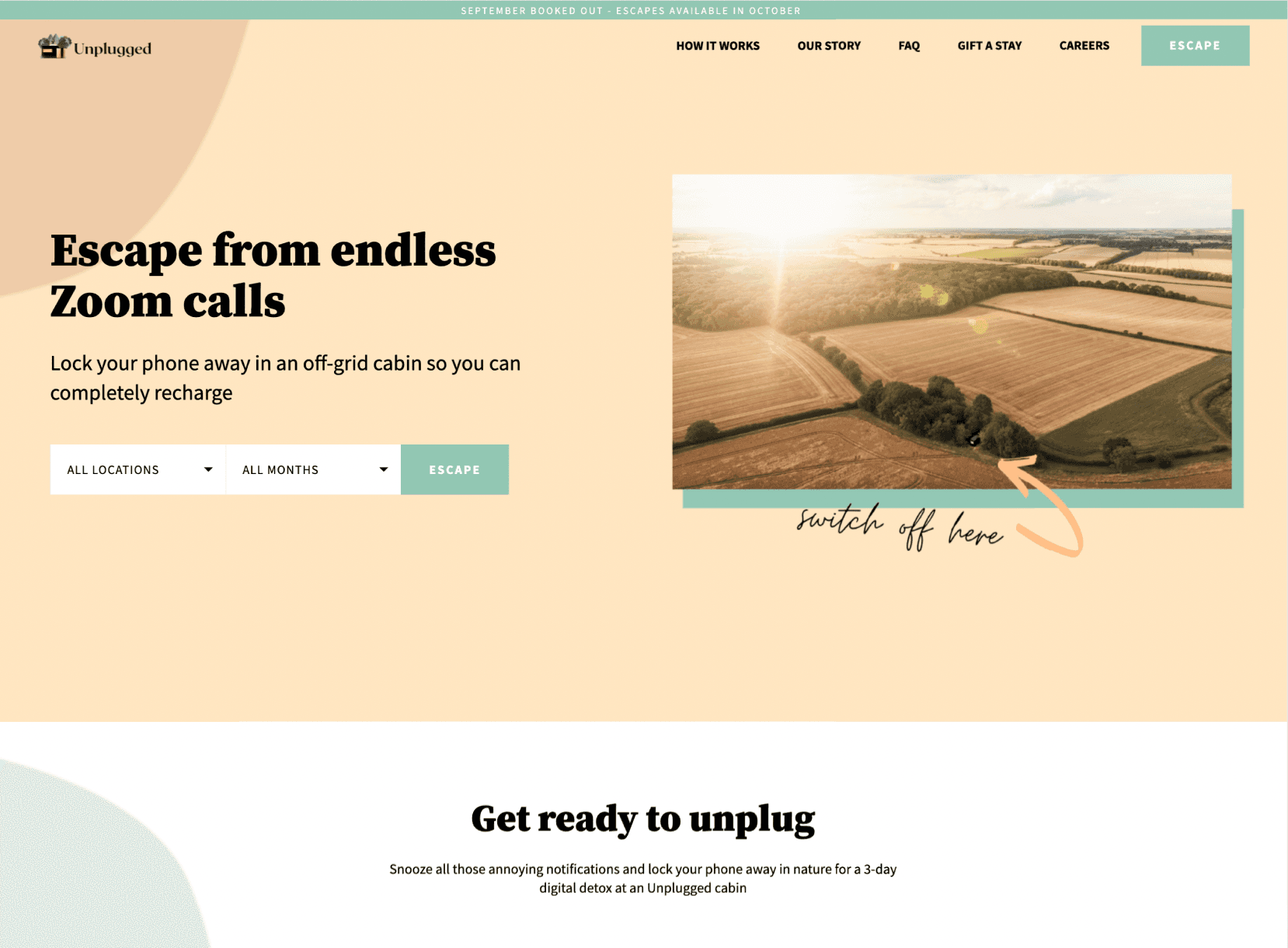
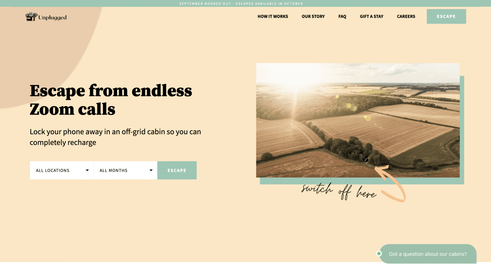
Users faced constraints with vague searching filters that limited personalized results, search results populated with every available date for every possible cabin, and a lack of location information. On top of that, cluttered UIs, overly ornate fonts, and vectors in the background made the whole experience more overwhelming than informative.
To address this, I:
- 1.Overhauled the landing page to be more engaging and intuitive
- 2.Restructured the search results, organized by cabin type
- 3.Added a new cabin catalog, for exploration outside of search
Key Highlights
Better search criteria
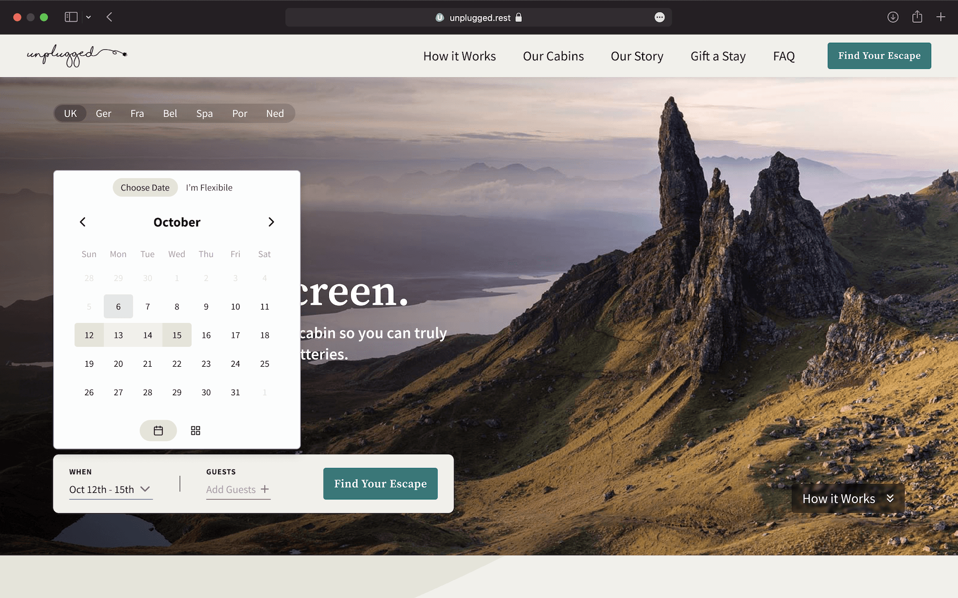
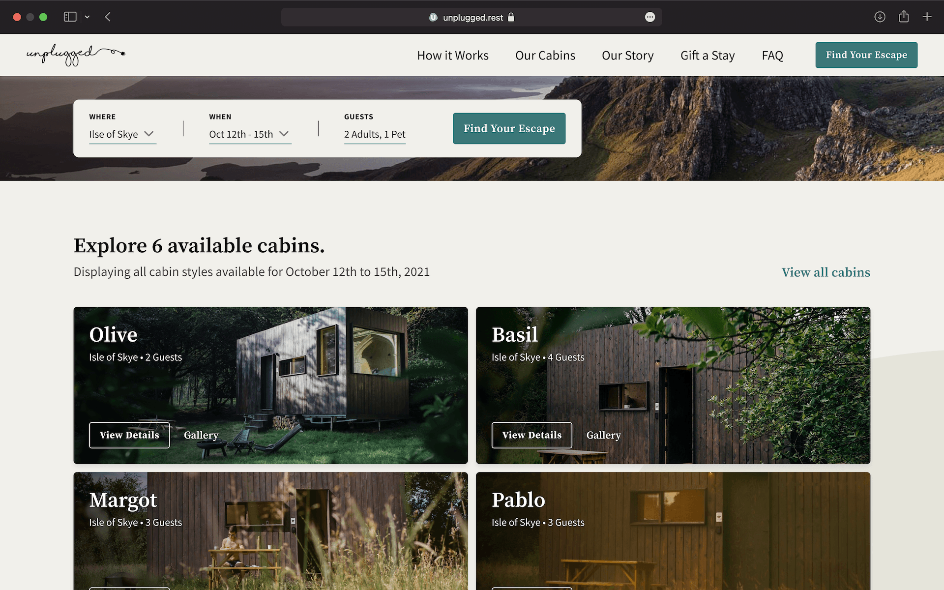
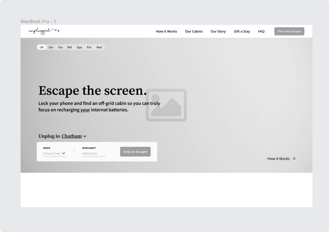
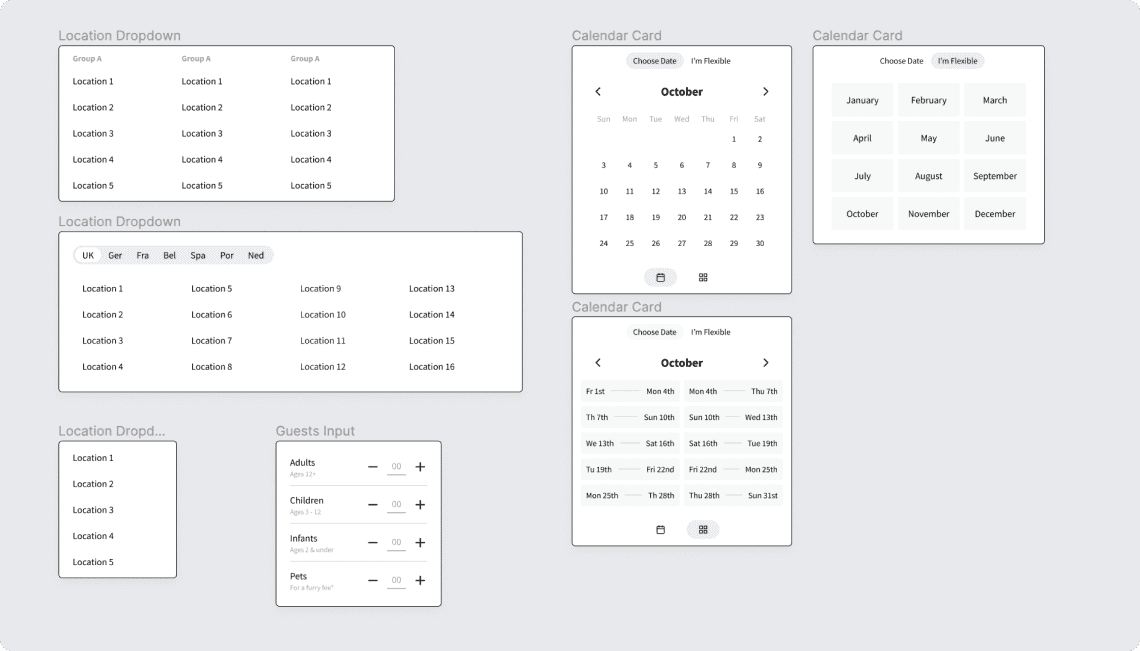
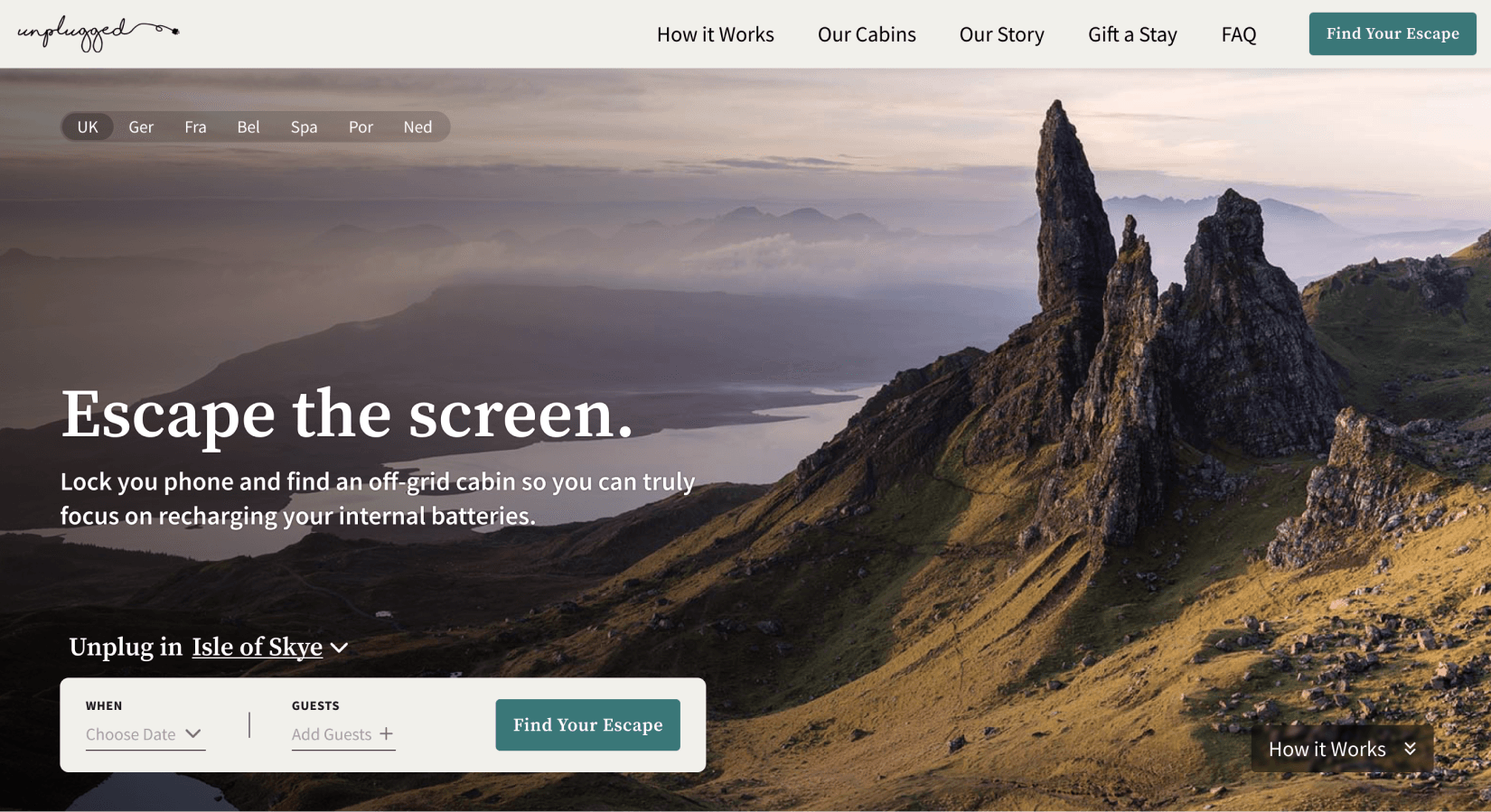
Previously, users could only search by location and months. The updated criteria — location, specific dates, and guests — gave better control and yielded better results.
Greater visual engagement
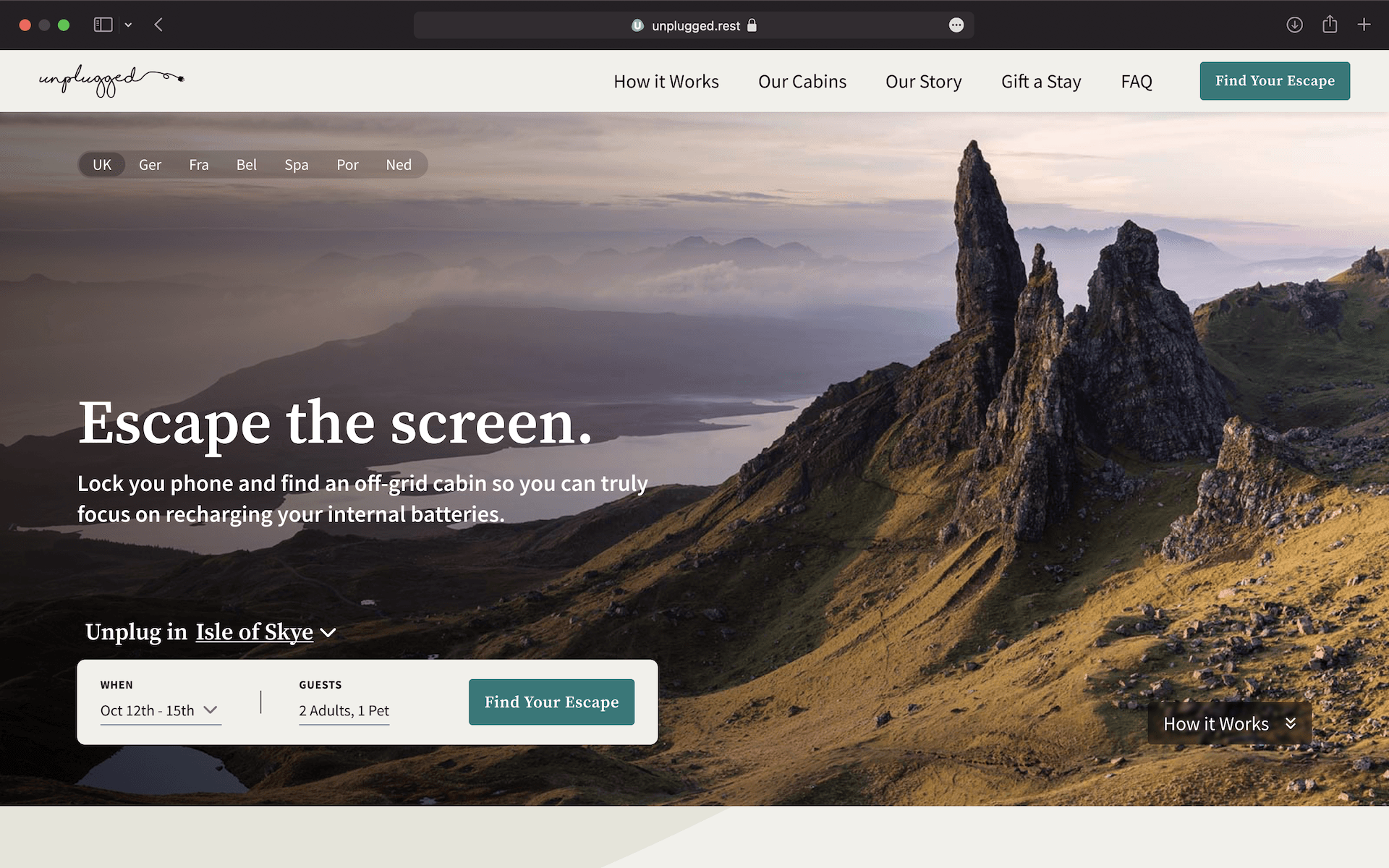
The background image now reflects the currently selected location, with full visual backsplashes that update as the selection changes. This builds excitement and draws the user in.
Understandable search results
Results are now returned by cabin type, letting users see what's available in their given dates.

Explore all cabins
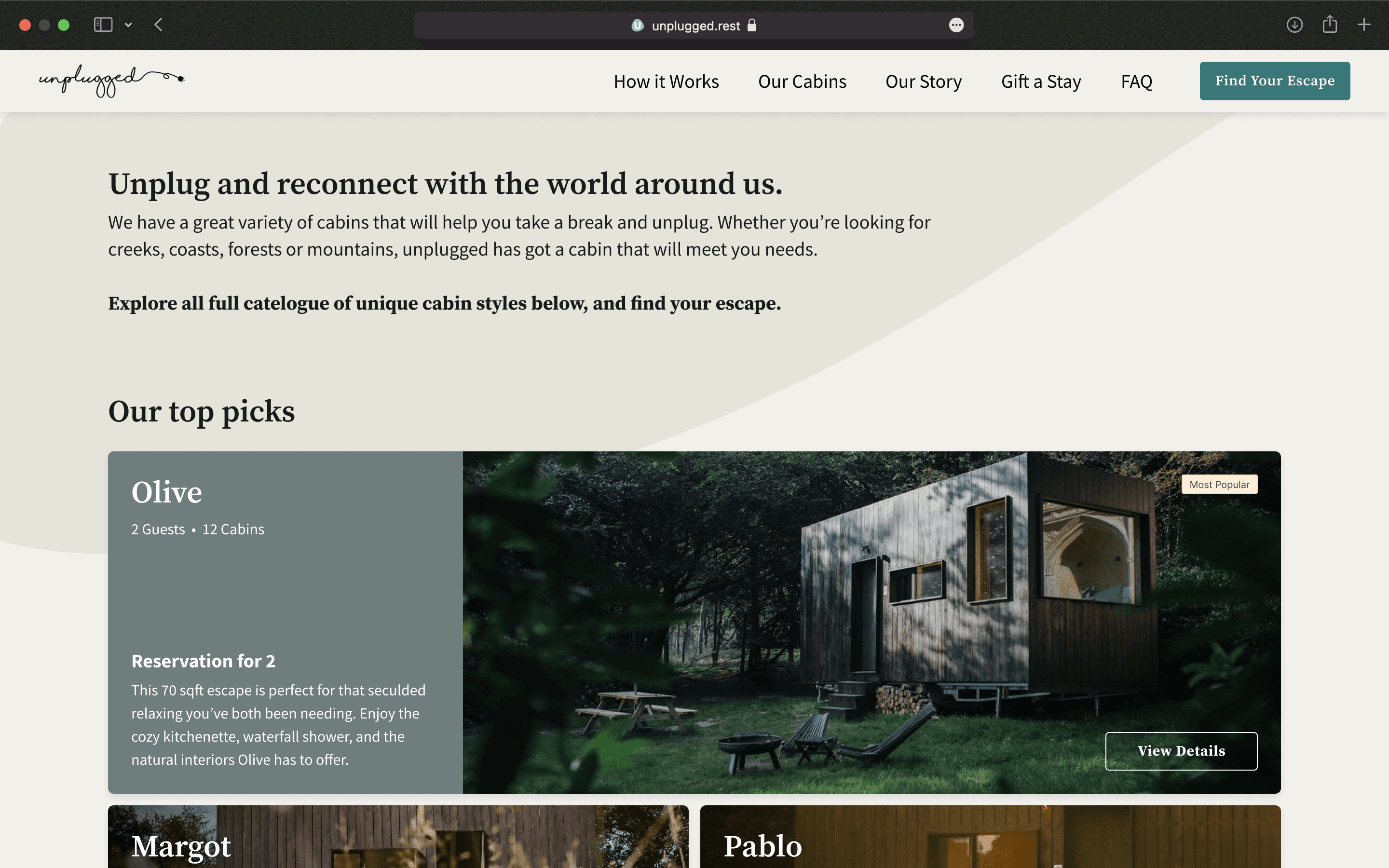
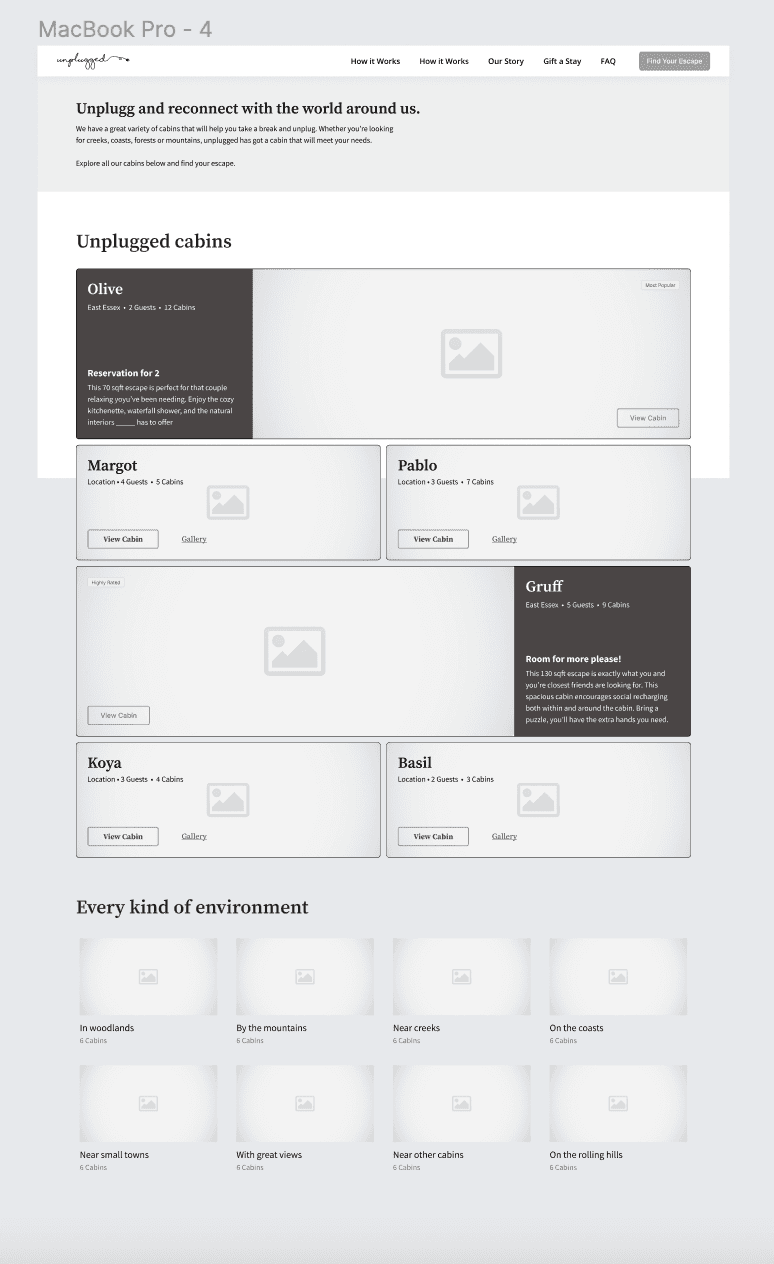
Previously, customers could only learn about cabin types if they came up in search results. Now, a newly added cabin catalogue lets customers explore all of the beautiful cabins and their unique amenities without having to create a search.
The Process
At the outset of this project, I began with some basic information provided by the founders of Unplugged. They knew there was interest in their service, but the actual booking numbers were much lower than anticipated.
The Challenge
The goal of this project was to improve users' experiences: first, with regards to the discovery of cabin options and, second, to build an improved understanding of cabin availability.
Identifying Problems
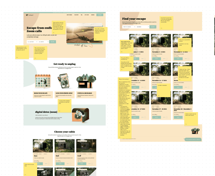
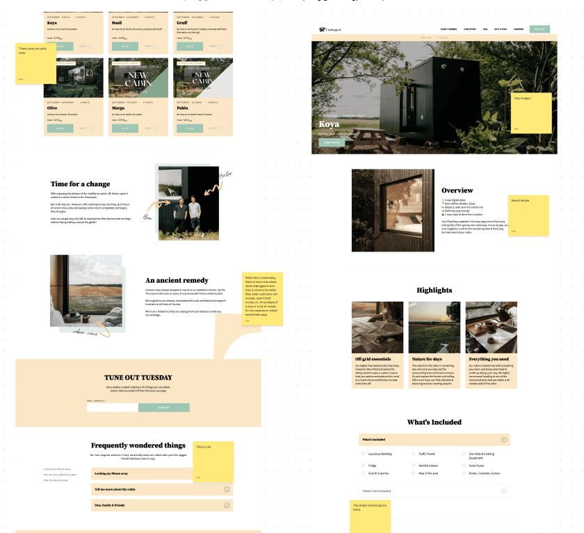
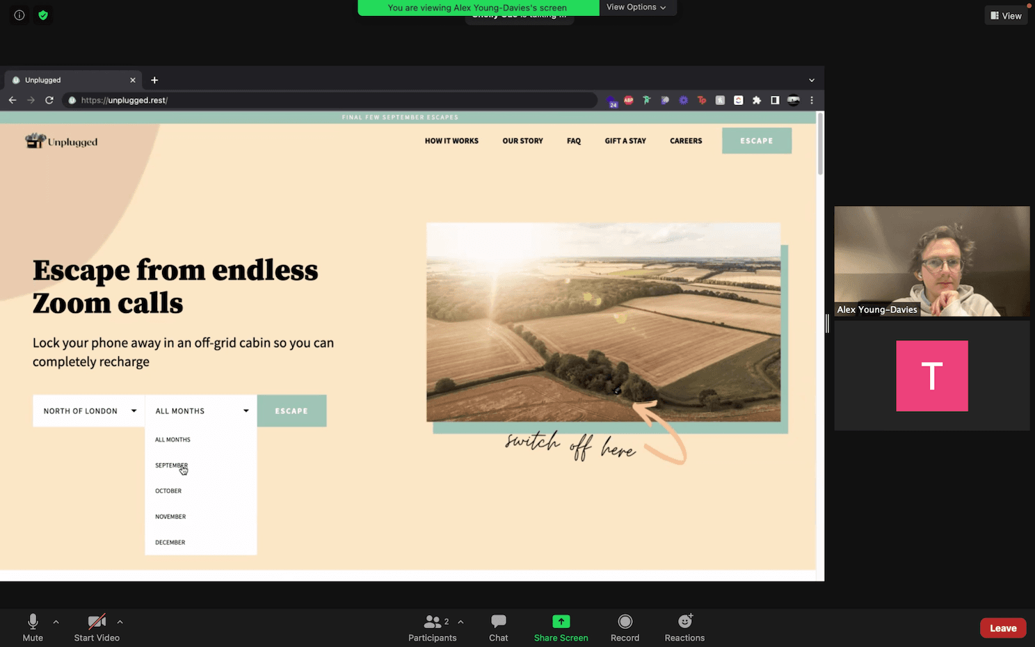
To find out where users were struggling, I started with a thorough site analysis and silent user observation, with users narrating as they went.
Key takeaways
- –Location filter disappointment — users from outside the UK discover the limited service and leave.
- –Search parameter confusion — vague filters cause uncertainty about whether they'll find a suitable cabin.
- –Search results overwhelm — too many options cause confusion and departure.
- –Date misunderstanding — results organized by availability date lead users to think each result is an individual cabin.
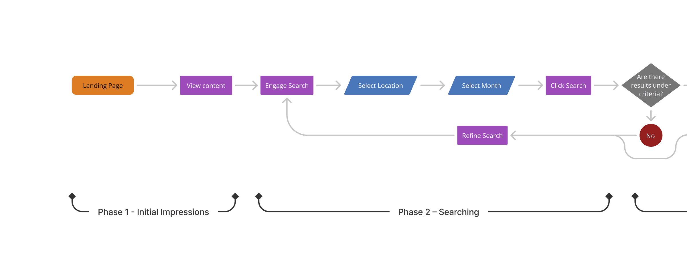
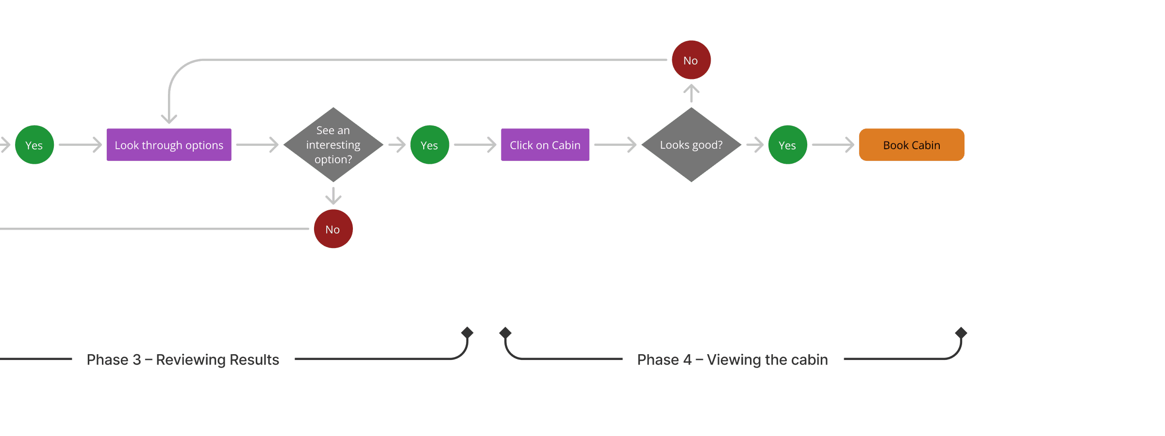
User Flow & Journey Mapping
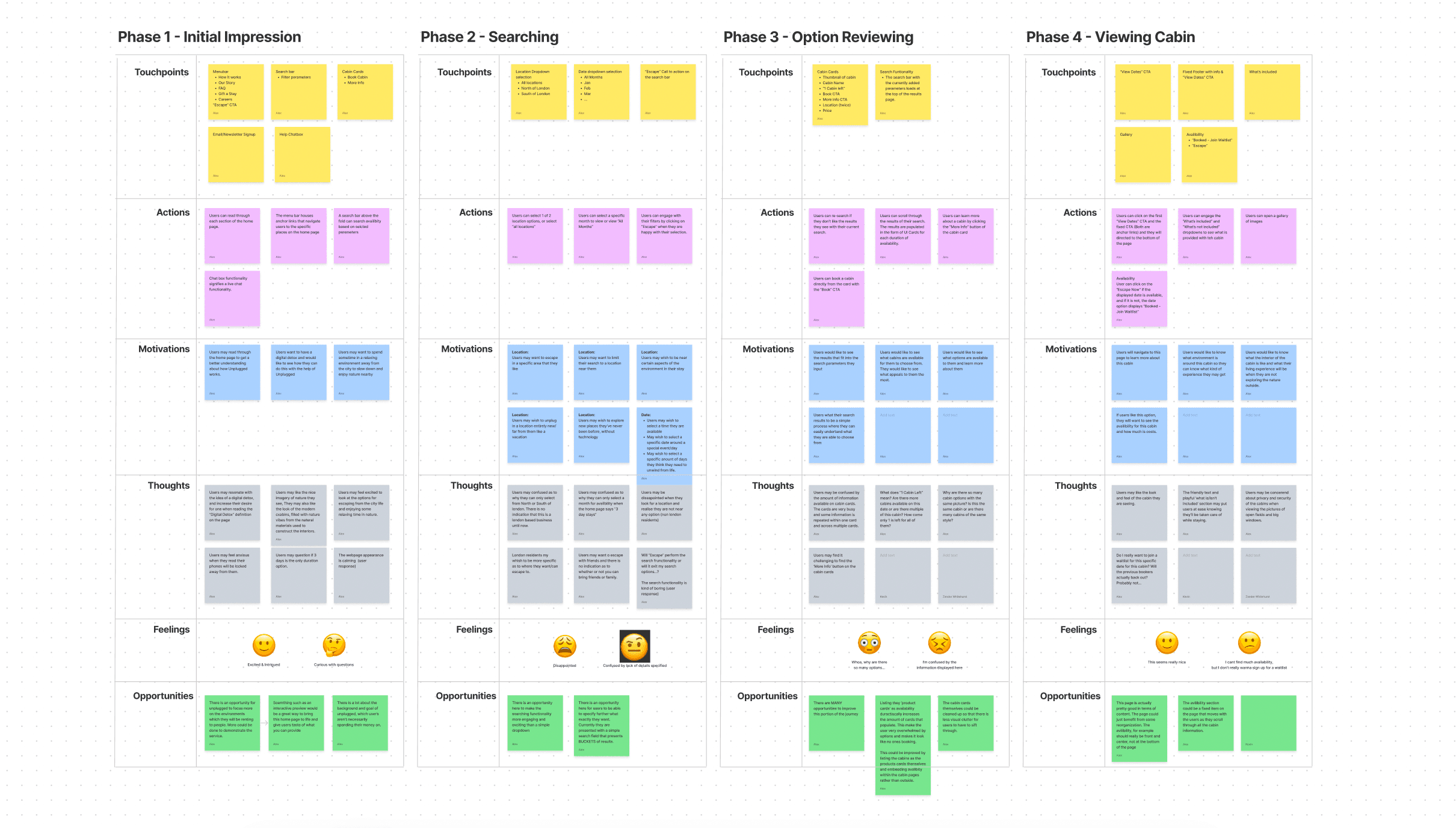
I identified four phases of the experience: landing on the homepage, engaging with the search functionality, viewing search results, and viewing the cabin info page.
The journey map analyzed six categories for each phase: touchpoints, actions, motivations, thoughts, feelings, and opportunities.
Design Direction
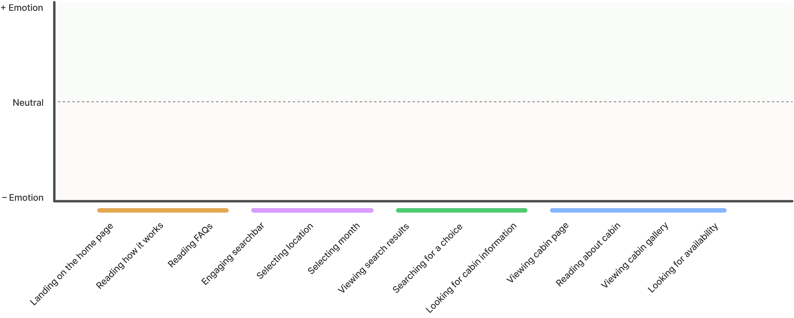
Graphing the emotional journey identified phases 2 and 3 — searching, and reviewing results — as having the poorest user experience.
Improve users' control over their search experience with greater specificity and more tailored results?




Ideation
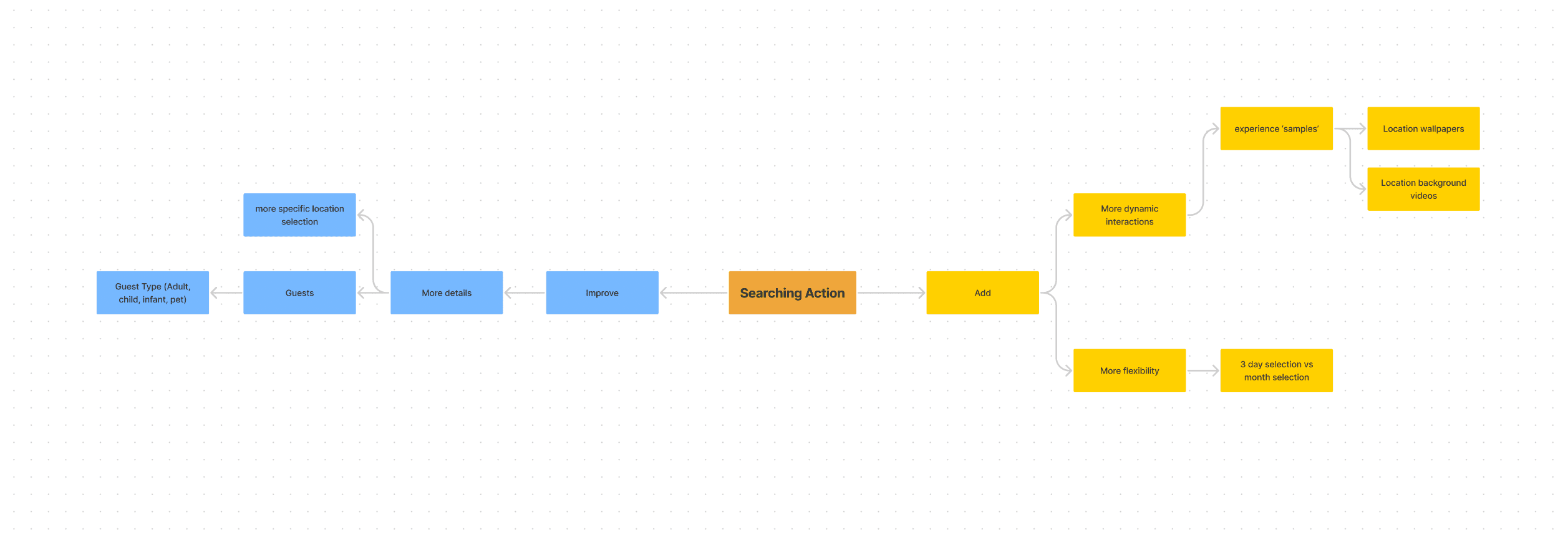
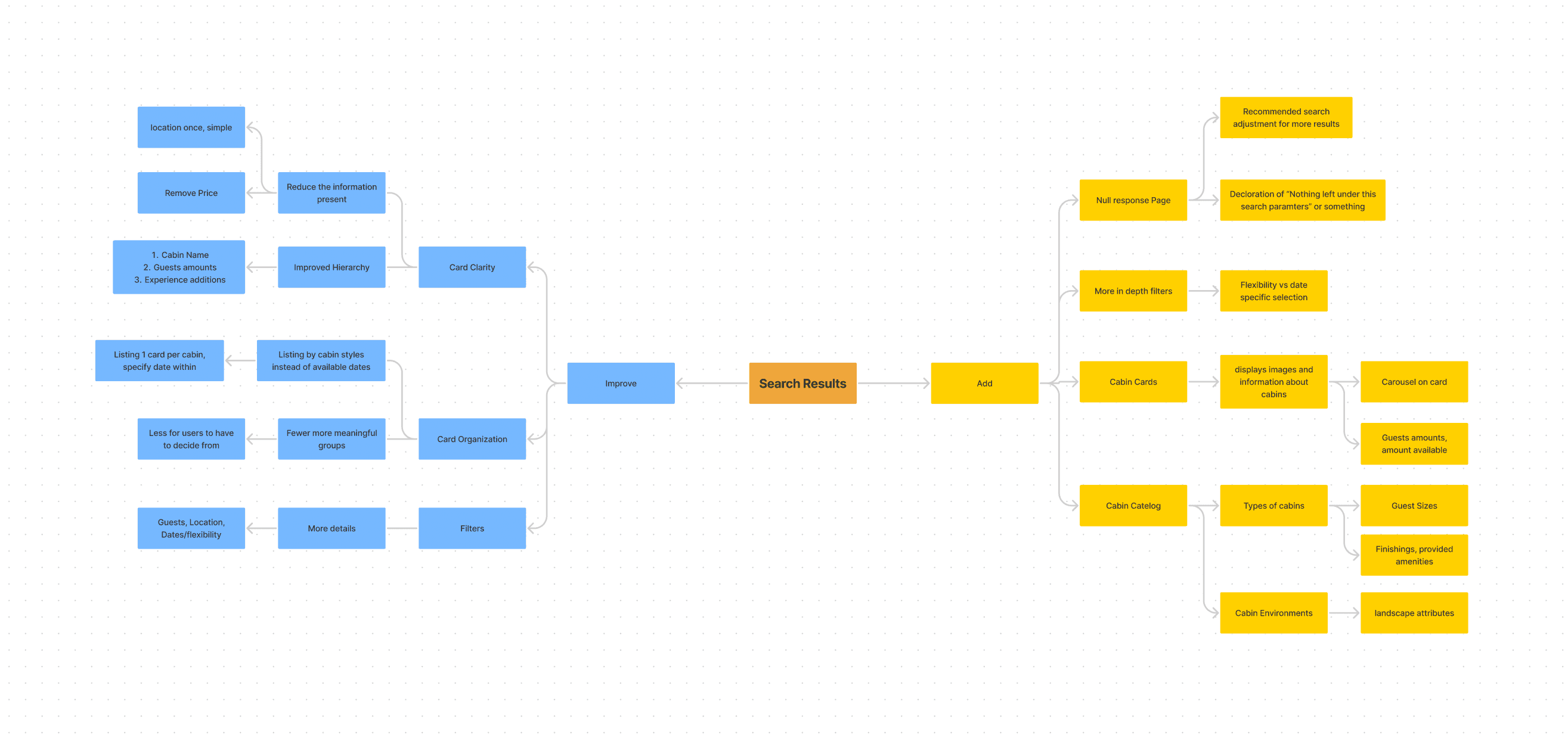
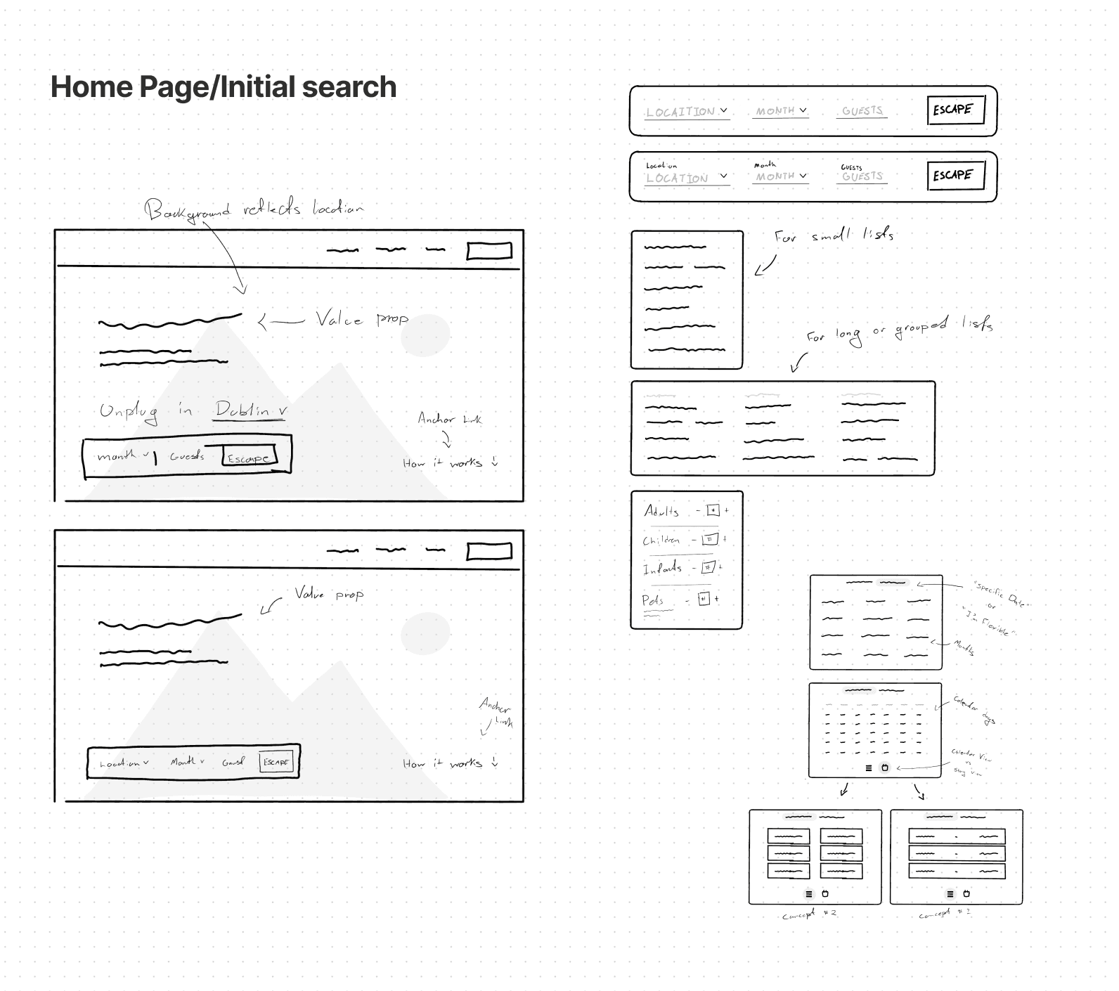
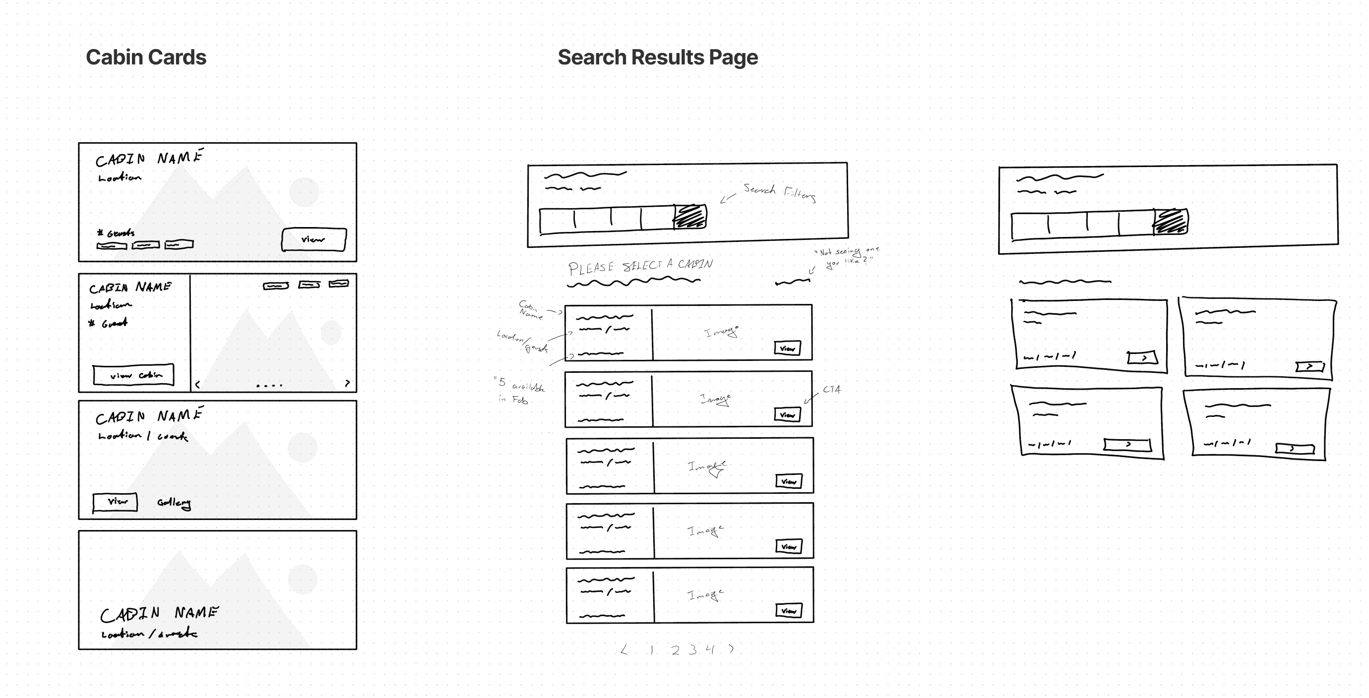
I used ‘Improve vs Add’ mind maps for the search functionality and the results, then converted rough wireframe sketches into low-fidelity Figma wireframes.
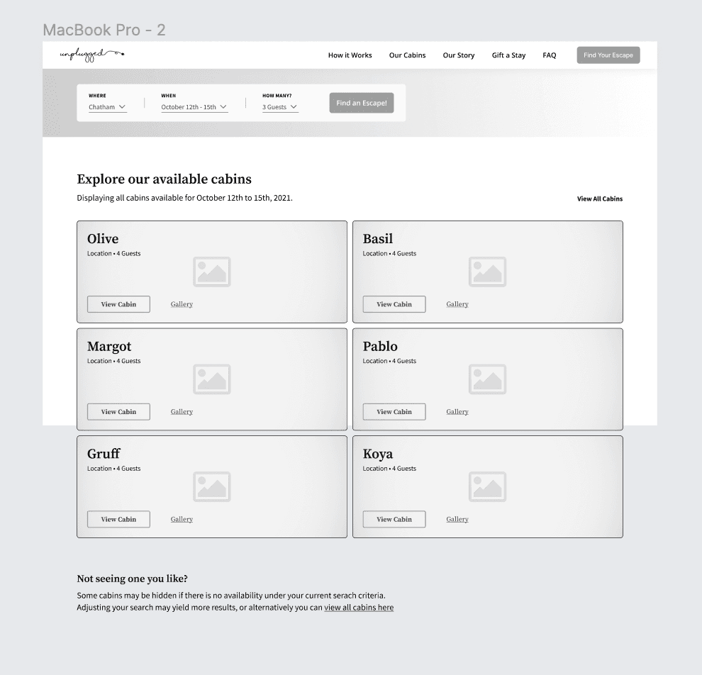
Mid-Fidelity Wireframes
Four wireframe screens were created: the landing page search prompt, the cabin catalogue, the search functionality UI patterns and components, and the search results.
Styling for Accessibility
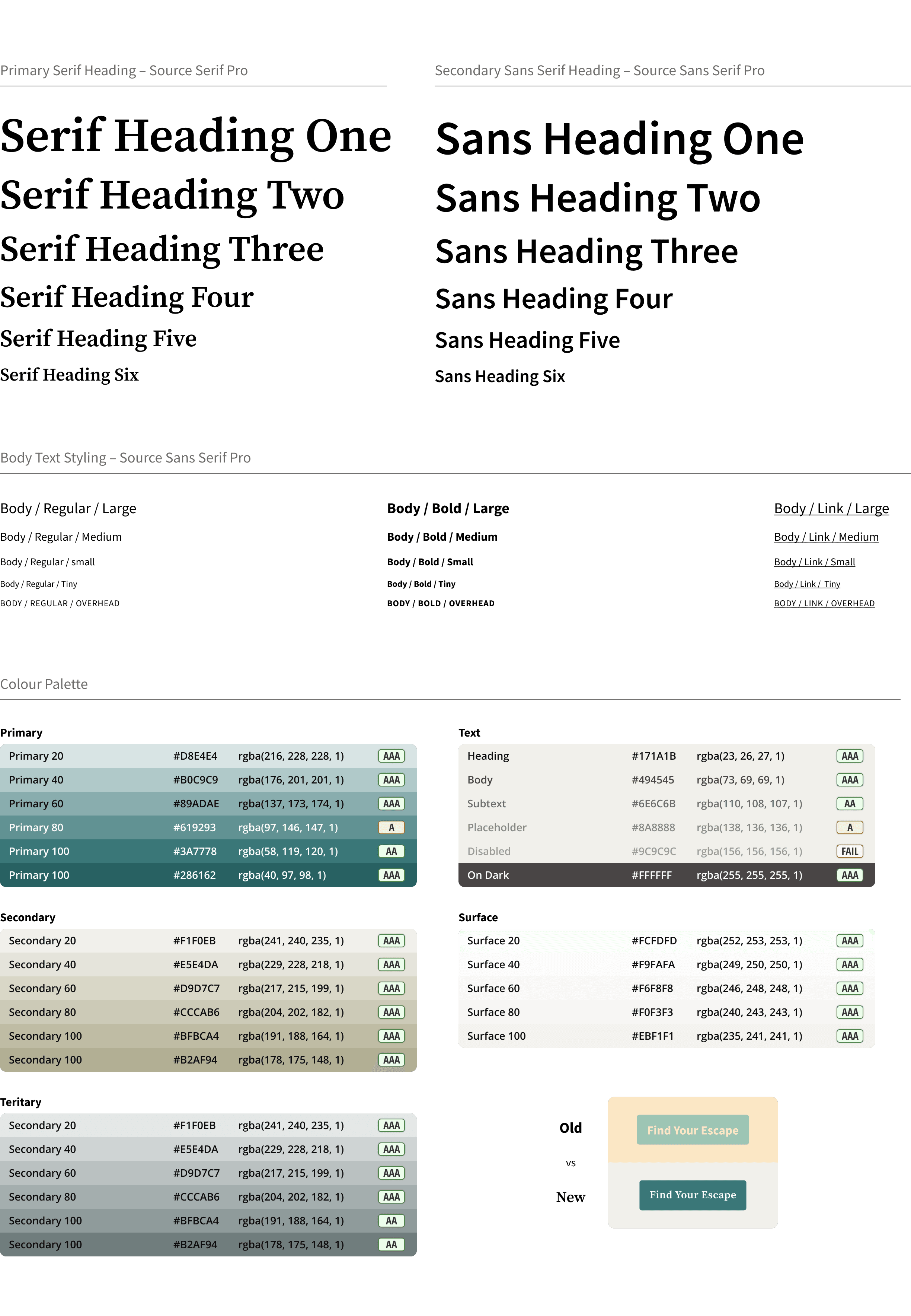
Feedback from users indicated that the original green and beige colour palette was calming and attractive, but these shades largely fell short of accessibility standards.
The updated palette maintains the theme while adjusting hue and tone values to meet accessibility requirements.
The final design
Other work.
Redesigning Athelas Air's EMR calendar block to be clearer, denser, and easier to scan at a glance.
A collection of 7,000+ digital product icons, designed for personal and commercial use.
Replace this with a real project — cover image, title, and summary.