WyDee Icons
A collection of 7,000+ digital product icons, designed for both personal and commercial use — currently employed in various real-world products.

The sparkDecember 2022
Back in 2022, I was working as a founding product designer at a biotech startup called Enable Medicine. It was still early days, and I wanted to help shape not just the product experience but the company’s visual language as a whole.
I’d always been fascinated by iconography, and I thought this would be a unique way I could inject a bit of personality into the product. The balance between form, function, and emotion in tiny symbols can appear so simple, yet make such a difference. So I thought, why not start by designing a few custom icons for our product and brand materials? That decision sent me down a path that, over a few years, would grow into a journey of joy, frustration, creative passion, and discovery; each moment of which I thoroughly enjoyed.
This is the story behind how I developed the WyDee icons collection.
The needJanuary 2023
How do you illustrate cutting edge biological research?
Enable Medicine develops software and tooling, specifically for analyzing spatial biology data. This is a field of studying cells in the context of their physical location within the tissues. At the time, this was a new frontier where scientists were pushing the boundaries of precision medicine.
Why does this matter?
While the scientific details don’t matter here, the takeaway is Enable Medicine was building technology at the forefront of human disease research. For me, the question became “How do you capture ‘technical advancement’ visually?
So, what does ‘advancement’ look like?
As the founding designer, one of my roles is to take whatever my company’s mission is and translate that into a visual language that evokes our core values.
For Enable Medicine, this could be captured in:
- Innovative
- Sleek
- Intuitive
- Nimble
- Cutting Edge
- Insightful
- Technologically Advanced
- Sophisticated
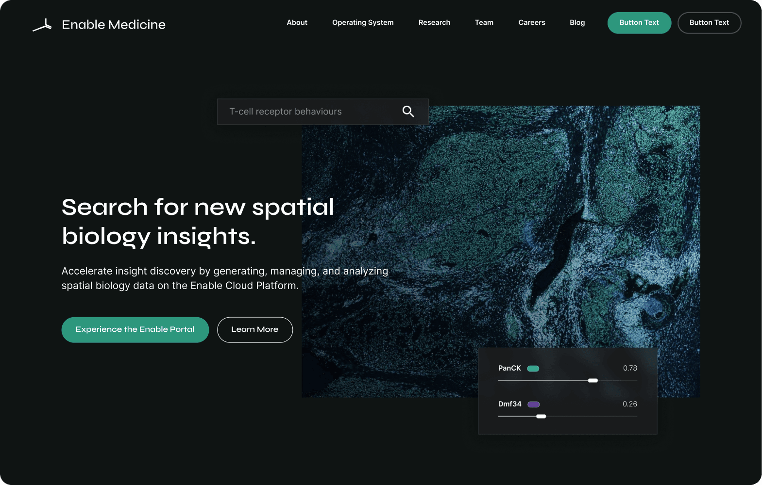
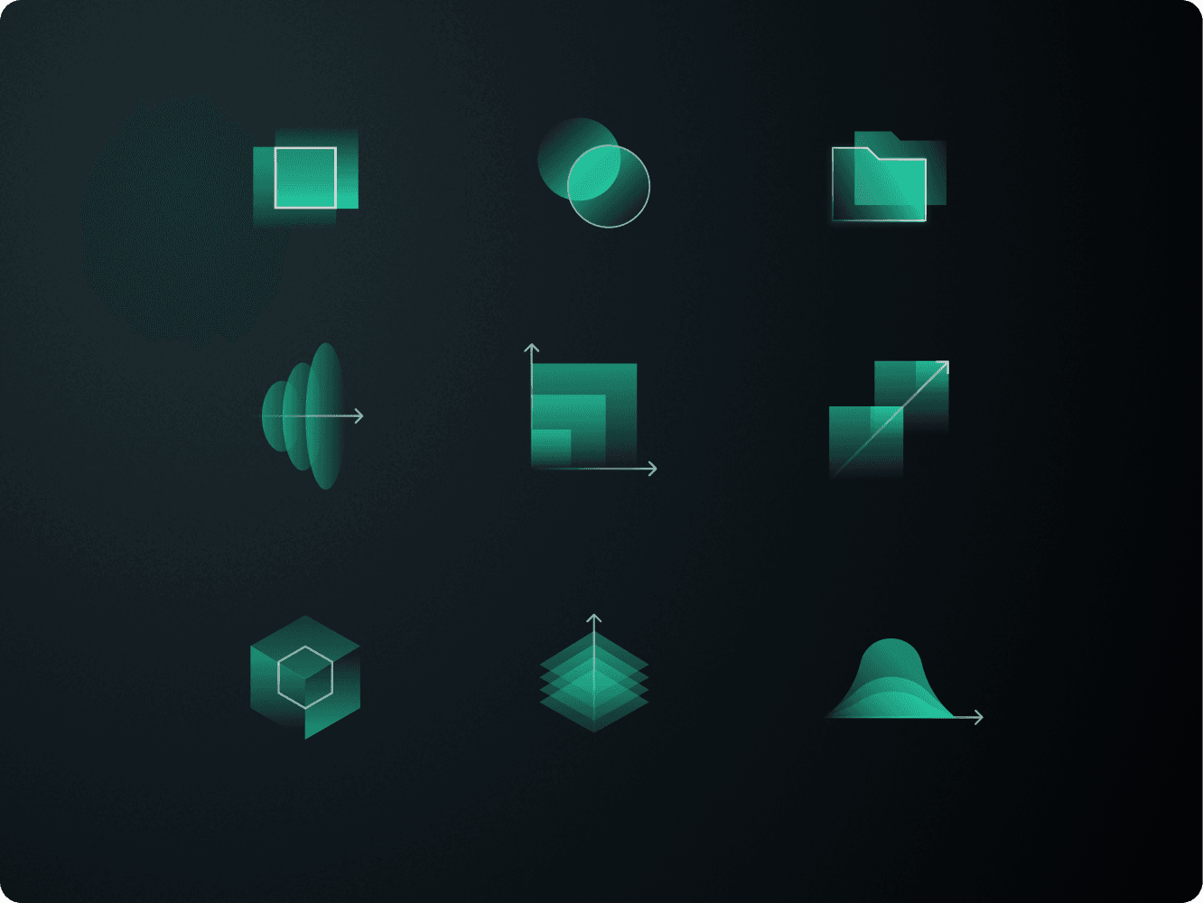
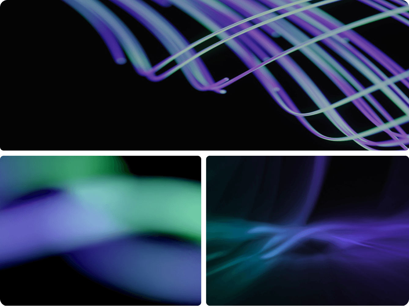
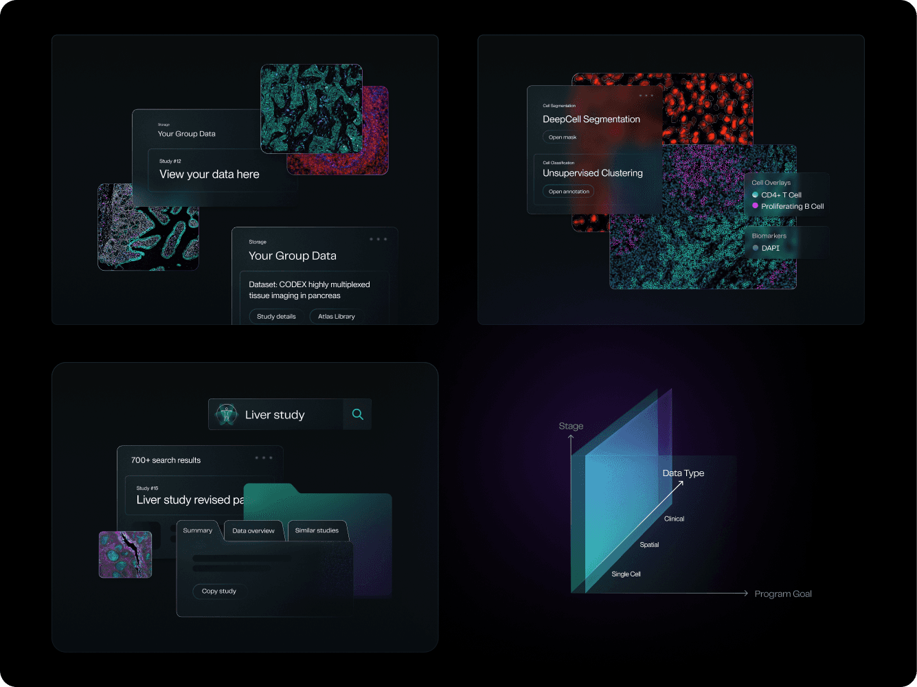
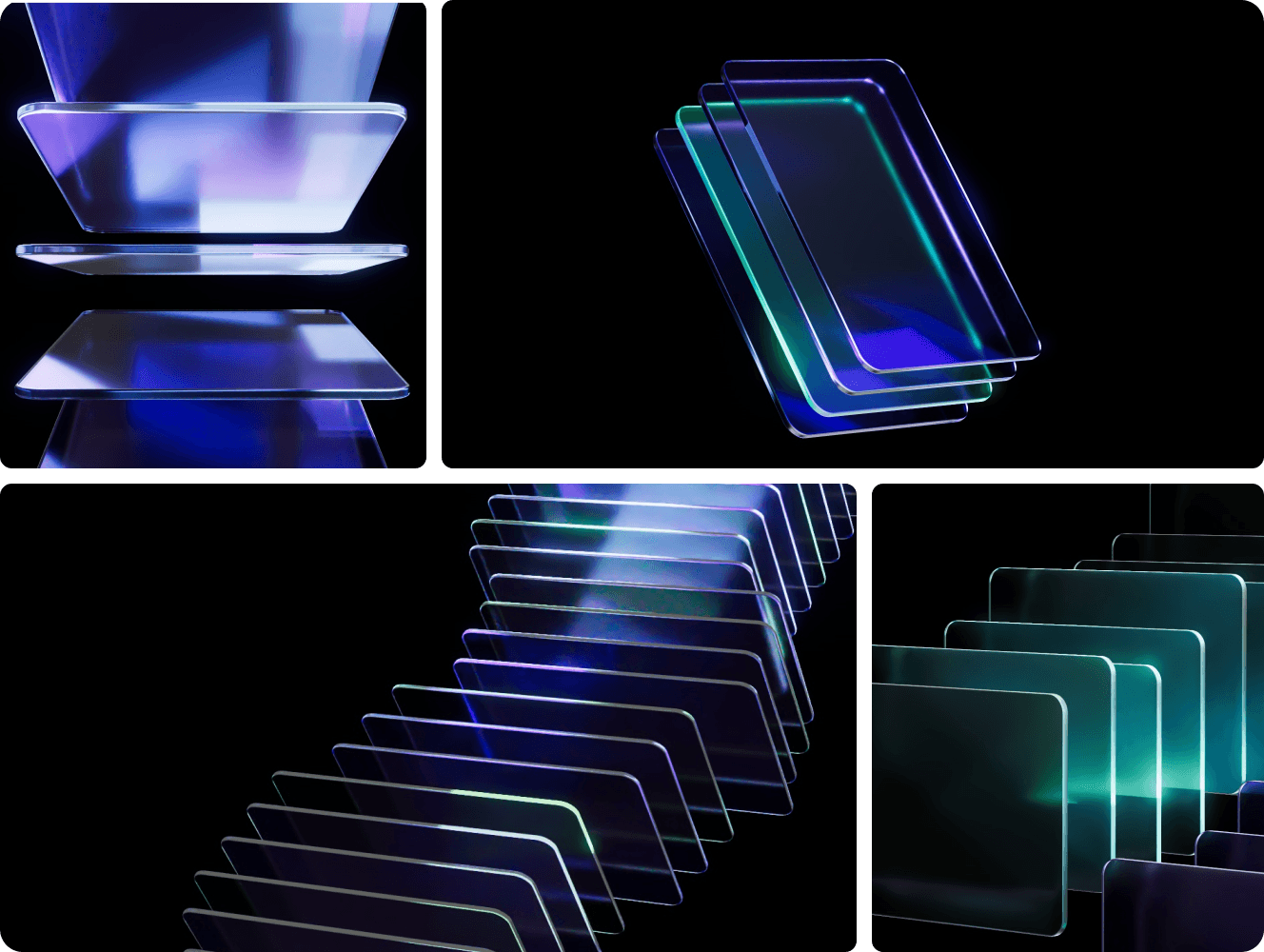
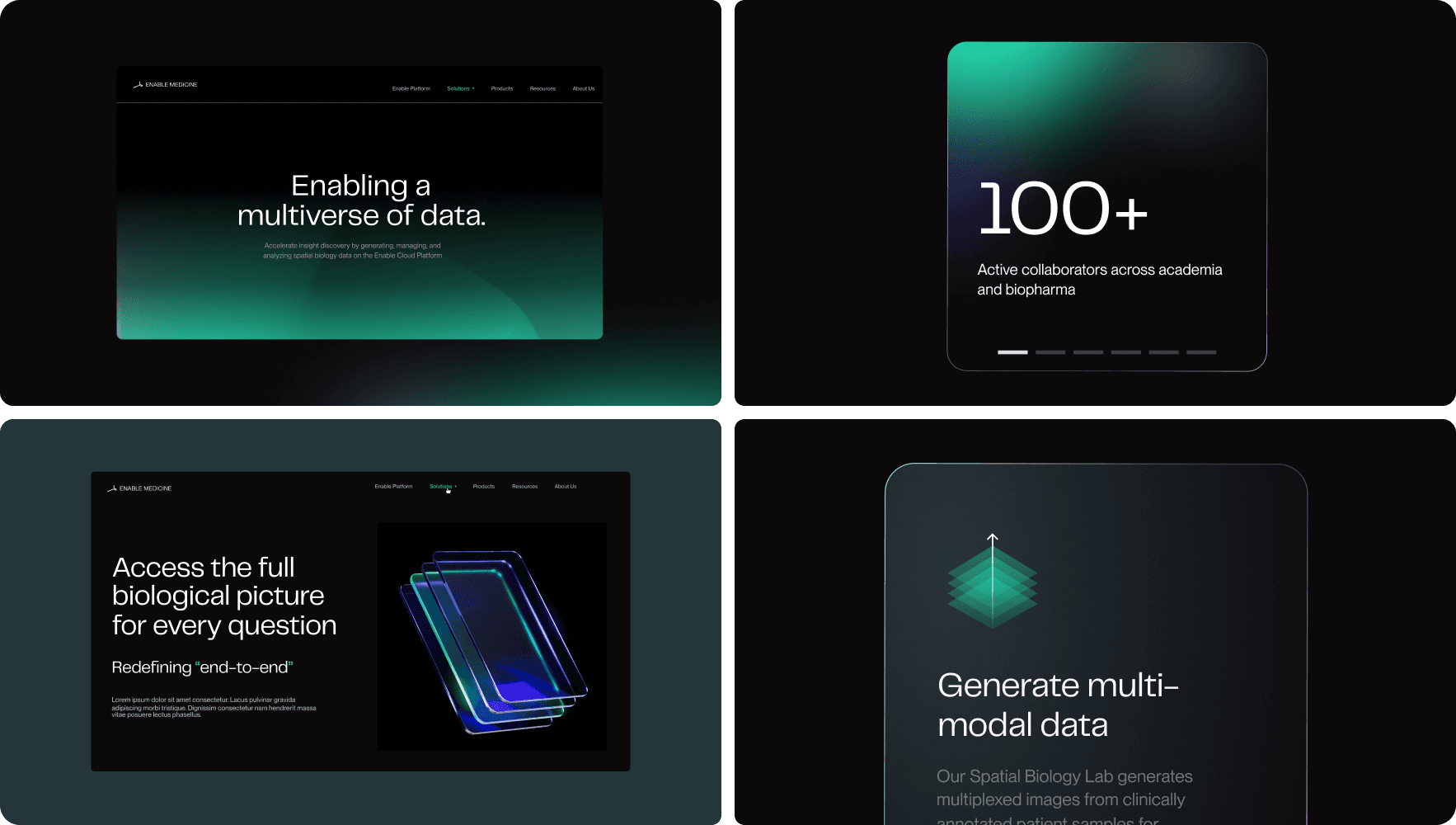
Shots of the company branding I am aiming to compliment.
Some imagery here was created in collaboration with the branding consultancy Benson Studio.
The feelFebruary 2023
Design decisions that build a visual foundation.
In order to establish a consistent theme and recurring motifs, I needed to decide what the look and feel of these icons should be. In the world of iconography, there are a multitude of ways you can differentiate your shapes from others, so I focused on making a few key decisions that would guide the library.
To build consistency across this collection, I needed to establish the visual DNA of the icons. In other words, the rules that would guide visual motifs, and make the system feel unified and intentional. In iconography, seemingly small design choices can profoundly shift visual tone, so I focused on four key variables:
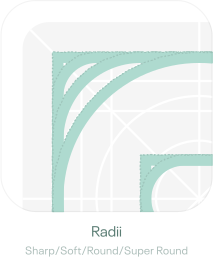
- Radii rules
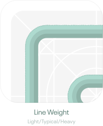
- Visual weight
- Fill style
- Overall approach to shape/personality
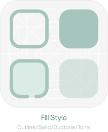
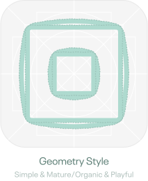
Matching key brand emotions to visual forms.
To connect visual choices to brand emotion, I used the brand terms above as direct design cues:
Radii
From “cutting edge” and “ Sleek”, I opted for...
Sharp 0px radii
Weight
From “Nimble,” “Sleek,” and “Advanced,” I opted for...
Lighter 1.5pt line weight
Fill
From “Intuitive” and “Nimble”, I opted for...
Cleaner outline style
Geometry
From “Sophistication” and “Innovative”, I opted for...
Simpler, mature geometry
The libraryNovember 2023
More options and more flexibility.
With the first collection of icons created, I got to work ensuring every in-app icon need was met and updated. After this, I started expanding the library proactively. I wanted to anticipate future needs instead of reacting to them. Up until this point, I’d been adding icons ad hoc, but this took time and lacked any sort of strategy to build comprehensive and scalable collection.
To begin scaling the system, I studied existing libraries like Material Icons, Coolicons, Iconic, and Untitled to benchmark pictogram coverage and expand the WyDee set accordingly.
Adding solid variants for each icon.
To increase versatility, I also introduced solid counterparts for each outline icon. This was a small change that greatly expanded usability across themes and backgrounds.
These expansions and new solid style grew the library from ~300 icons to 1200+.
Beyond one brandDecember 2024
Taking this library beyond Enable Medicine.
At some point in this journey I realized this library could – and probably should – extend beyond the Enable Medicine product and brand. I decided then that the thin and sharp appearance I’d designed for Enable Medicine should be just one configuration of the library, rather than its defining properties.
Adding a new ‘feel’ to the library with softer shapes.
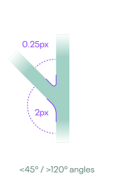
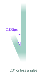
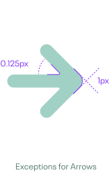
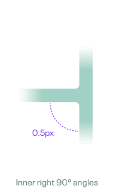
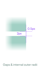
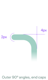
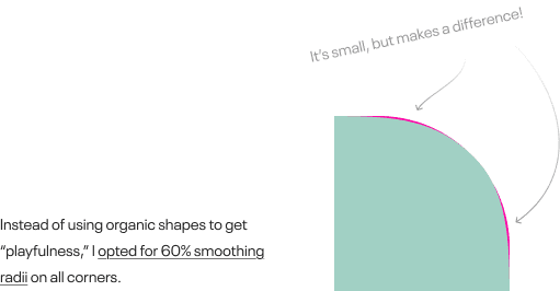
To expand the emotional range, I developed a new “soft” variant by introducing measured corner radii across each icon and its element. To do this, I established consistent radii rules to maintain structural harmony and applied them systematically.
This expanded the library to ~2,500+ icons.
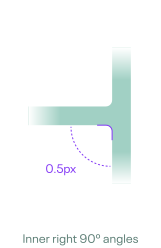
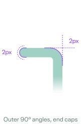
Adding playfulnessJanuary 2025
“Rounding” out the shape spectrum.
To complete the spectrum of supported shape styles, I added an even more rounded variant. Since the original, sharp icons had aimed for sleek, sharp, and sophisticated, I now wanted to lean into warmth and friendliness for the super rounded variants. This would bring a sense of playfulness and approachability into the library.
Like before, I established a set of radii rules and applied them to each filled and outlined icon.
This expanded the library to ~3700+ icons.
Color & communicationMay 2025
Adding a color-friendly tonal variant.
At this point, this library was pretty extensive and I wanted to do something more interesting, so I decided to tackle a new dimension: color.
Using saturation to guide communication.
I didn’t want color to just decorate the icons. Instead, I wanted to use it as a means of communication. By softening some areas and keeping others fully saturated, I could establish hierarchy within each icon, helping users instantly recognize what’s most important.
To achieve this, I reduced supporting or non-key visual elements to 30% opacity. Using transparency also ensures these icons can adapt to the surface color underneath. Below are a couple examples to illustrate this notion.




This latest expansion brings the library to ~6000+ icons.
What began as a simple desire to match and extend a brand’s personality has evolved into a comprehensive, multi-voice icon system that can flex between sleek, professional interfaces and playful, expressive products.
If you’re interested in using this library for your project or product, please get in touch here.
The full libraryToday
- Styles
- 9
- Categories
- 30
- Pictograms
- 1,061
- Total icons
- 9,549
AI Related
Arrows
Connectivity
Data
Development
Docs
Keyboard Keys
Layout
Media
Misc
People
Playback
Settings
Weather Nature
Writing
Alerting
Audio
Buildings Vehicles Travel
Communication
Date Time
Devices
Food
General Actions
Letters
Math Numerical
Monetary
Objects
Power
Shapes
World Navigation
Other work.
Redesigning Athelas Air's EMR calendar block to be clearer, denser, and easier to scan at a glance.
Redesigning the initial search experience for a getaway cabin on Unplugged.rest to be more engaging, intuitive, and polished.
Replace this with a real project — cover image, title, and summary.