Making mentor booking feel simple on Margot Community
Redesigning the mobile booking experience to improve responsiveness, usability, and bring more emotional comfort to a very personal action.
Project Background
Margot Community is an online, inclusive network helping women and gender-marginalized individuals provide virtual 1 on 1 guidance to their peers.
Their goal is to provide a mentorship platform for individuals who don't always feel represented. Our task was to redesign the mentor booking flow to feel more personal and approachable — booking a mentor is a deeply personal moment.
The Challenge
The existing experience had a few things working against it:
- 1.Text-heavy, visually bland profiles discouraged people from engaging with mentors
- 2.Conflicting form fields about the necessary financial commitment undermined people's confidence
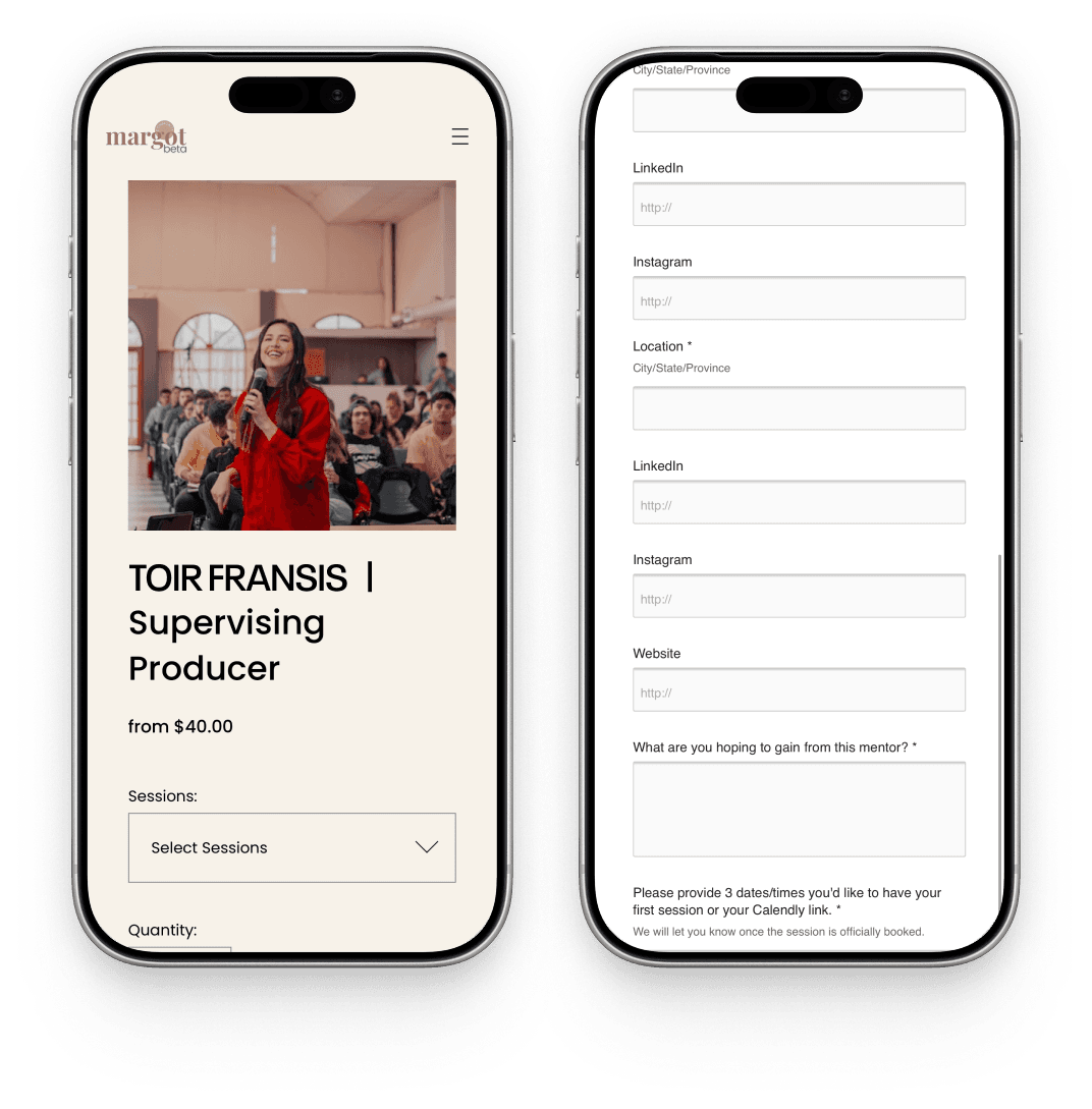
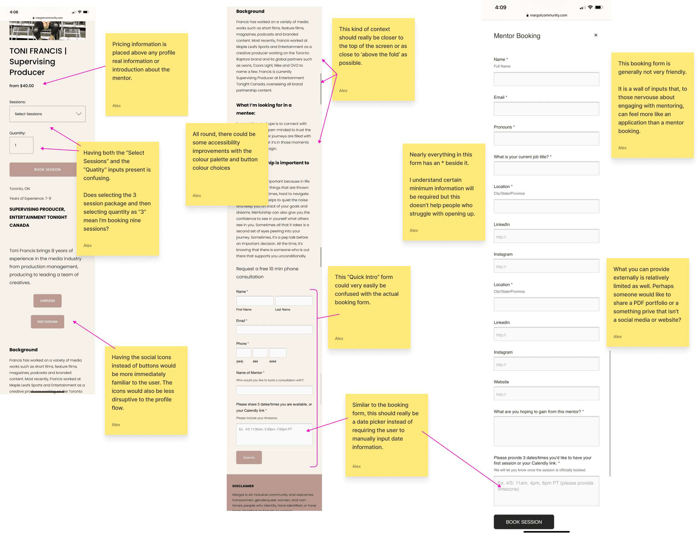
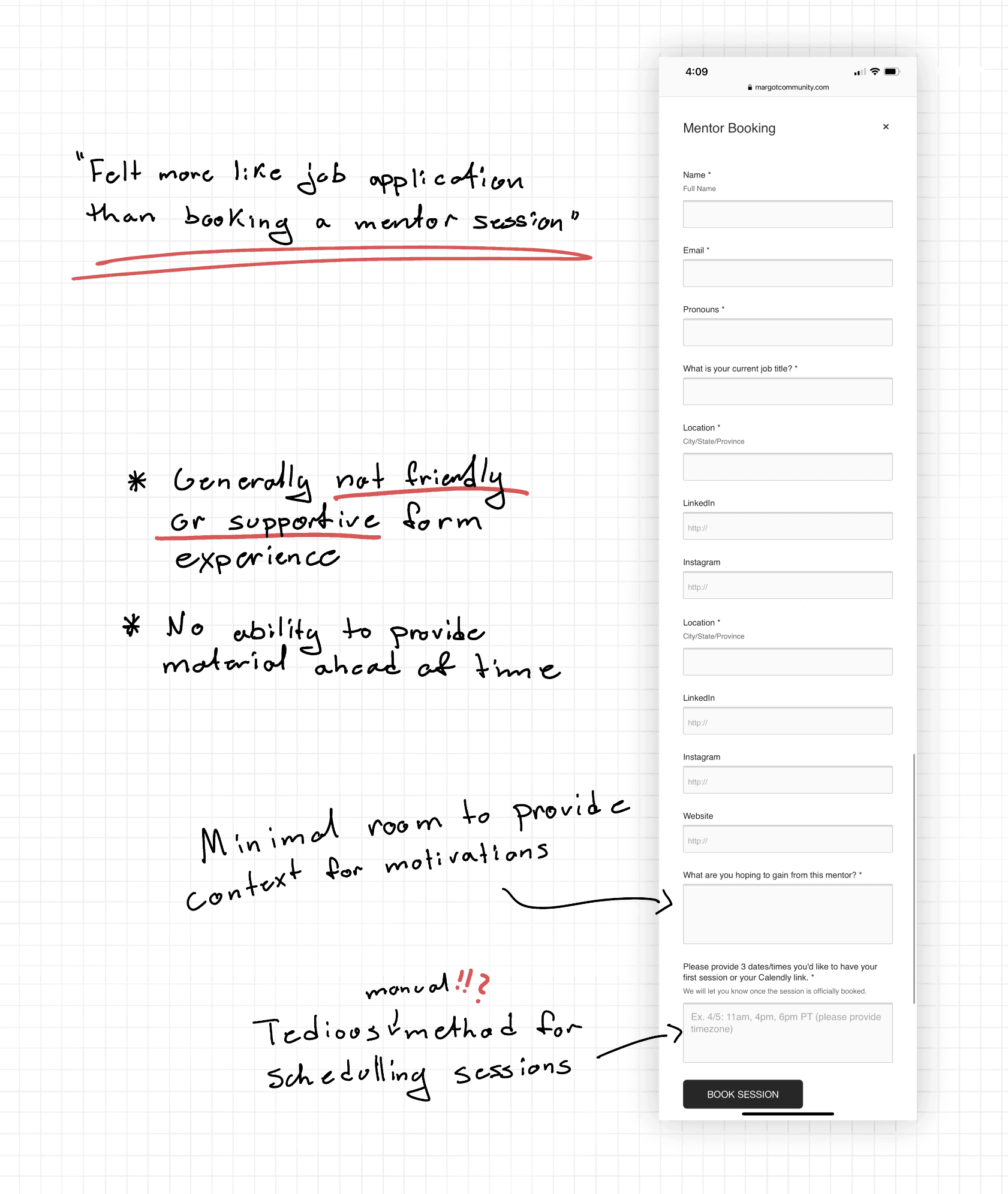
- 3.The booking form resembled more of a job application than a mentor booking form
- 4.The result: abandoned forms and high user drop-off rates
The Solution
Kevin and I re-structured the mentor profile and redesigned the entire form-entry process, opting for simplicity, comfort, and guidance throughout.
Profiles now focus on mentor personality, pricing lives in a clear, always-accessible location, and the booking form is broken into a simple step-by-step guide that is friendly, supportive, and comprehensive for the mentee's needs and goals.
Key Improvements
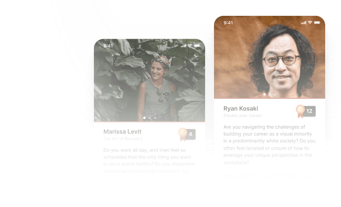
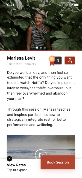
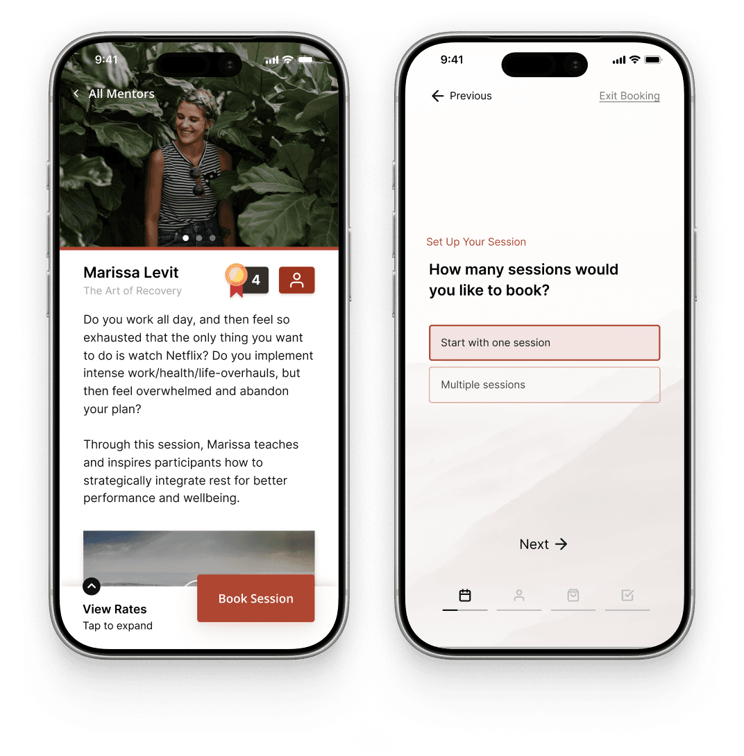
Profiles focused on personality
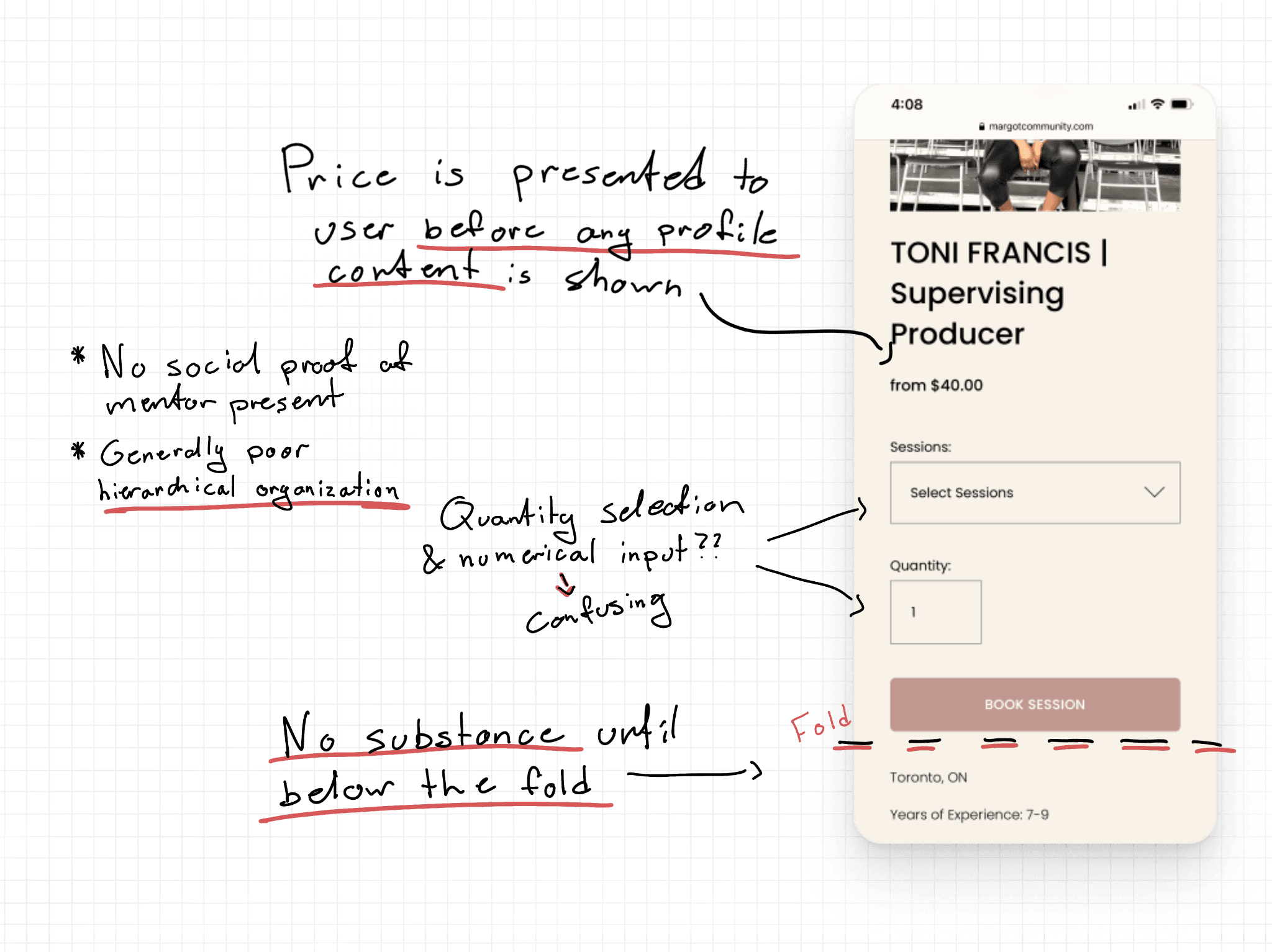
The previous profile was full of drab colors and placed pricing above any mentor information. The new profile focuses entirely on mentor personality — the deciding factor for many users — by better leveraging photos, ratings, and messaging. Pricing is hidden away until mentees wish to dig deeper.

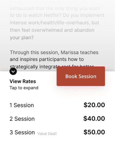
Clear pricing all in one place
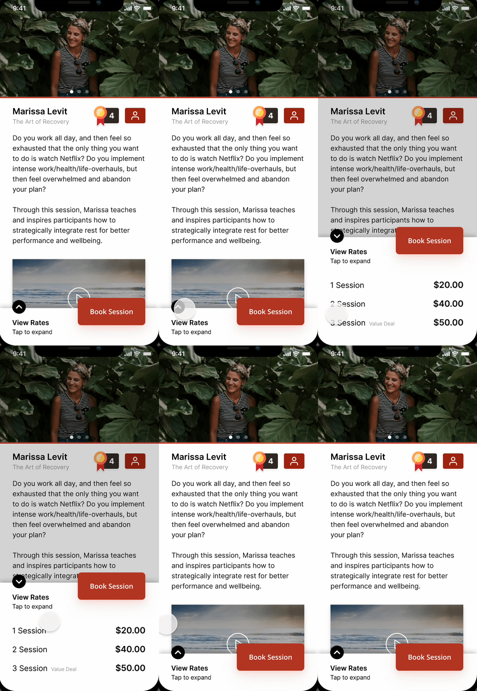
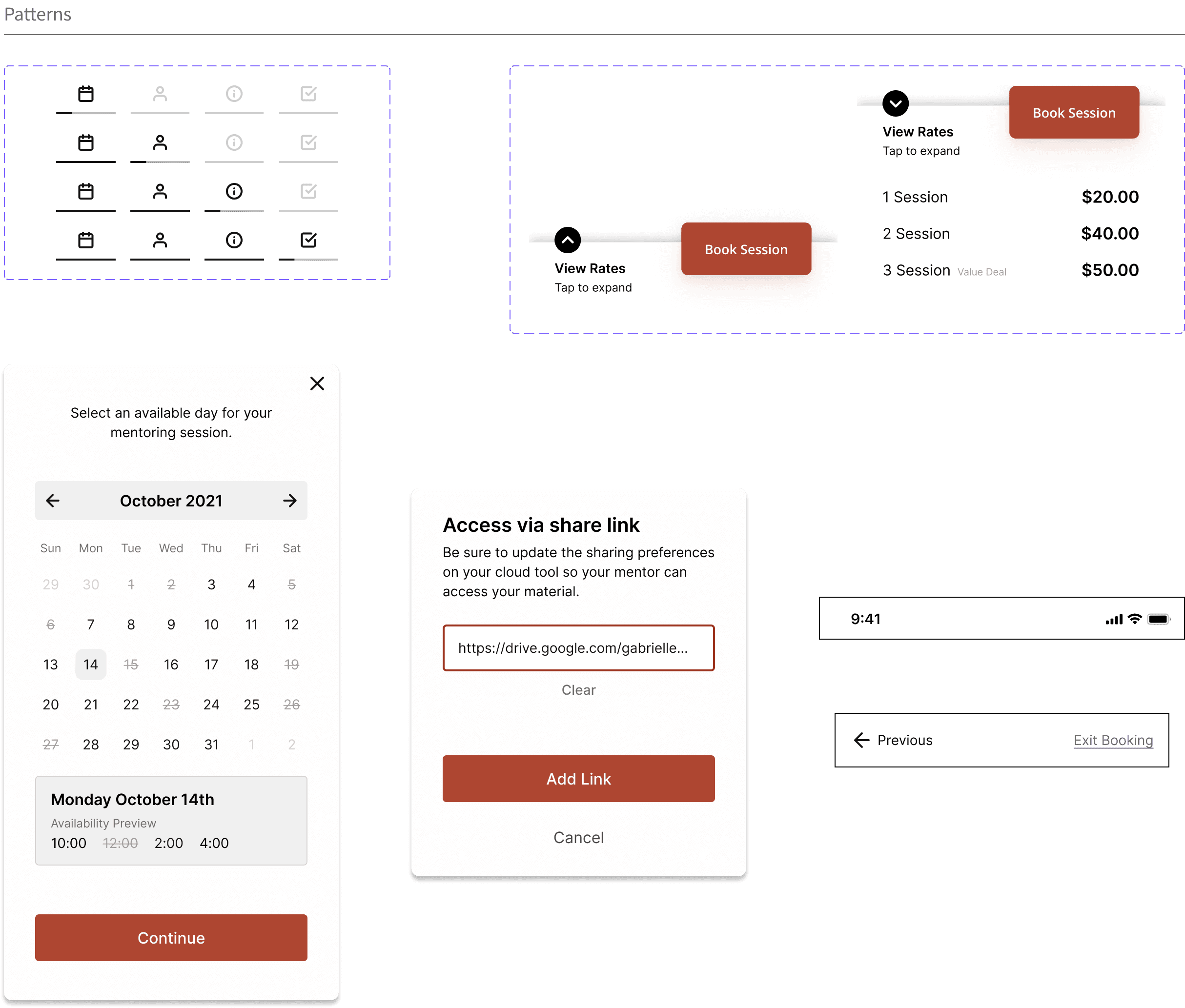
All relevant pricing information now lives in an expandable drawer at the bottom of the screen. Extracting the pricing information out of the profile content ensures that the mentor's personalized content isn't interrupted.
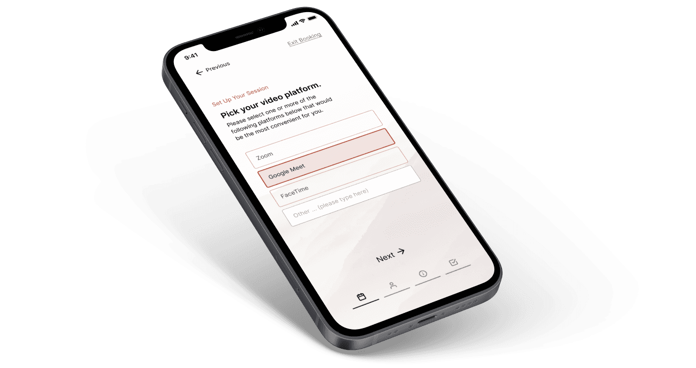
Building a booking “guide” instead of a booking form
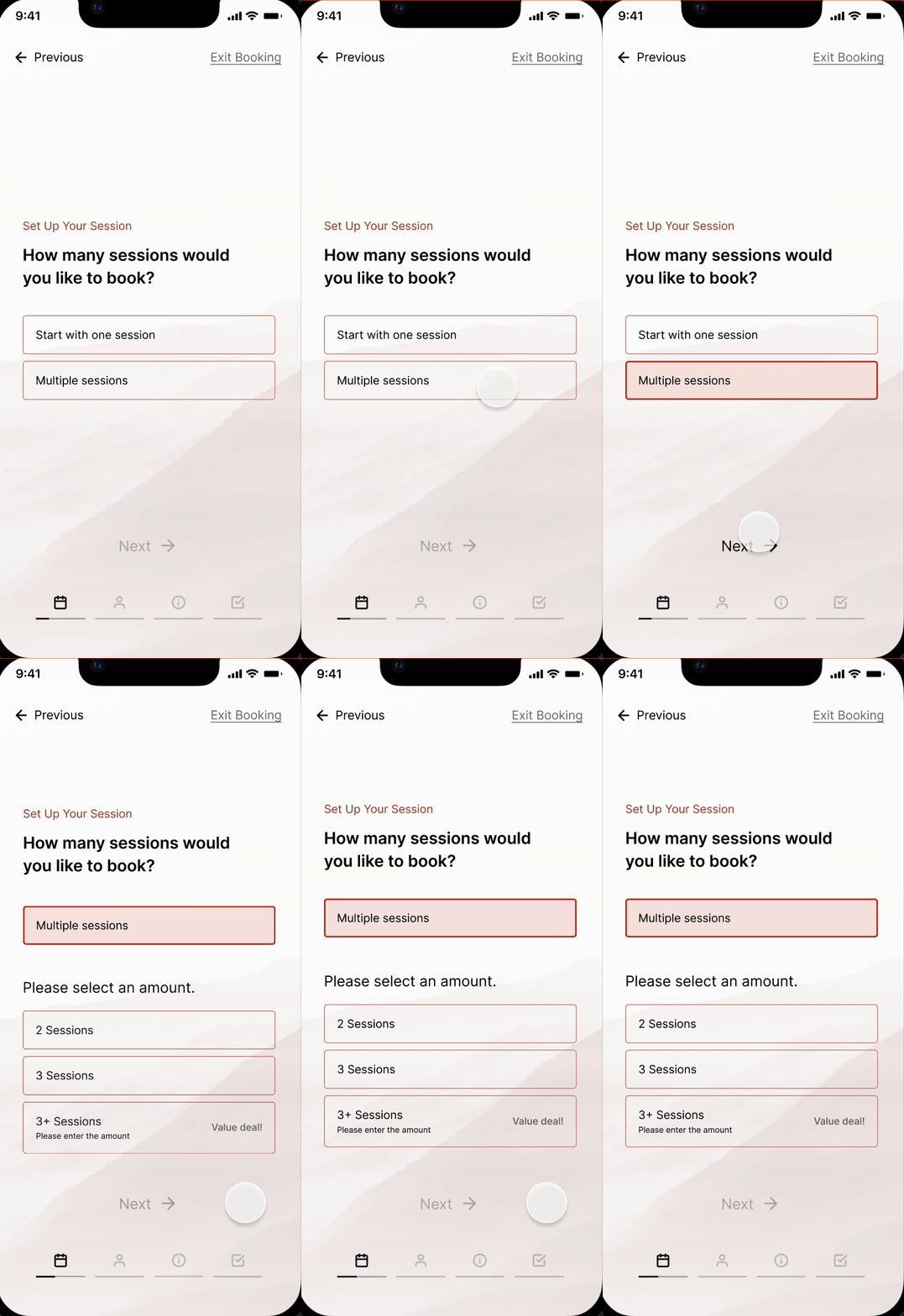
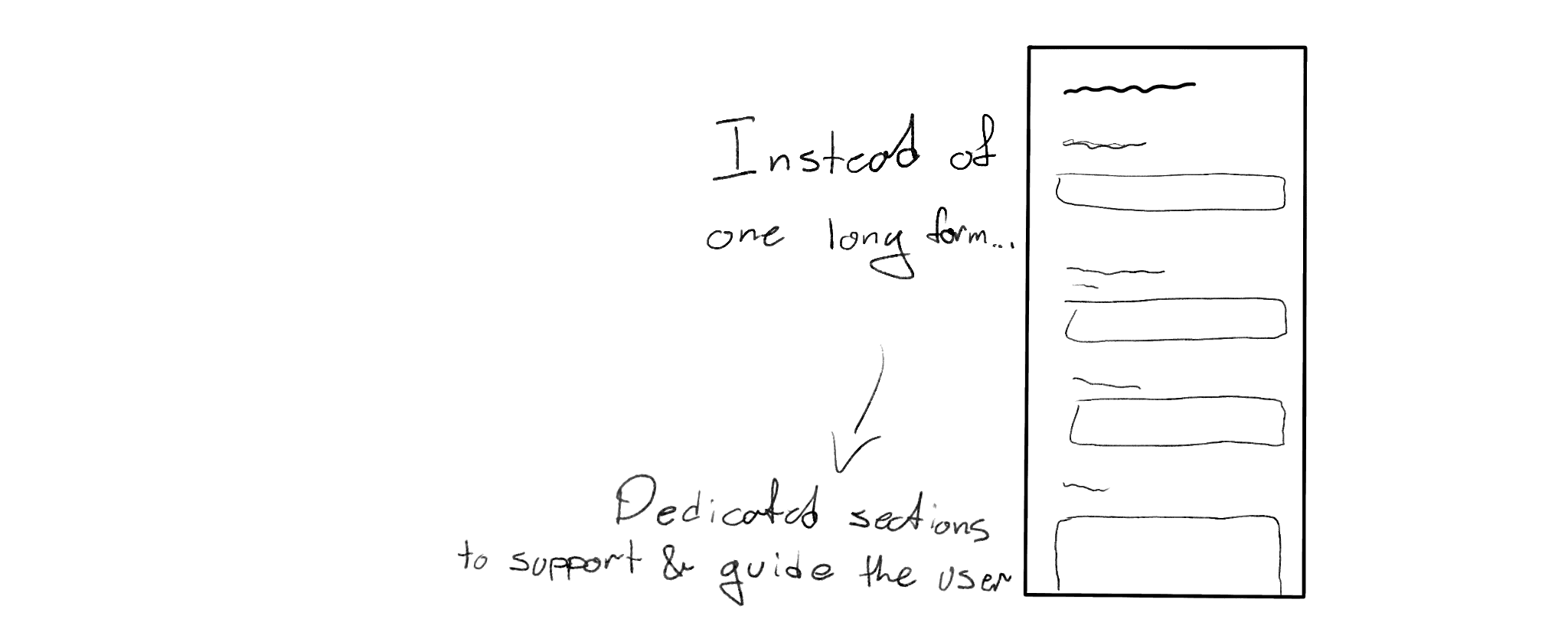
To ensure users feel fully supported and in control when booking a mentor, the redesigned booking form is now a friendly step-by-step guide. With simplified screens that focus on the question at hand, information gathering can be more thorough while not overwhelming the user.
Bringing the experience to life
To bring more life and engagement to the experience, micro-interactions and transitions were added to important actions. These help the experience feel more fluid and professional.
The Process
Despite a plentiful catalogue of mentors and a fair amount of site traffic, Margot Community still struggled to convert users into active mentees. What they found was a lot of profile bounce (quick departure after arrival) and booking forms being abandoned partially finished.
The challenge
Margot Community's desire was to have Kevin and me evaluate their current product experience, identify why users may be hesitant, and put together a solution that would make users more likely to book mentorships.
To help potential mentees feel comfortable, confident, and supported while booking a mentorship session. Our aim was to improve user experiences throughout — from landing upon a mentor profile to completing the booking form.
Gathering observations & research
Personal observations — after learning about Margot Community's challenges, Kevin and I each went through the process of booking a mentor. With a first-person understanding, we each took note of points we felt were detractors to the experience.
Prospective user survey — to follow up on our personal findings, we put together a survey to better understand prospective Margot Community users. Our aim was to learn what prospective mentees look for when trying to connect with a mentor, and what would help them feel supported in getting this set up.
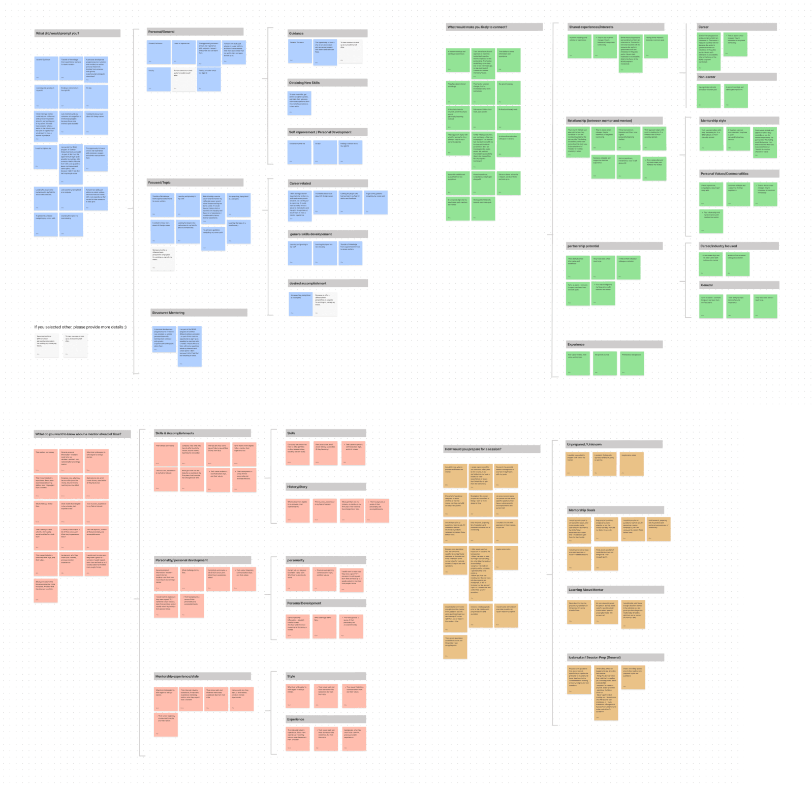
Affinity mapping — after collecting our survey responses, we used an affinity map to group thematically similar responses and see if we could identify trends in what past, present or future mentees are looking for.
Survey questions
- –Have you ever had an interest in being mentored?
- –What did/would prompt you to engage with mentoring?
- –What would you hope to get out of a discussion with a mentor?
- –Would you prefer to have a brief introduction to a mentor before engaging with them more personally?
- –What would you want to know about a mentor ahead of time?
- –What about a mentor would make you likely to connect to them?
- –Would you want your mentor to know more about you ahead of time?
- –How would you prefer to book mentoring sessions?
- –How would you prepare for a mentoring session?
Themes from the affinity map
- –Blue — what prompts people to find a mentor
- –Green — what helps people connect with a mentor
- –Red — what people want to know about a mentorship ahead of time
- –Brown — how individuals might prepare for a mentorship
Key findings
Based on this, we believed that a refined mentor profile and a more thorough, engaging booking form would address some of the negative and confusing experiences.
- –Perhaps our most important piece of feedback was that connecting and committing to a mentor can be a very vulnerable process.
- –This seemed to hold true regardless of whether someone was finding a mentor for the first time or had had many mentors in the past.
- –The actual monetary cost of mentorship went practically unmentioned in our responses, for both past and potential users.
- –While this doesn't mean price is not important, it seems less crucial an aspect than we had anticipated.
Ideation & UI development
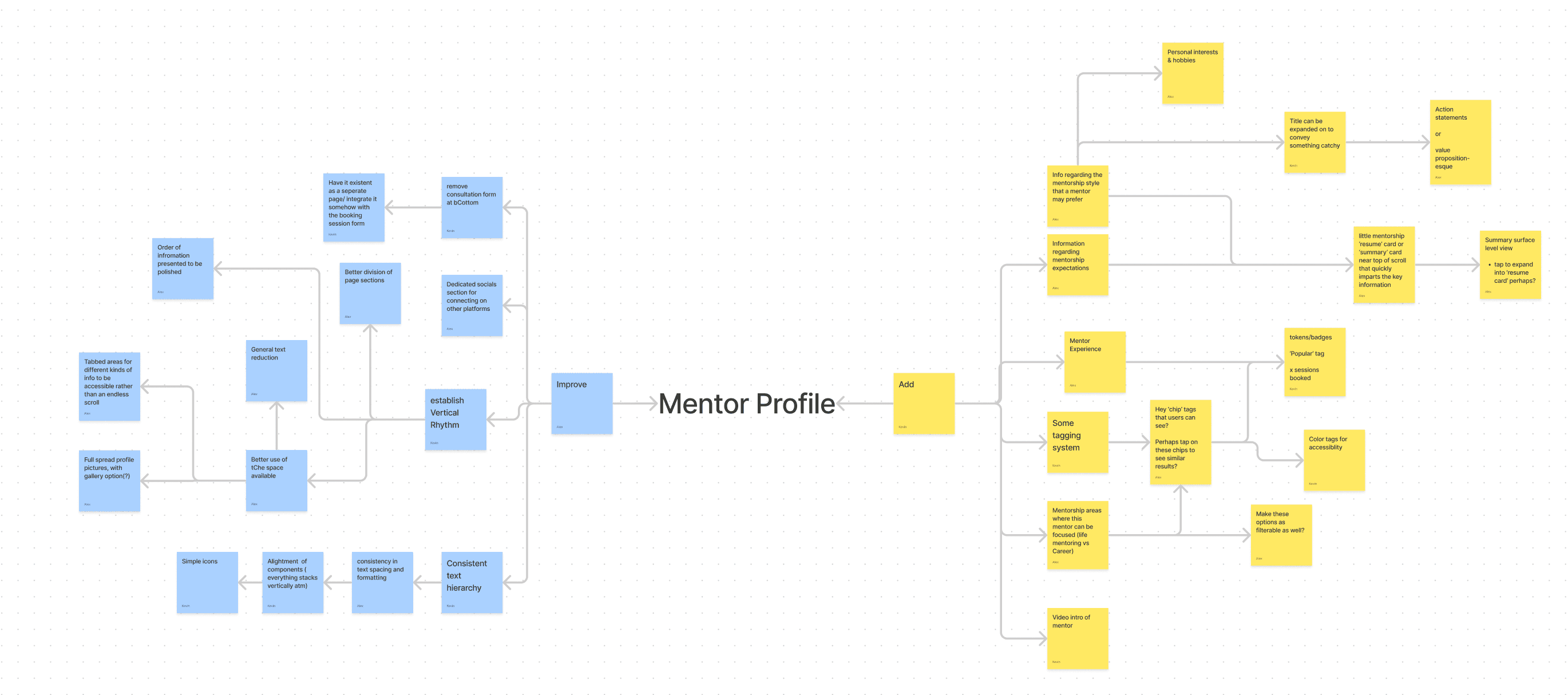
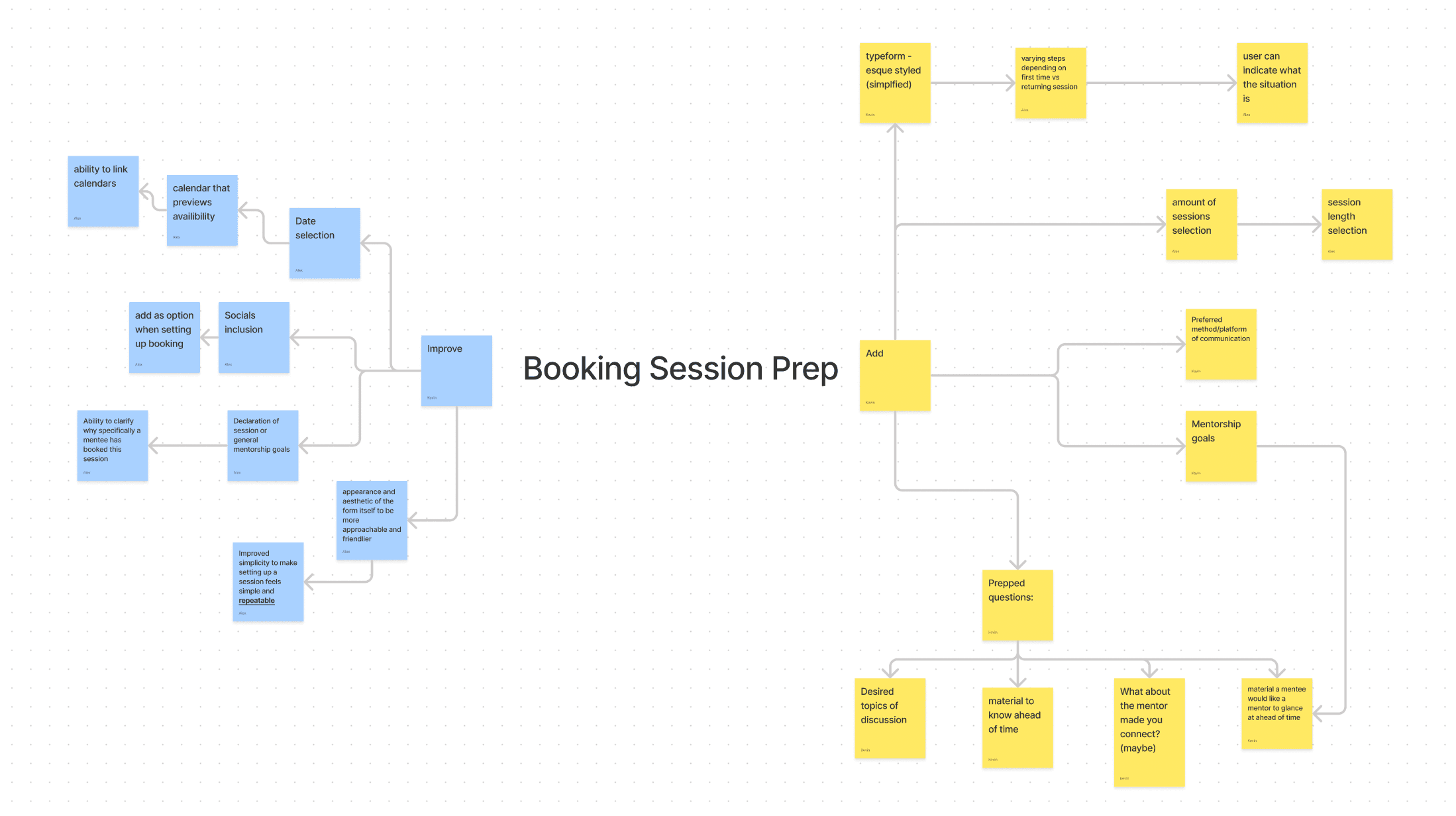
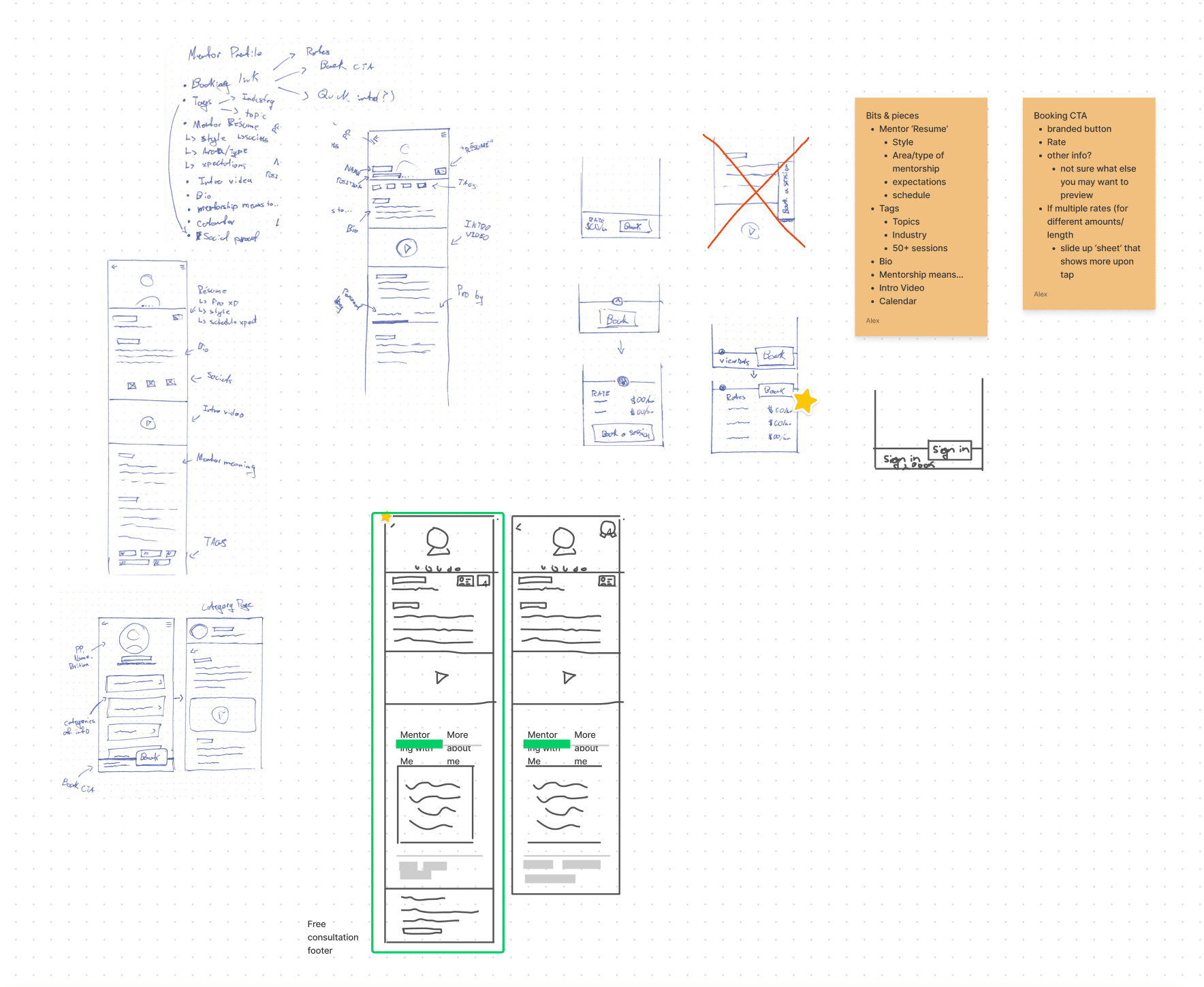
For both the profile page and the booking form, we began with ‘improve vs add’ mind maps. This forced us to see what could be improved first, rather than just resort to new and shiny features.
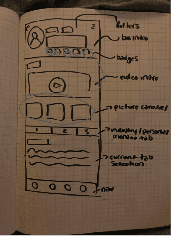
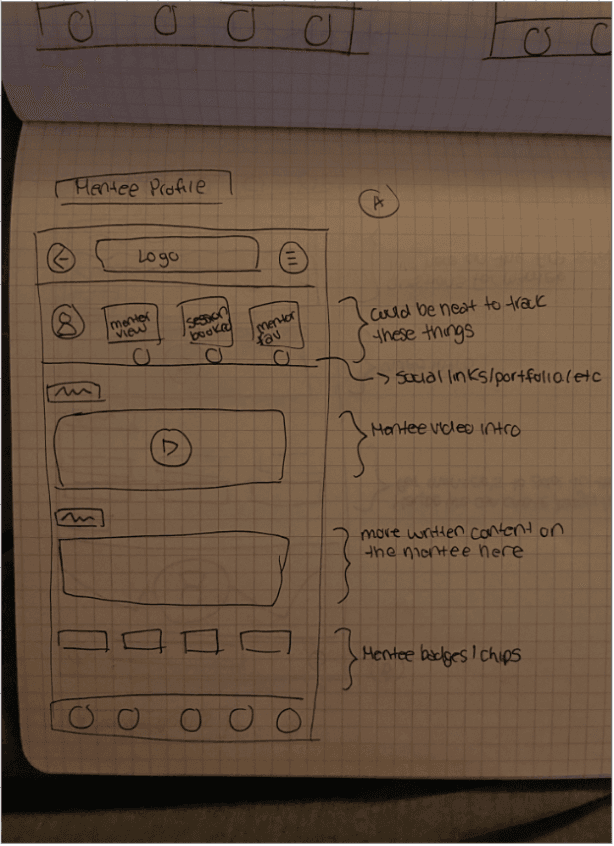
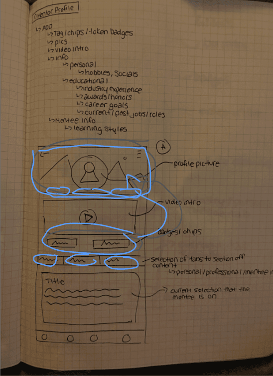
Using these mind maps as a foundation, Kevin and I went away to generate some initial ideas and explore solutions via sketches and low-fidelity wireframes. After that, we discussed our ideas, iterated upon them, and finalized some concrete directions to develop in higher fidelity.
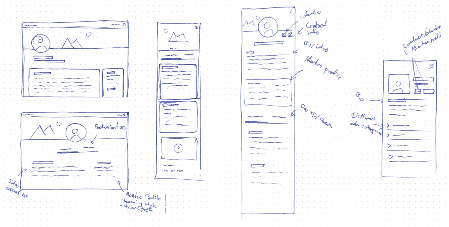
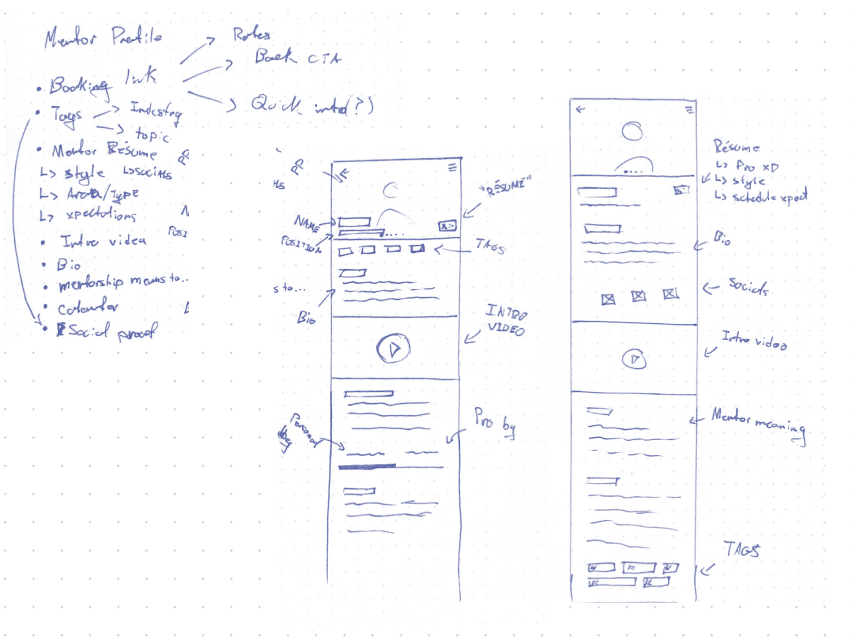
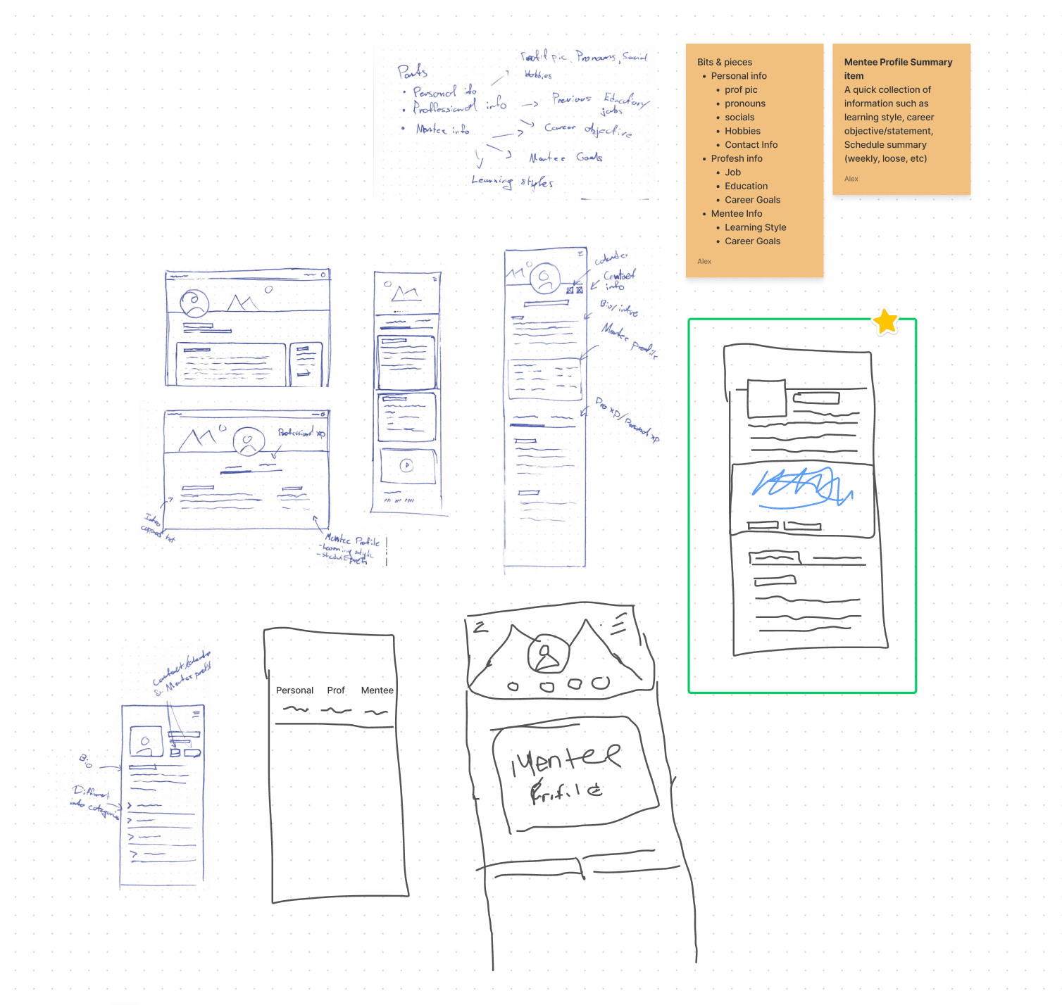
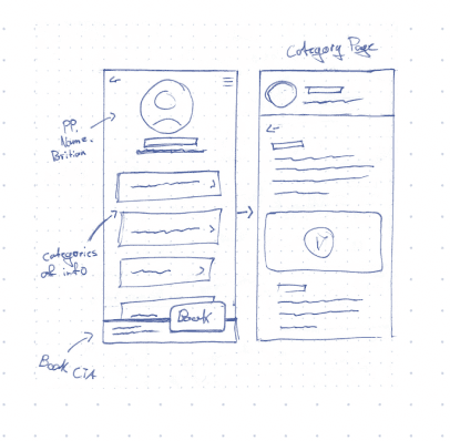
Early ideation via wireframe sketches
A selection of the early sketches Kevin and I generated for the profile and booking form.
Rethinking the booking user flow
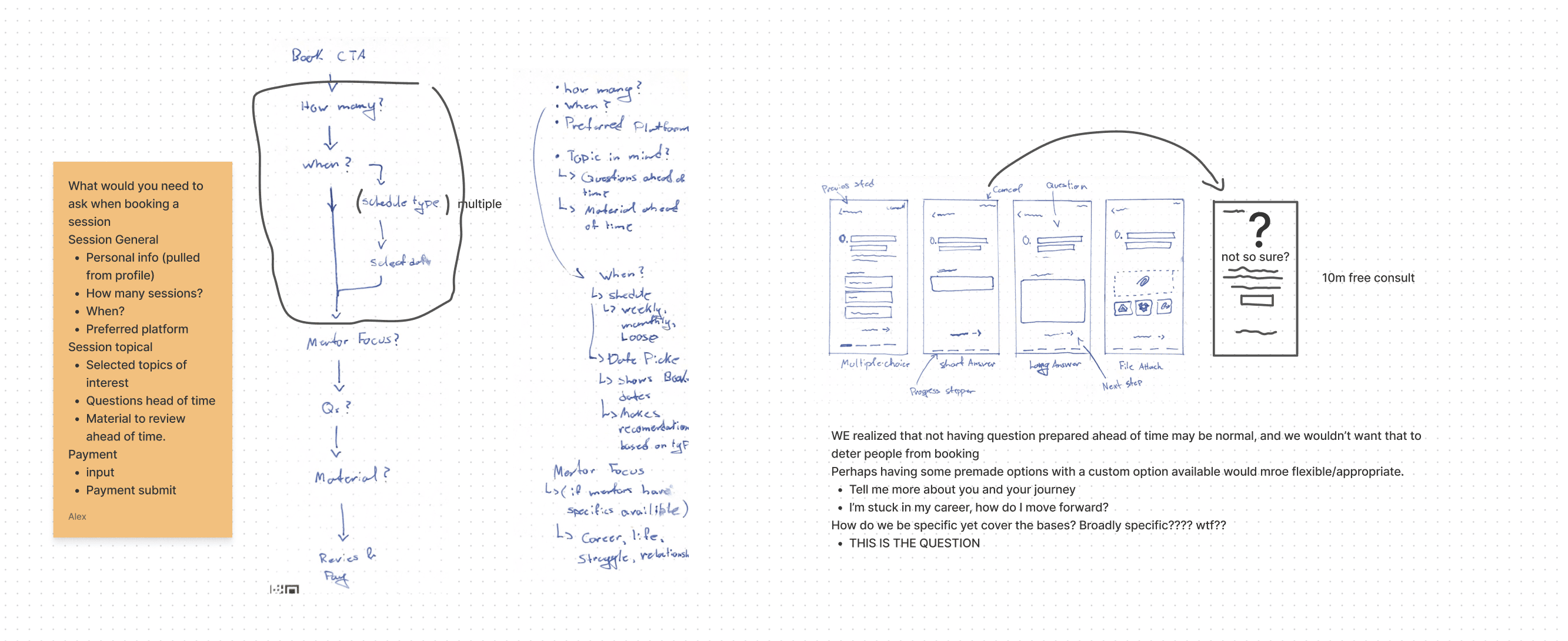
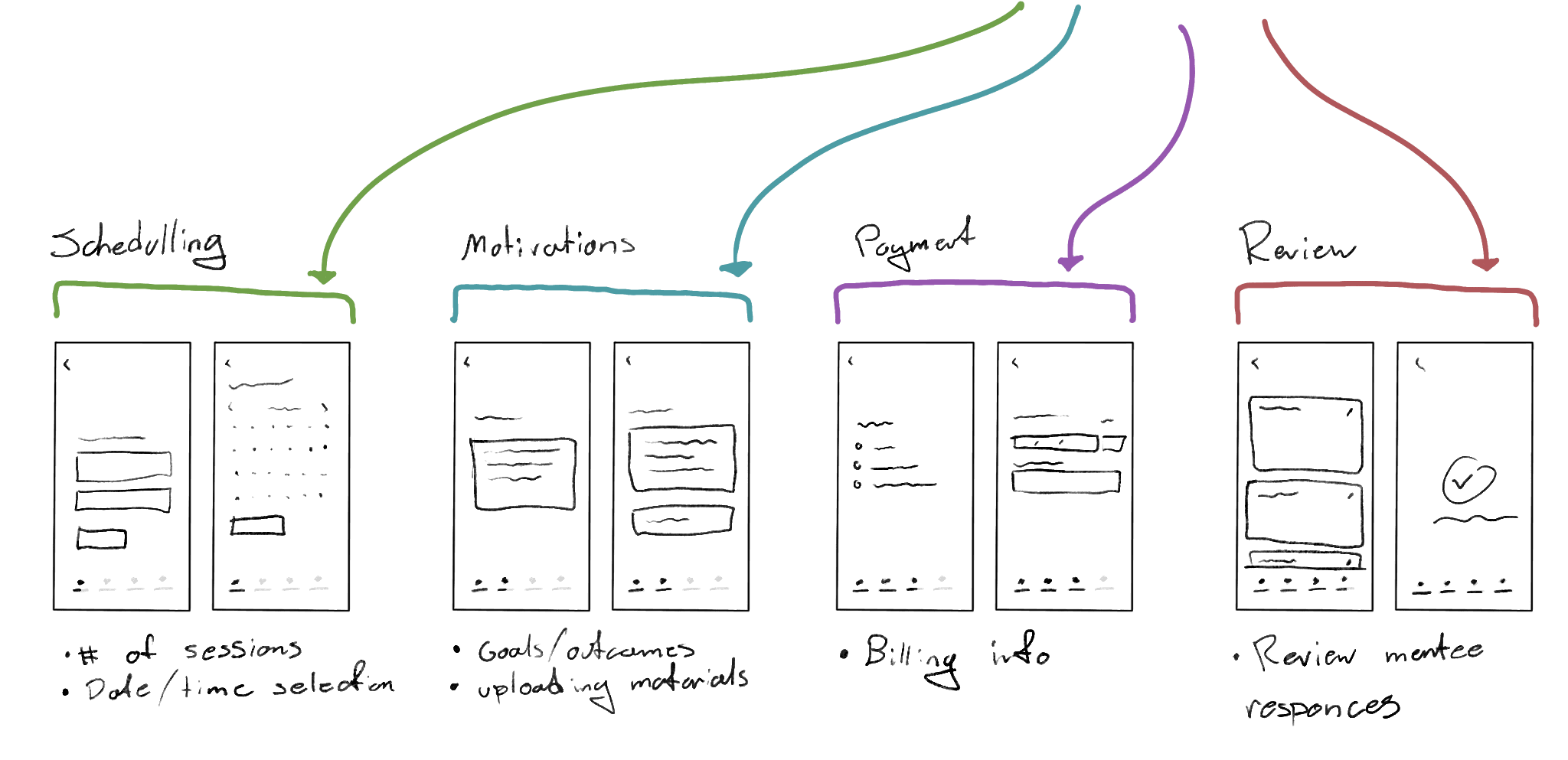
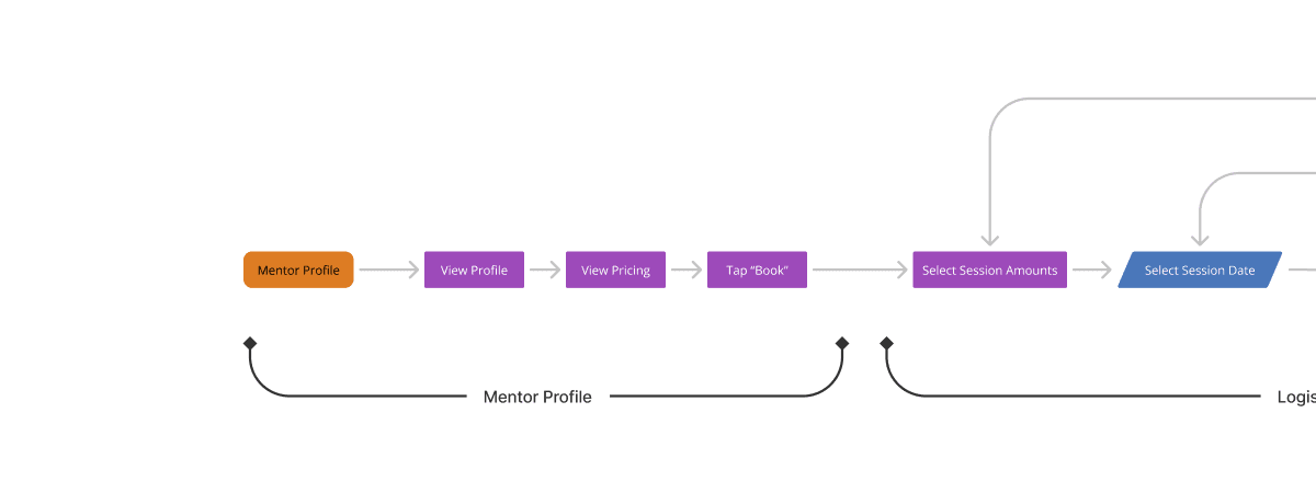
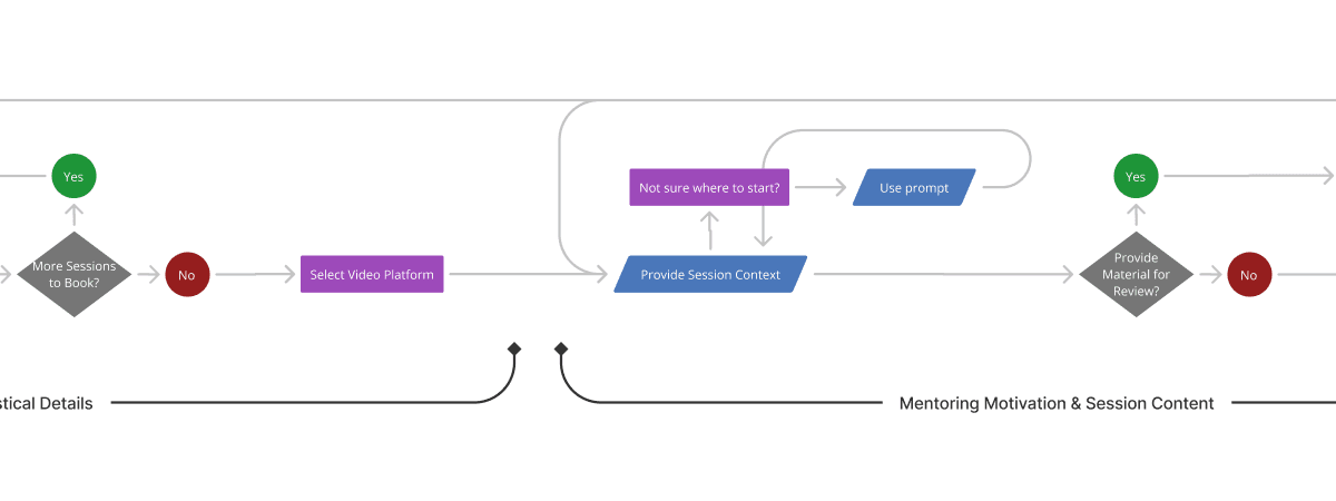
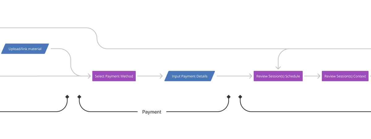
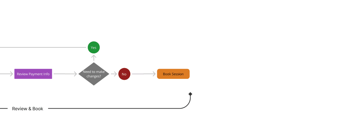
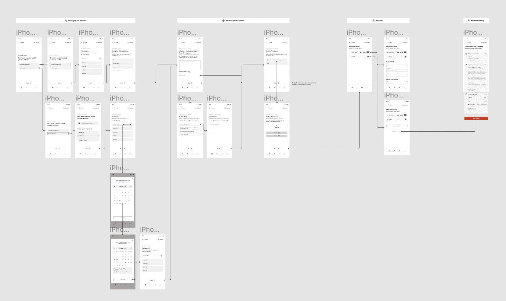
To improve the experience, we rebuilt the booking form in a way we felt reduced the cognitive load. By breaking the process down into dedicated sections, we could be more thorough with each, while keeping screens simple, personal, and supportive of the user's needs.
Below is the fully revamped user-flow diagram, indicating what users encounter at each stage of the booking process.
Greyscale wireframe development
Now that we had a well-defined user flow, we turned our earlier ideas and sketches into more developed greyscale wireframes. We also illustrated how users would move from screen to screen, with arrows connecting up the flow.
Refining components and styling
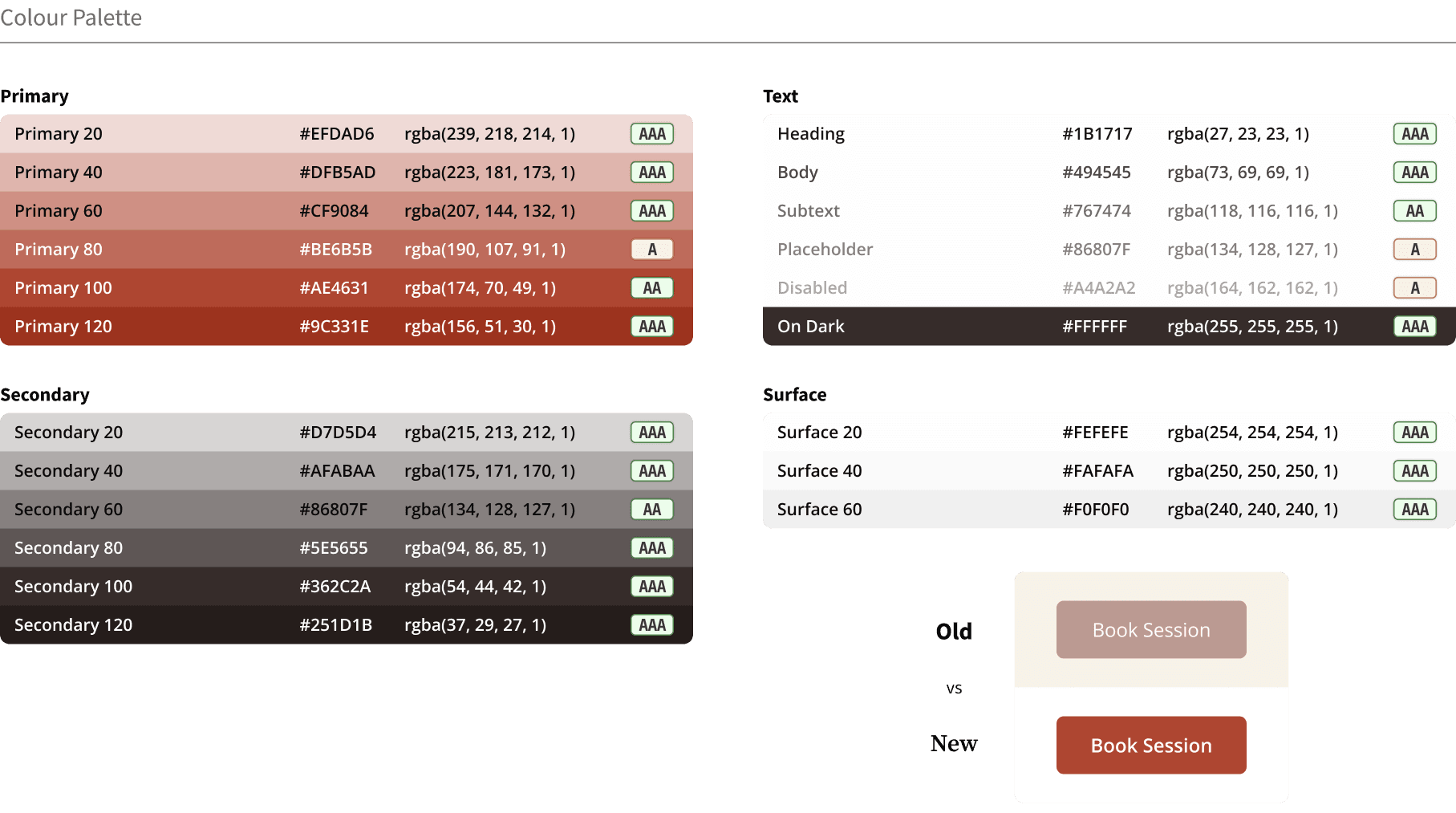
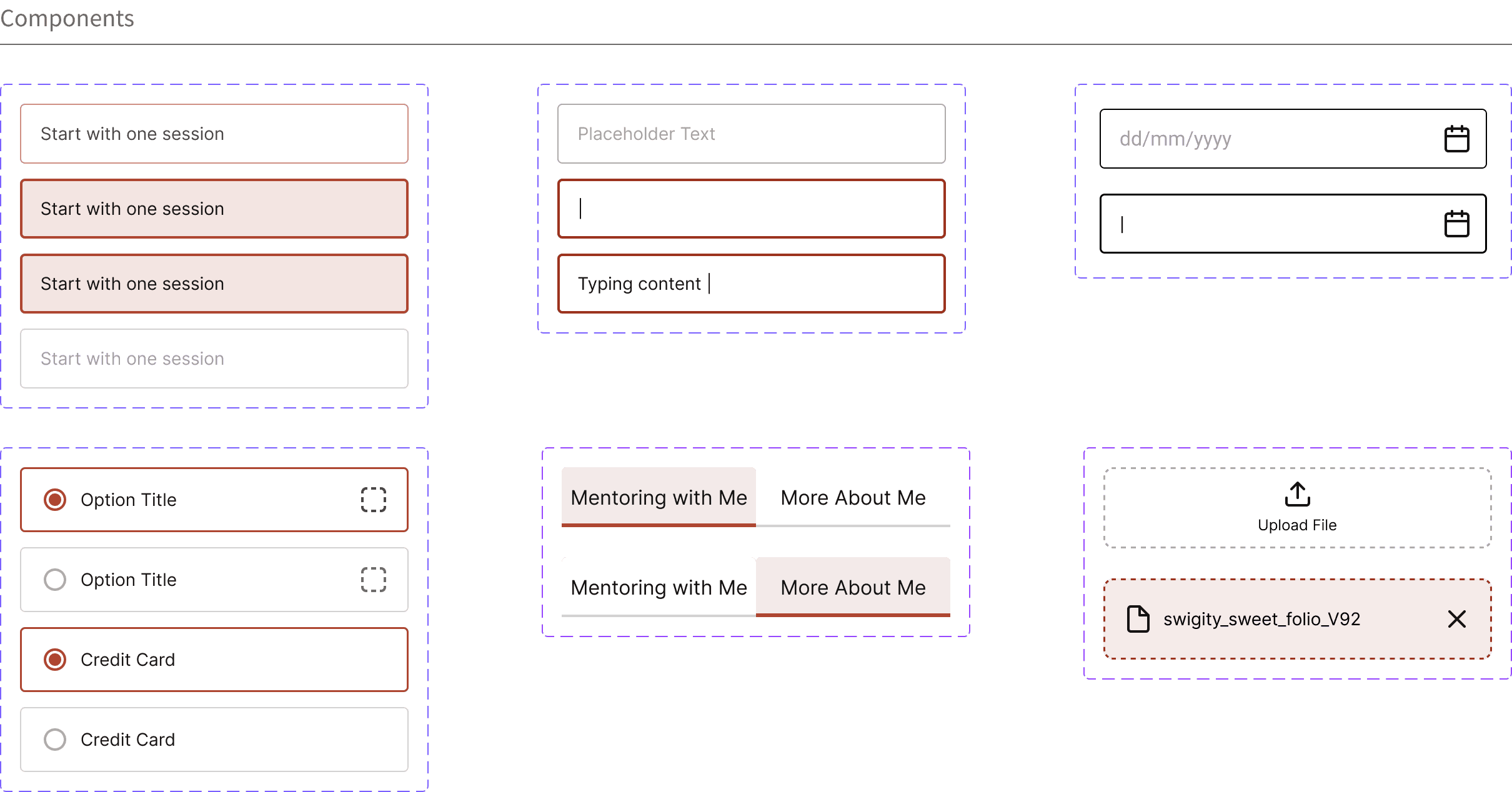
Since Margot Community was open to improving the branding palette, we tackled this when we revamped all the user interface components and patterns needed for our high-fidelity prototype.
To improve the branding palette, Kevin and I took the existing colour values and tweaked and expanded them. Now Margot Community has a flexible colour palette with enhanced contrast in the interest of accessibility.
The final design
Other work.
Redesigning Athelas Air's EMR calendar block to be clearer, denser, and easier to scan at a glance.
A collection of 7,000+ digital product icons, designed for personal and commercial use.
Redesigning the initial search experience for a getaway cabin on Unplugged.rest to be more engaging, intuitive, and polished.