Redesigning Enable Medicine's Data Upload Journey
Redesigning the Enable Cloud Platform's image data upload flow to be more approachable, usable, and time efficient for biologists.

Project Background
Enable Medicine is a biotech company building products that allow biologists to upload, index, and analyze spatial image data in the cloud. Currently targeted toward multiplex spatial proteomic image data, this cloud-based product gives biologists cutting-edge analysis tools and powerful indexing capabilities, all in the pursuit of enabling better drug development and disease treatment.
Multiplex spatial proteomic images are essentially multi-layered image scans of tissue, where each layer highlights a different protein in the tissue sample.
The Challenge
Simply put, the existing data upload journey was confusing, complicated, and unintuitive. The process of uploading and configuring image data — a crucial first step in beginning analysis — was pushing users away from the product.
Biologists were consistently:
- 1.Unsure of what steps were required or optional in the upload process, and where to complete those tasks
- 2.Unsure of what information or data types were required of them (image, CSV, etc.)
- 3.Unsure how to format the information correctly
Beyond usability
In addition to underlying usability issues, improperly used UI elements made each step confusing and generally did not scale with future plans to support more data types.
Key Improvements
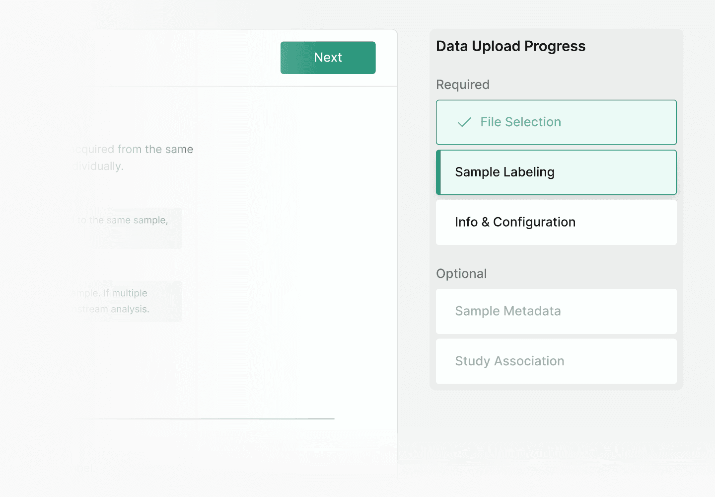
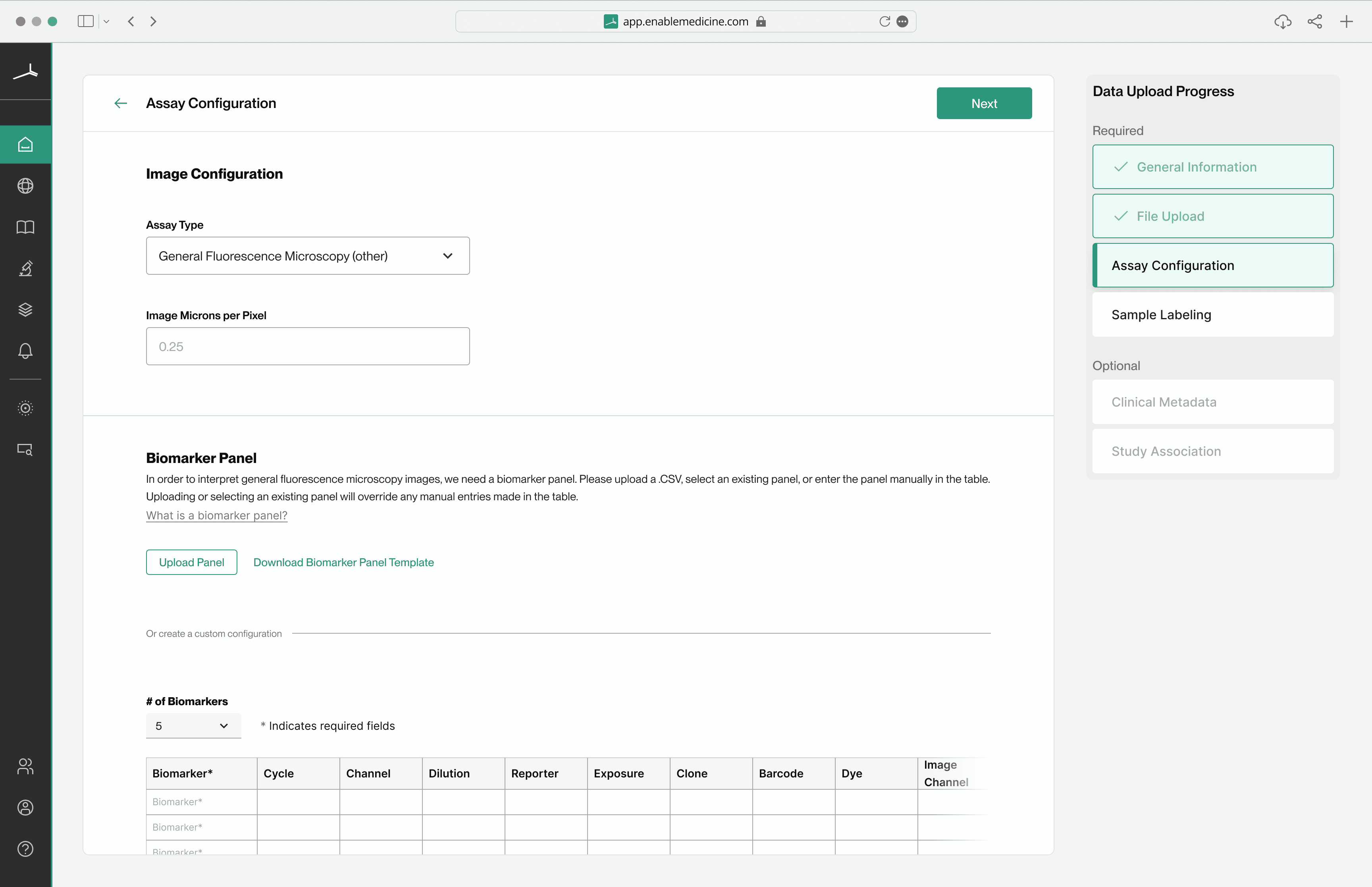
An easily trackable journey
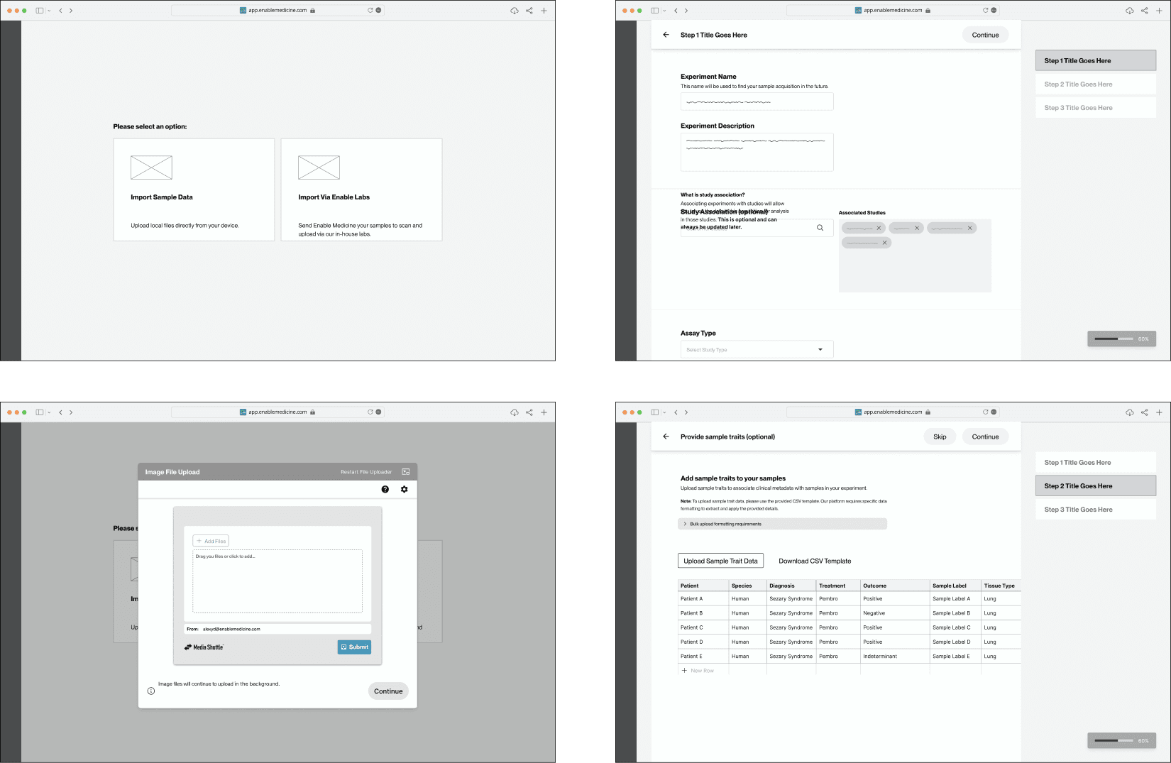
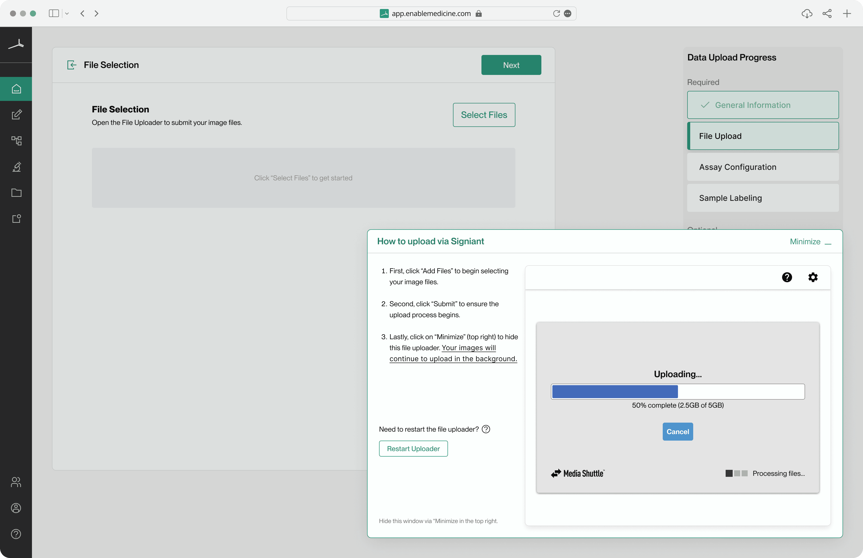
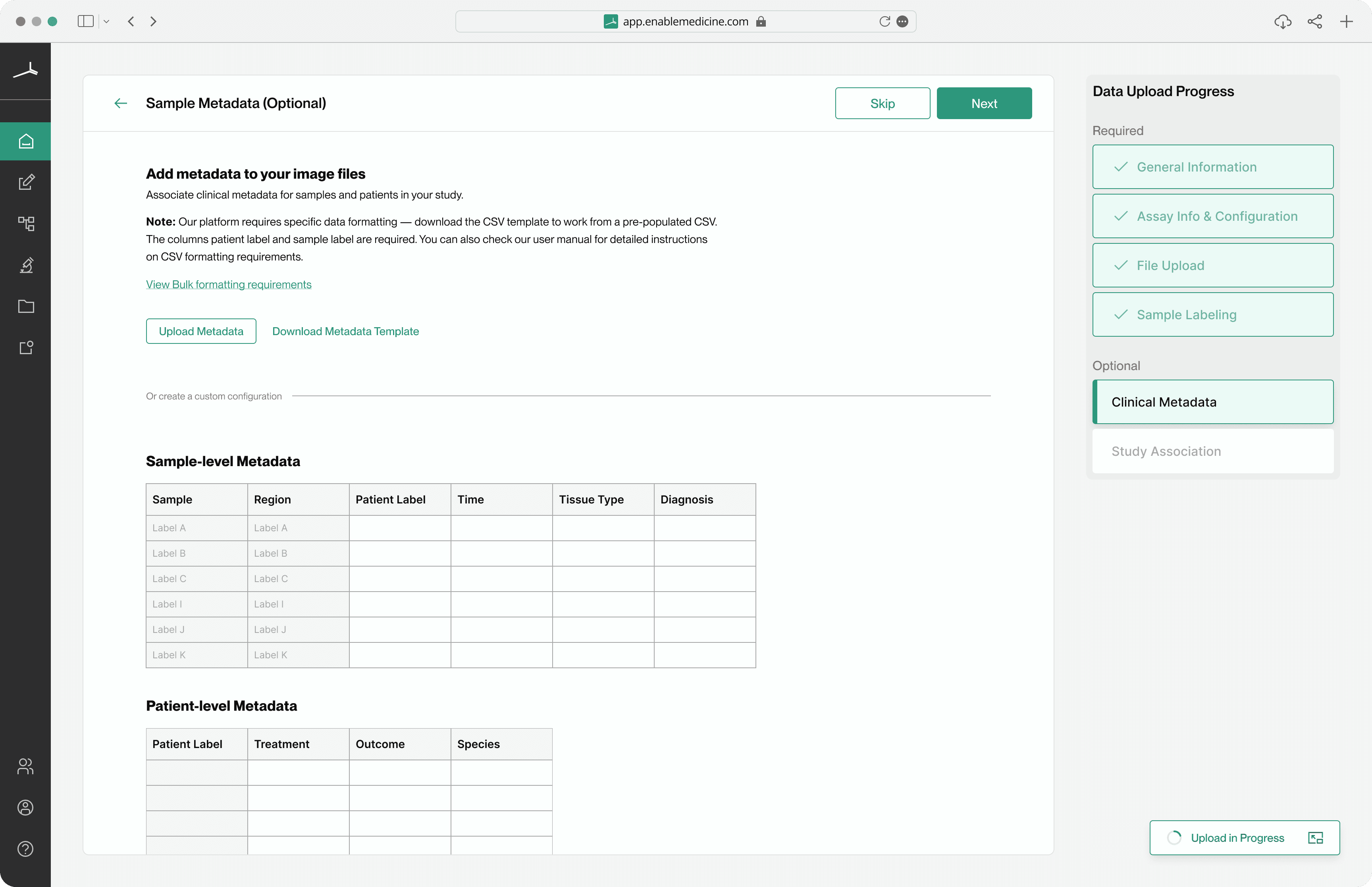
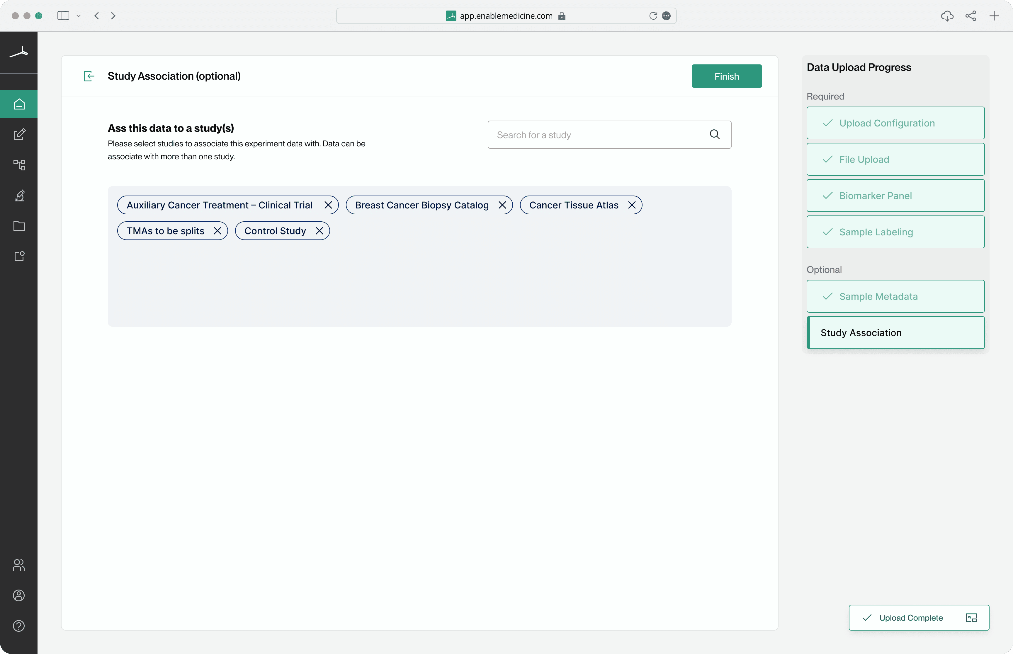
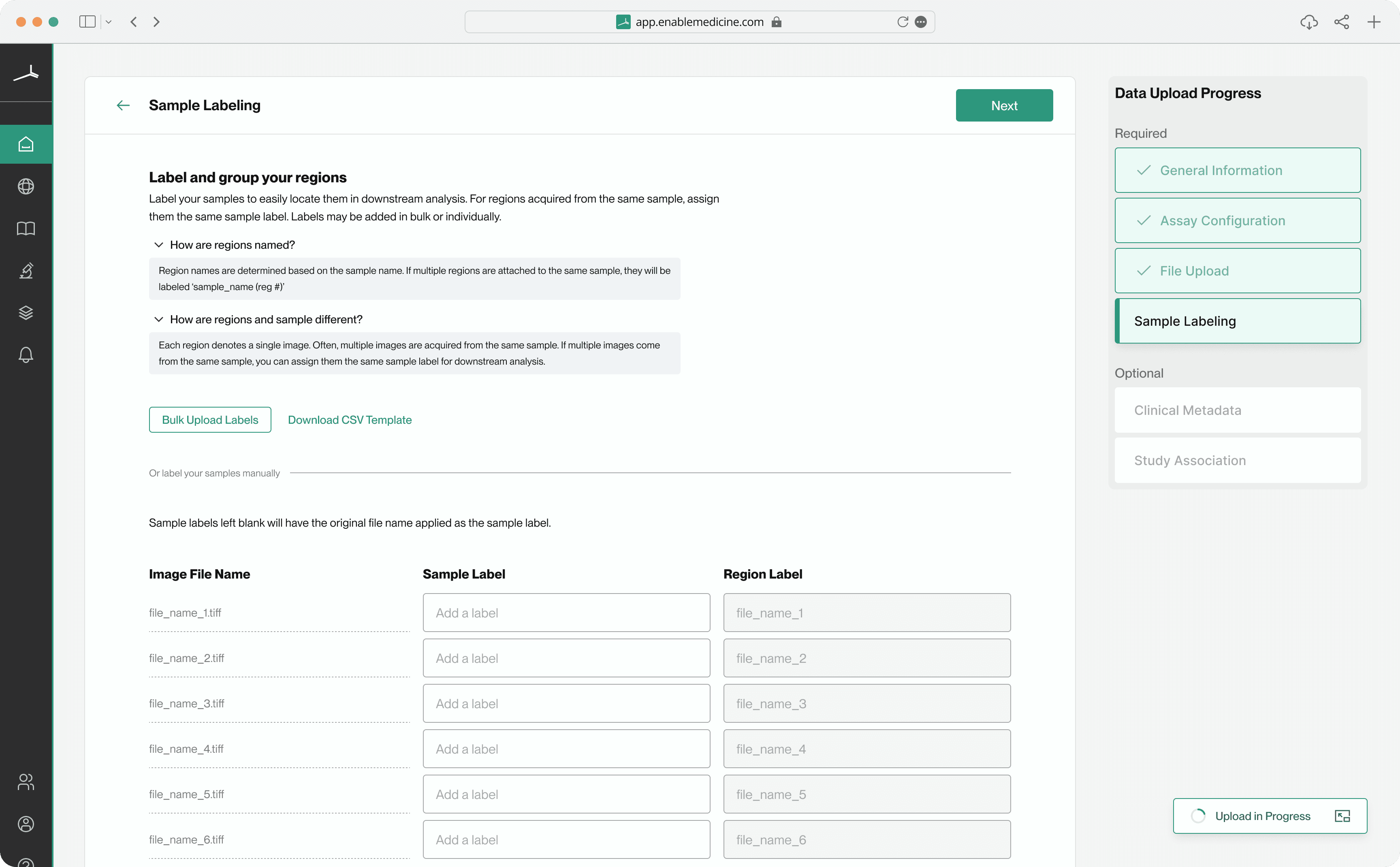
A linear structure was added where an open-ended flow wasn't working. This always-visible progress tracker made it clear what was expected of users and when. Simply ‘going along for the ride’ lets users focus on providing the required information rather than having to discover what's required on their own.
Improving user guidance, standardizing communication
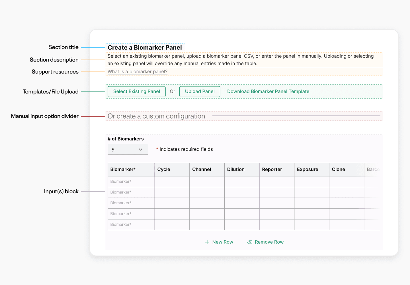
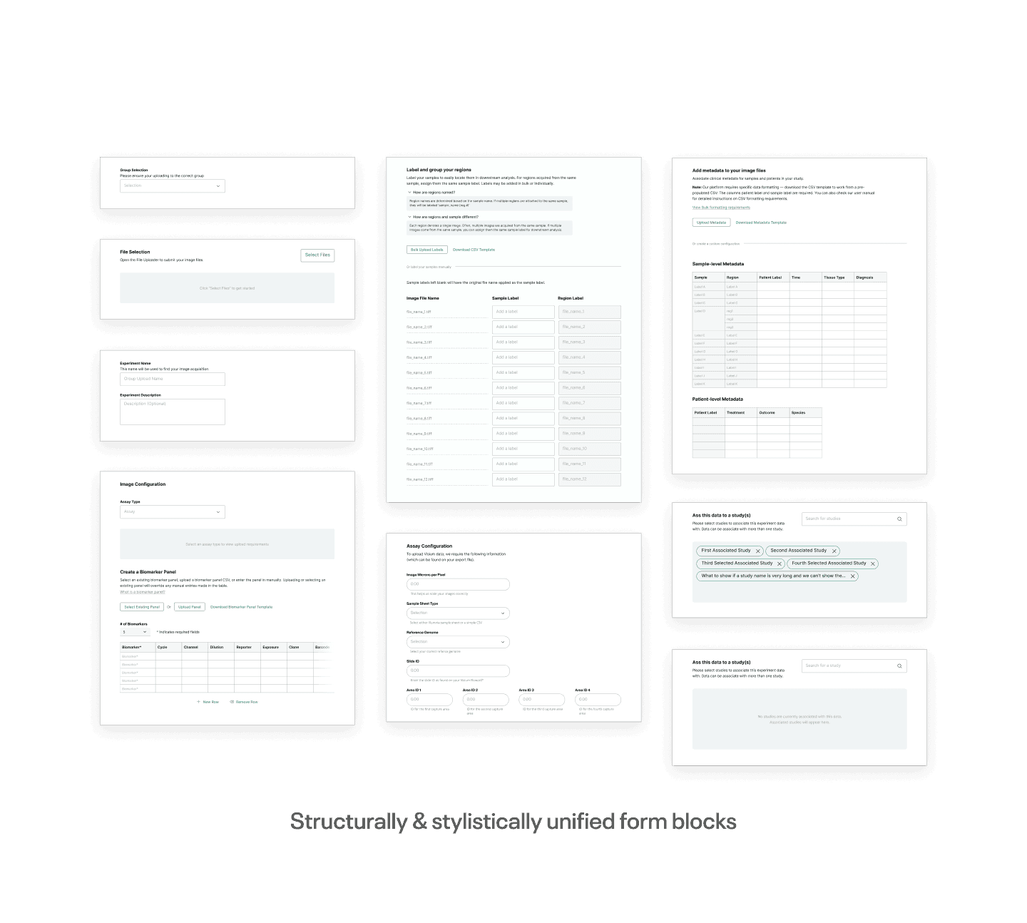
Standardizing the forms presented at each step of the upload flow meant we could build consistency and familiarity into the experience. An added benefit was the scalability if we ever needed to add more steps in the future.
Upload data in the background
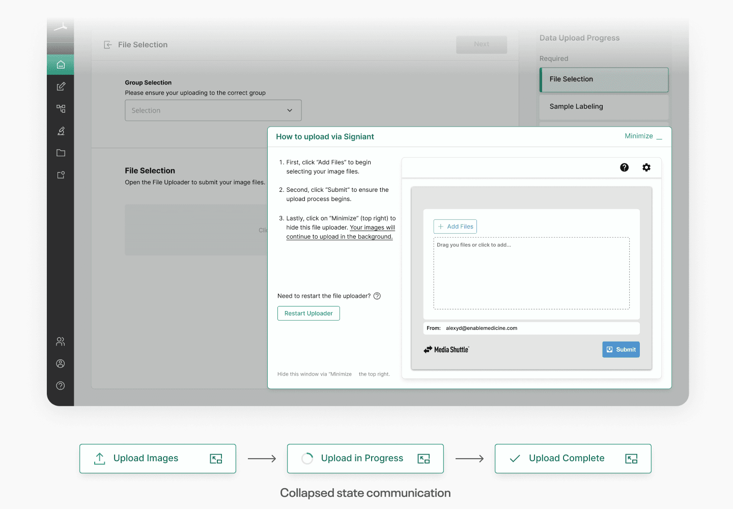
Placing the file upload UI in a separate, collapsible window allowed users to complete other steps while their files processed in the background, preventing delays. Multiplex images range in the 1s to 10s of gigabytes, meaning processing times can be huge. Previously, users had to wait for completion before doing anything else.
The Impact
Usability improvements reduced the number of data upload support tickets our scientists needed to handle — which in turn gave their time back, to focus on their important research and work.
Enabling users to move on to other steps while files processed in the background significantly reduced the time spent in the upload journey — which in turn reduced user drop-off, compared to before.
The Process
From consulting our scientists on the right sequence of steps to validating the redesign with usability testing, here's how the new upload flow came together.
Consulting our scientists to build an intuitive series of steps
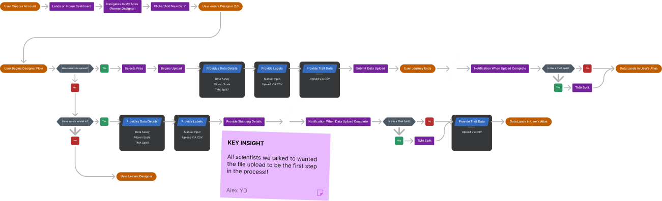
The number one piece of feedback was that the process felt unintuitive and out of expected order. To understand why, I consulted our internal scientists to best understand what they expect to be able to do.
Given the criticality of the upload journey and the complexity of the data involved, right from the beginning this needed to be a collaborative effort — so we let the scientists guide us.
All scientists we talked to expected a sequential set of steps for uploading. Instead, they were presented with tabs for each type of upload activity. This caused dependency issues when one activity required completion before another.
This gave me
- –A clear set of data assets to upload, labeling and classifying requirements, and correct terminology
- –A proper order for the upload steps

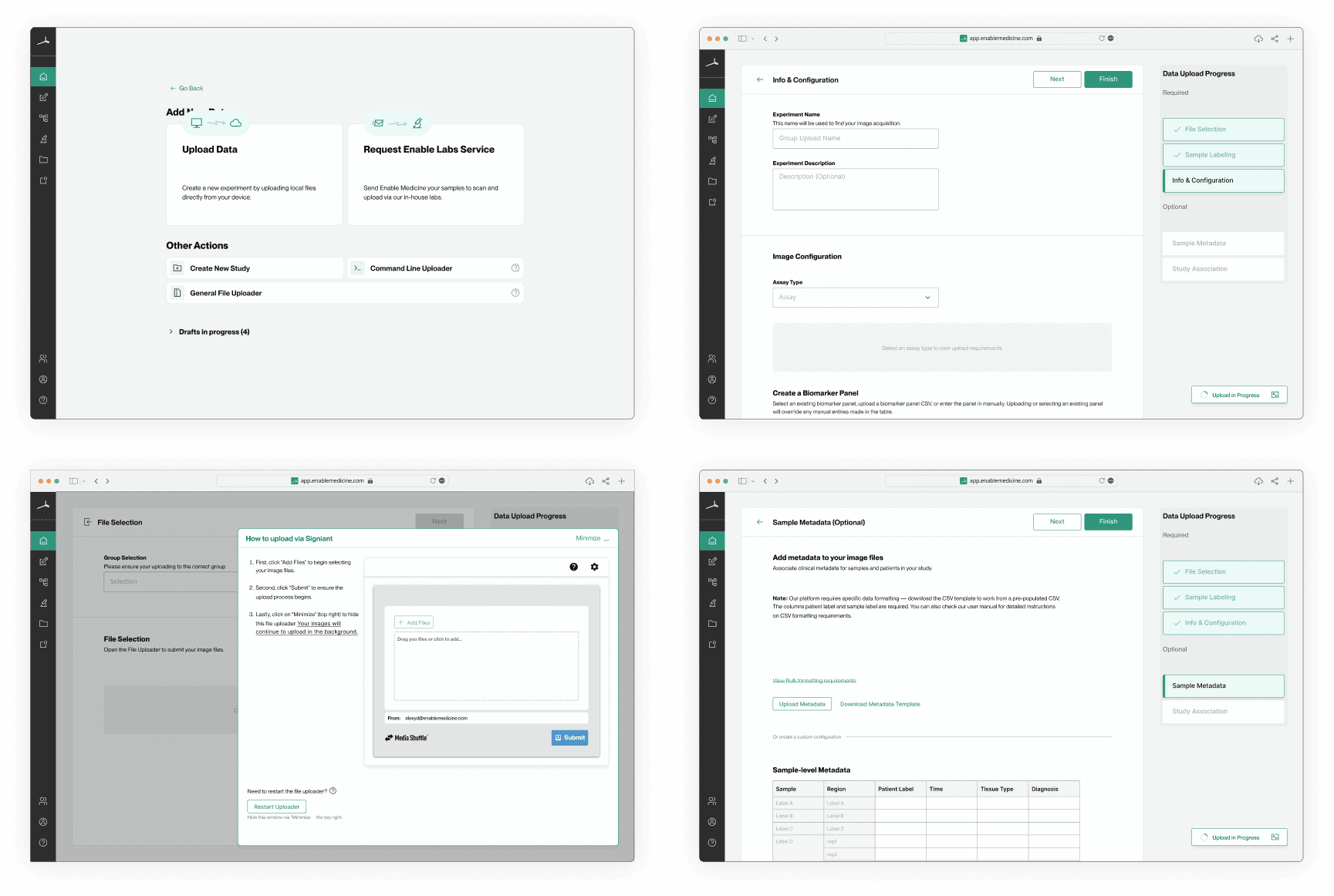
Cleaning up UIs & enforcing a linear process instead of a tabbed approach
With a solid user flow to build on, I focused on understanding which elements of the UI were causing localized pain points and confusion.
Key notes from this work
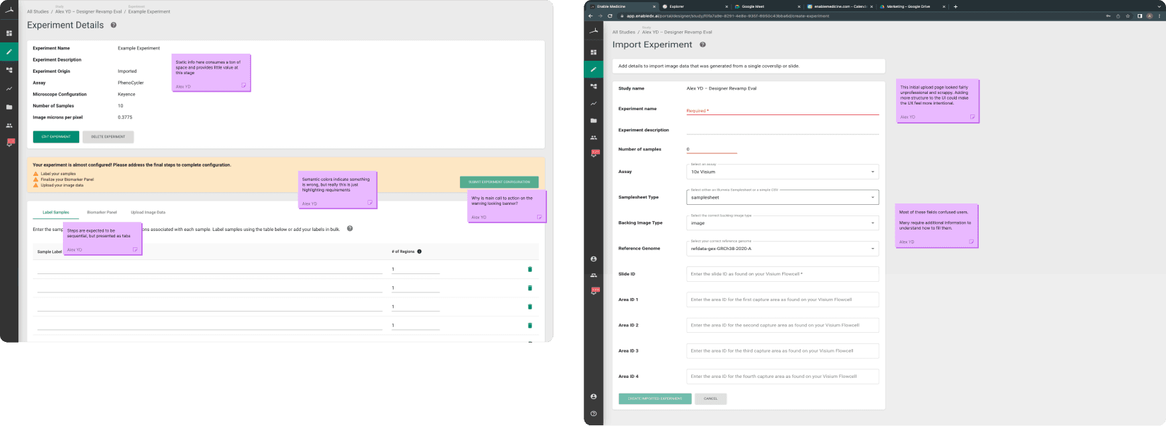
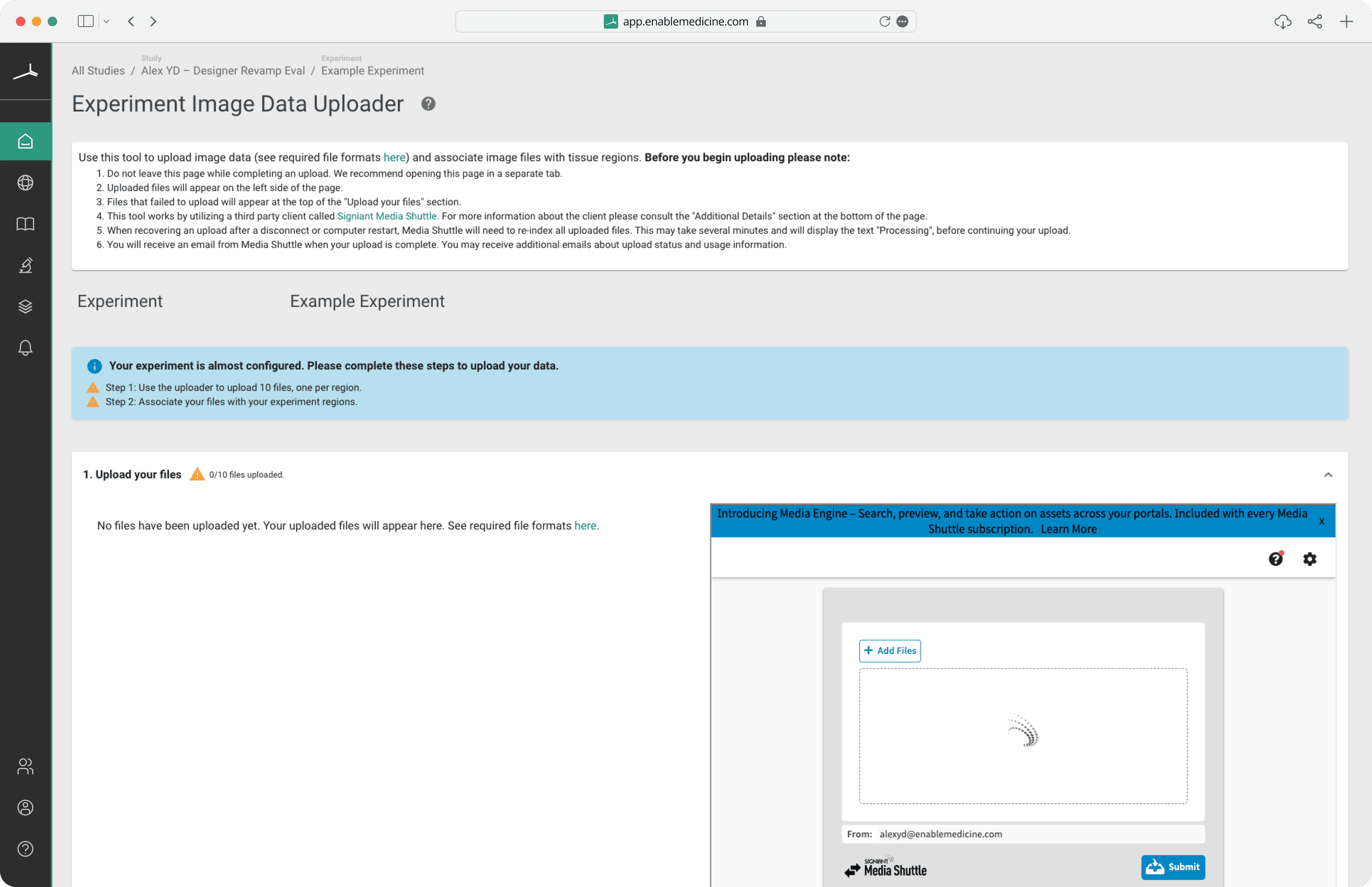
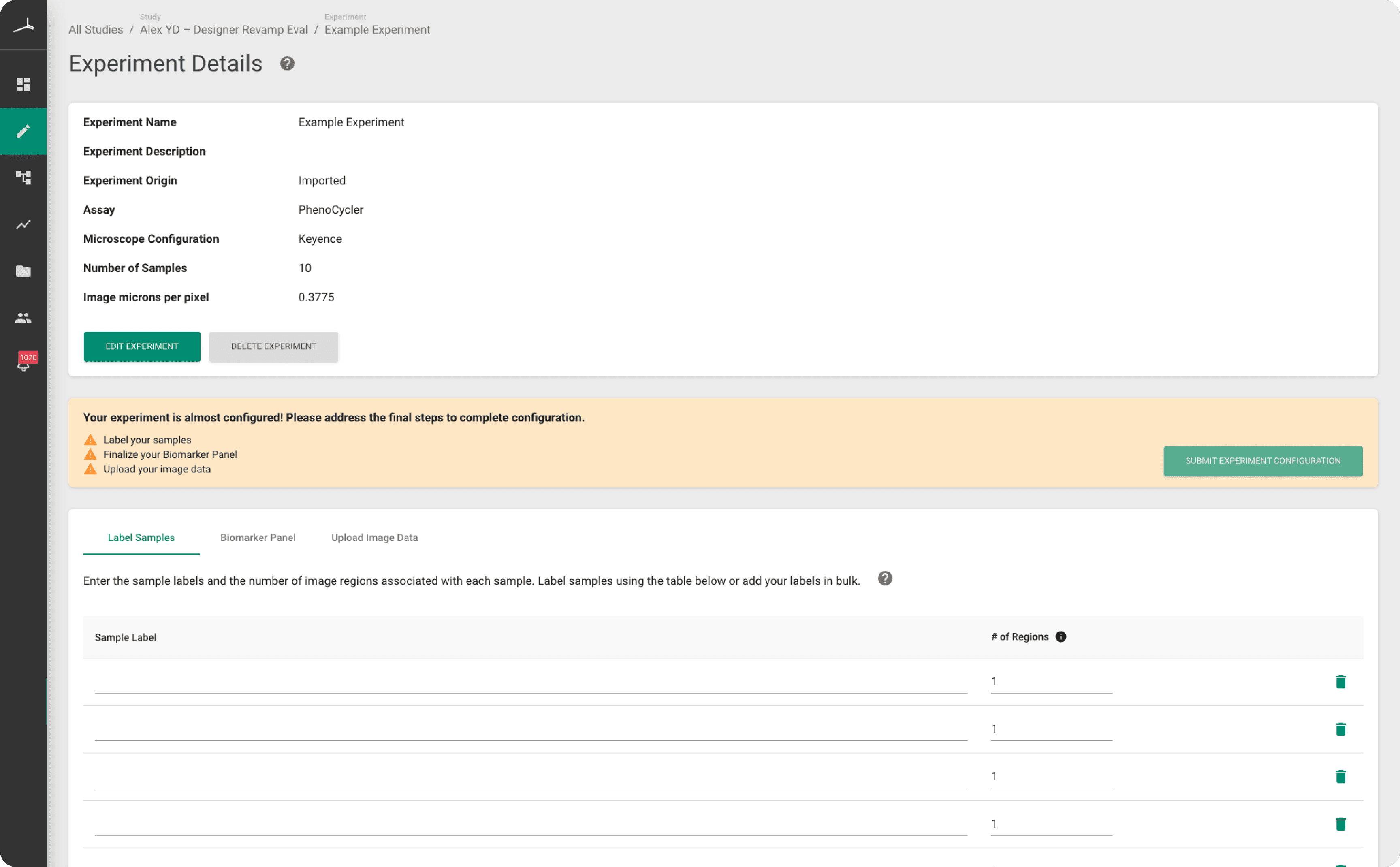
- –What users expected to be a consistent set of steps was presented through a tab menu. This made the process confusing, as some steps had dependencies on others.
- –The upload requirements lived inside a semantically themed banner that made it look like there were errors.
- –The main CTA was placed on that banner, making it look like an action to take on an error instead of the key finishing CTA.
Critical goals of the new UI
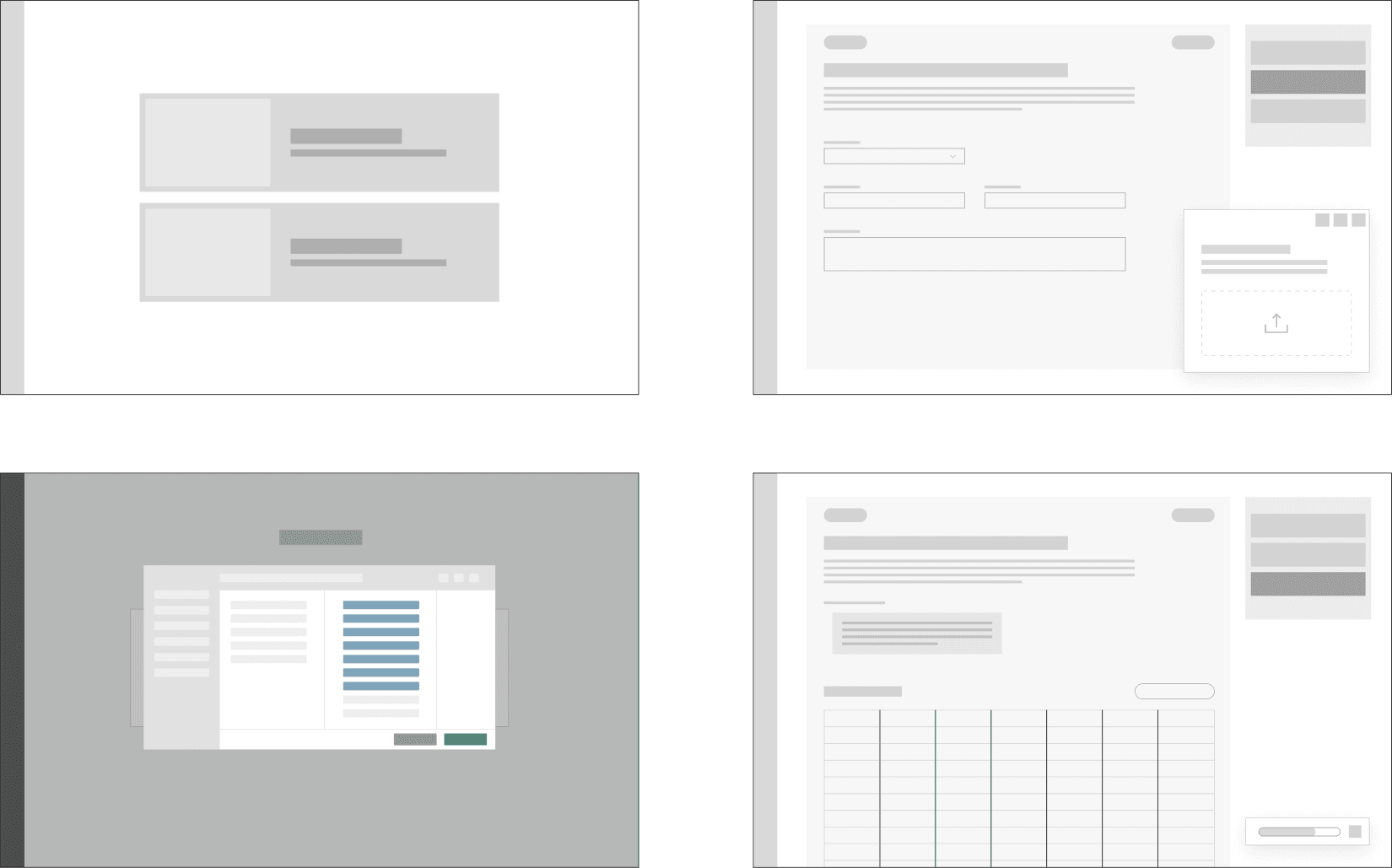
- –Make all required steps and current progress super easy and quick to understand
- –Allow uploads to happen in the background so users don't get held up
Usability testing and feedback updates
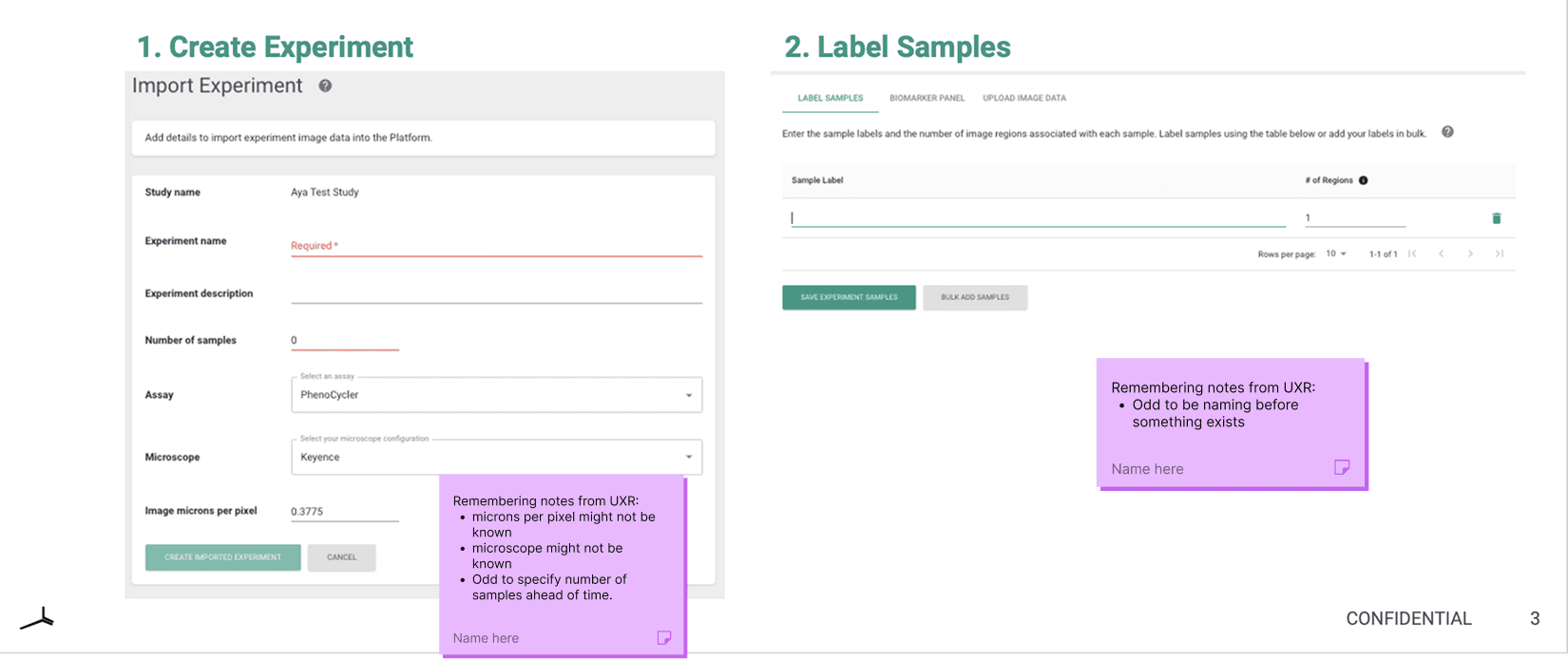
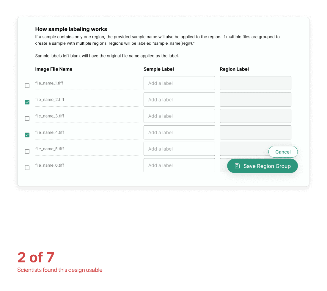
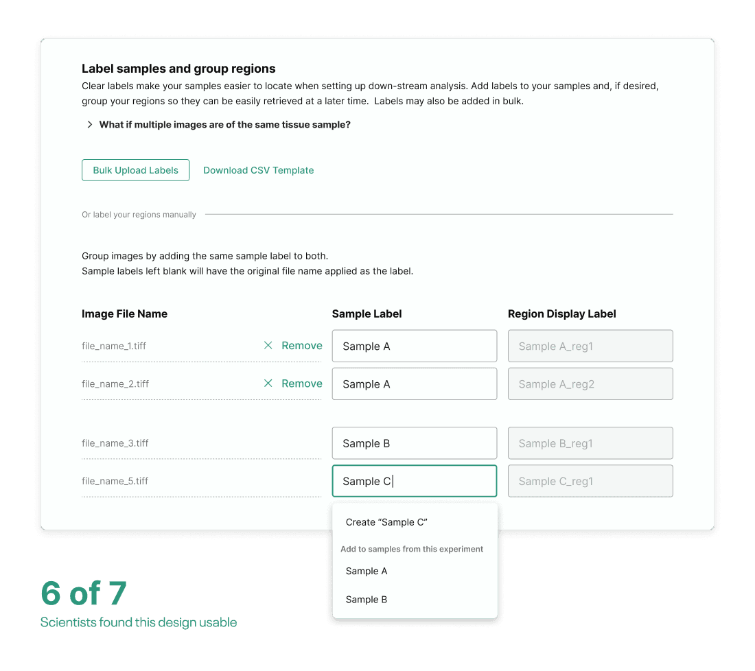
When running usability tests on the full upload flow, major issues arose in the sample labeling and region grouping step.
What wasn't working
- –The grouping trigger was undiscoverable
- –The initially disabled ‘Region Label’ fields were confusing
- –The expected hierarchy of Experiment > Sample > Region was confusing
What worked better
- –Letting users create groups as they go
- –Auto-grouping images into groups as they're created
- –No ‘Save Region Group’ confirmation requirement
Prepping designs for implementation
With a full set of proven UIs, front-end developers helped determine the feasibility of the proposed designs and how we could streamline the UI for scalable implementation.
Key callouts at this stage
- –All sections were structurally and stylistically streamlined (as much as possible) to reuse code, cutting down implementation time.
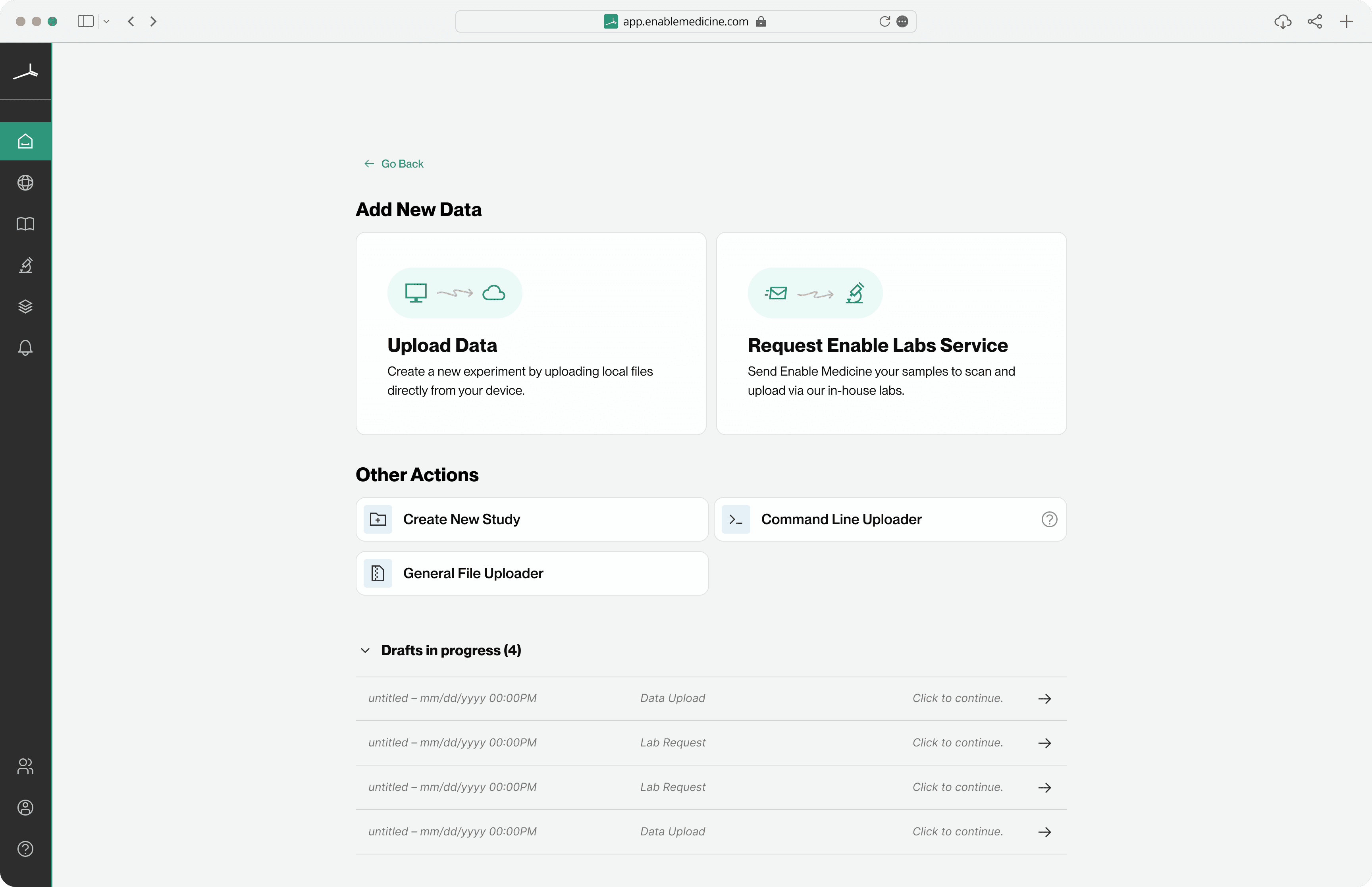
- –A new step for selecting your user group and study was added at the beginning. This was required for the backend to know where to store the rest of the data.
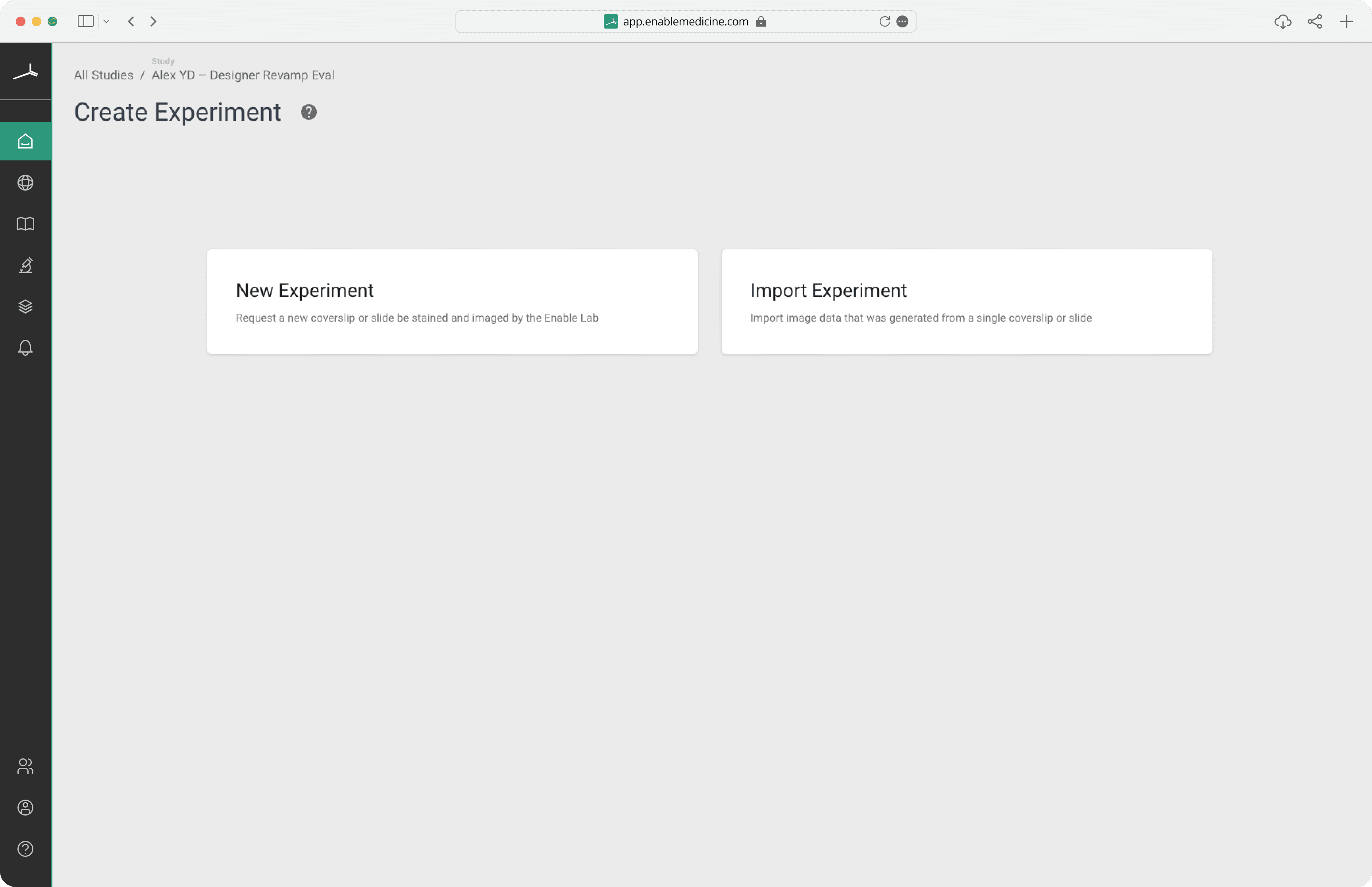
From start to finish
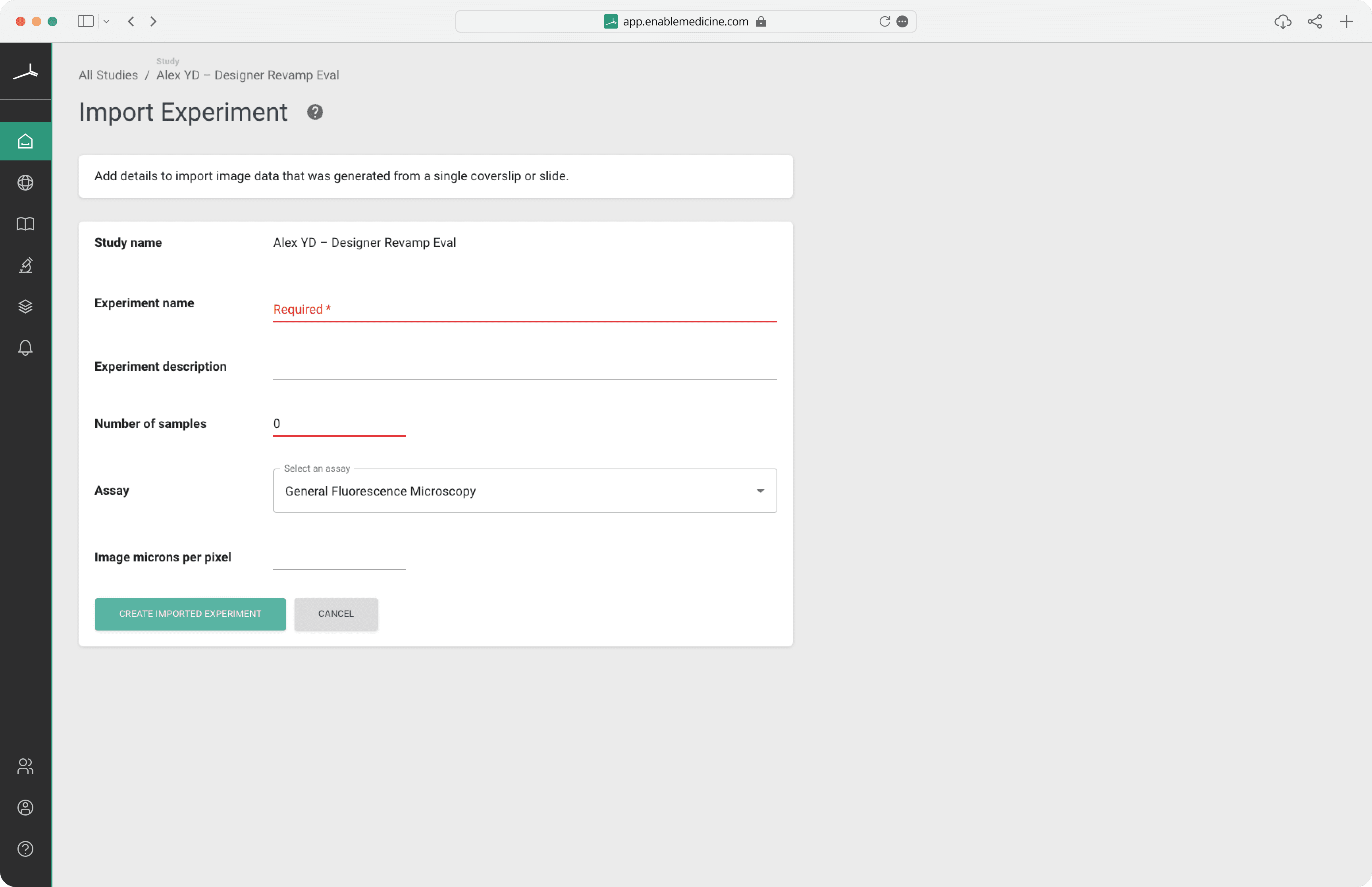
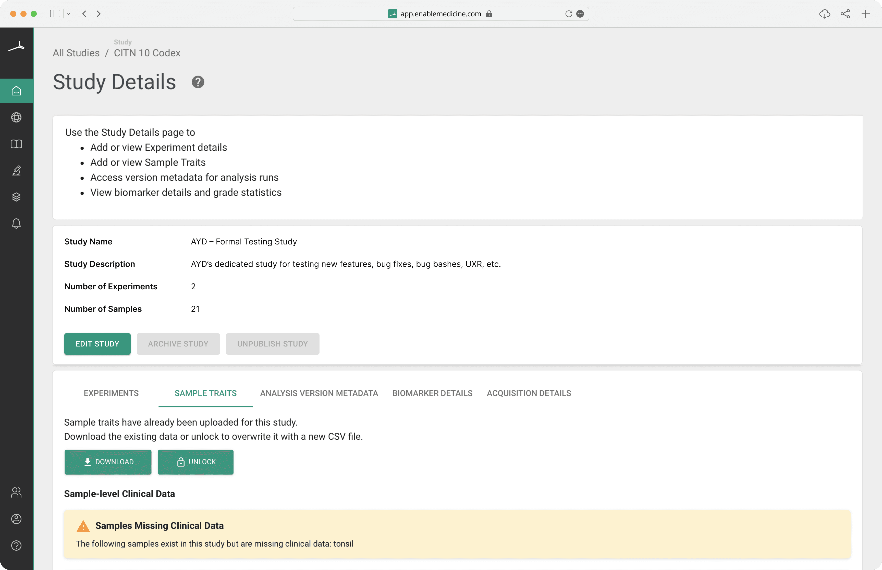
Below is a comparison of the original UI and the final updated UI.
Other work.
Redesigning Athelas Air's EMR calendar block to be clearer, denser, and easier to scan at a glance.
A collection of 7,000+ digital product icons, designed for personal and commercial use.
Redesigning the initial search experience for a getaway cabin on Unplugged.rest to be more engaging, intuitive, and polished.